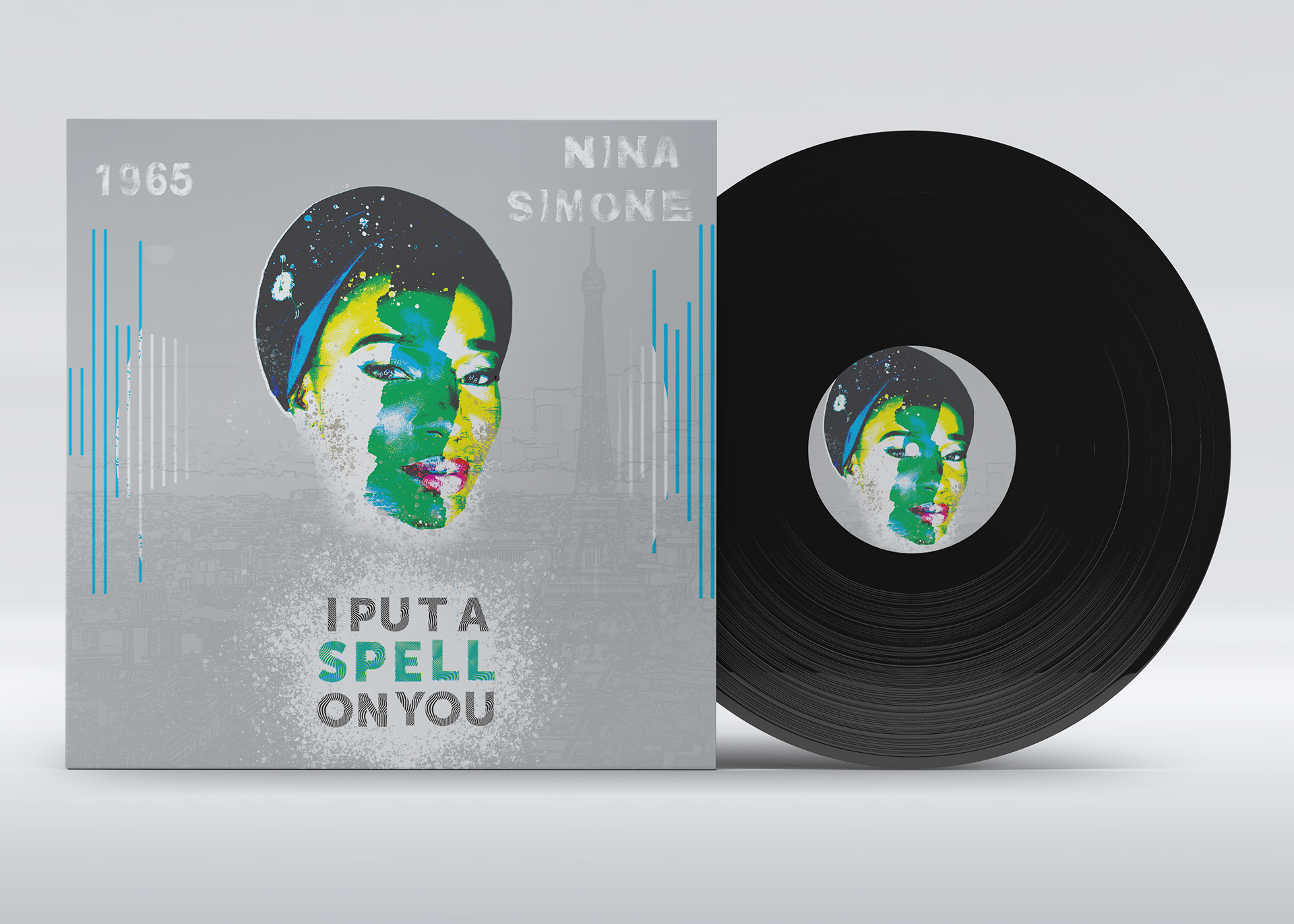
For this assignment, we had to create an using a song from a pre curated list. My album of choice: I Put A Spell on You by Nina Simone (1965)
Originally written and performed by Screamin' Jay Hawkins (1956)
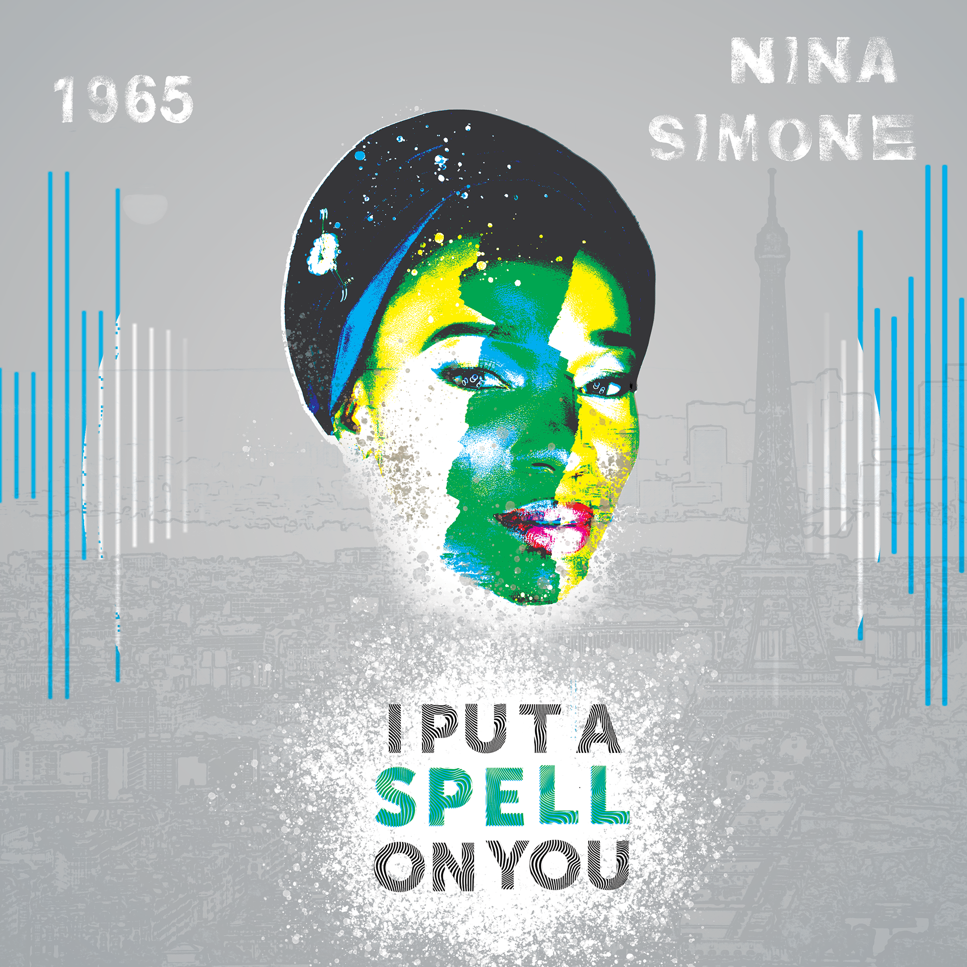
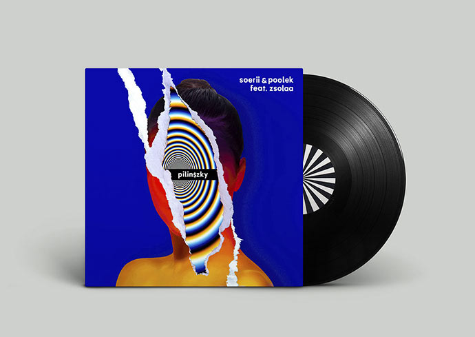
Album Design

Album Mock-up
Scroll for Creative Process
This is my favorite project so far because I enjoy a good mix of pop/rock/alternative genres ranging from the 50s to the present. When presented with the list of tracks to choose from, I recognized many of the offered songs, however, I chose to switch to Nina Simone’s “I Put a Spell On You, ” because I wanted to learn more about her.
Feelin’ Good, Blackbird, and Sinnerman have all made their way into various playlists for the rich melodies and stories they weave. I Put a Spell on You was not a disappointment either. In my research of Simone, one of the quotes that stood out to me most was that she didn't classify her work as Jazz.
“To most white people, jazz means black and jazz means dirt, and that's not what I play, said Simone. I play black classical music.”
- (Interview with Brantley Bardin 1997)
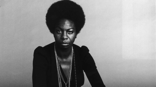
The full quartet that accompanies her powerhouse vocals lead me to agrees me to agree. However, Simone didn't have the easiest career and wasn't acknowledged as the talent she was being a black female singer pre-civil rights era. Some of her songs such as Mississippi Goddam weren't allowed to be played in the U.S. during that time. This leads her to leave the U.S. for Paris where she also struggled for a time, until she dropped much of her political agenda in her music, and slowly built her fame up from there.
As strong and powerful a singer as Simone was, I didn't know how hard it was for her to become the legend she is now. The way she had to endure being a woman singing in a world where it wasn't ok to do anything independently, and adding to that, her struggle for civil rights has truly inspired this design.
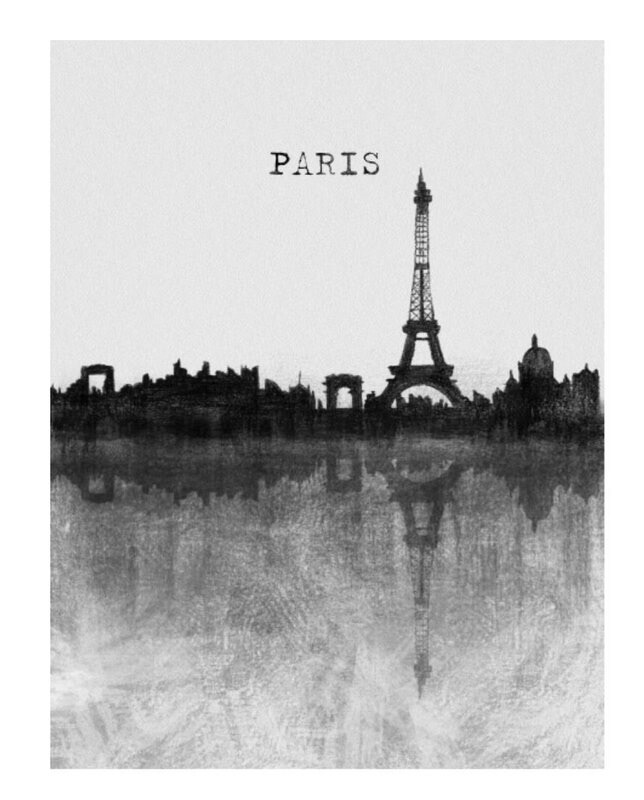
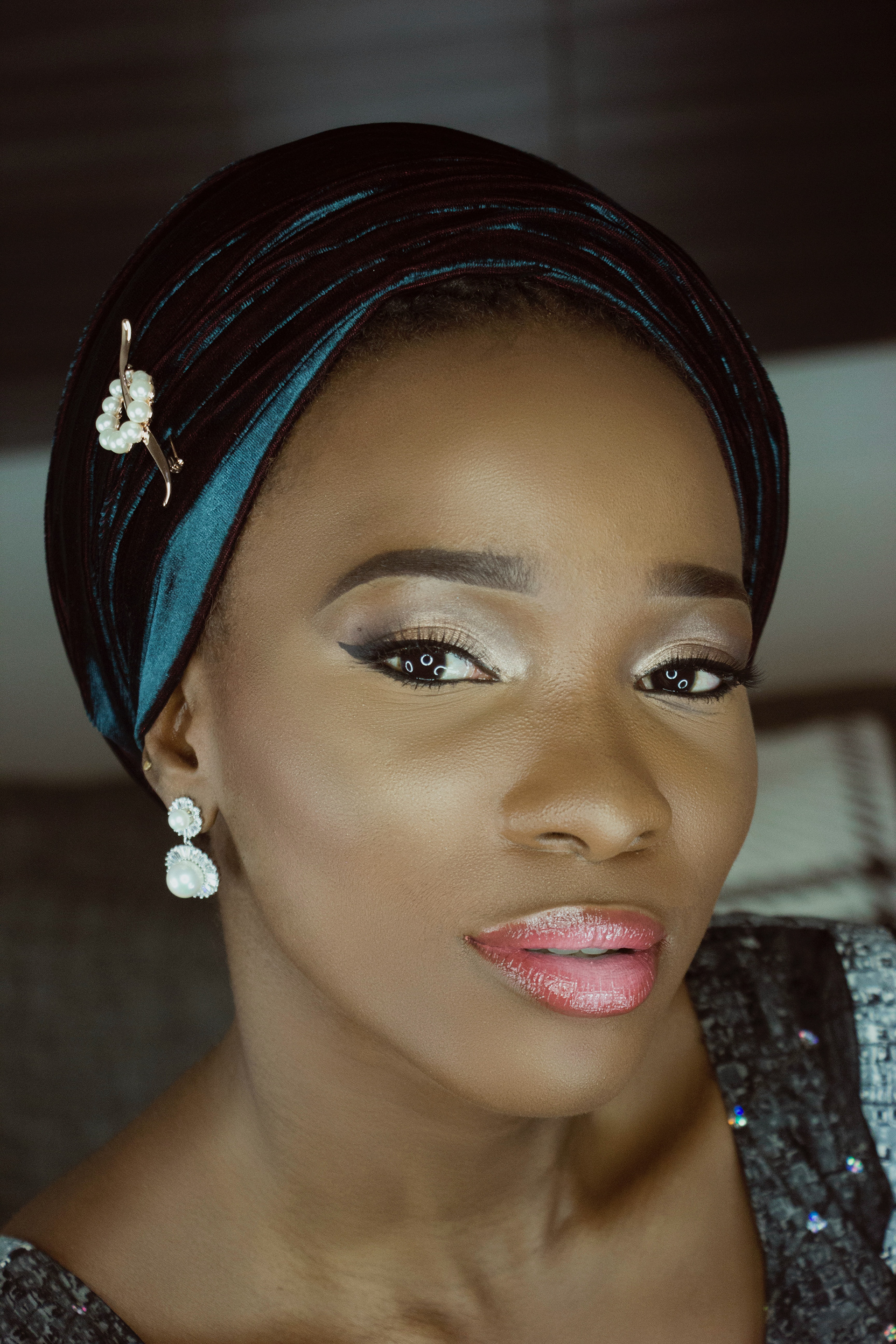
I played around with several different symbols in Simone’s songs and her story. The moon and the Eiffel Tower were the ones I liked best because the promise that the city of lights held for Simone seemed to empower her, and there is no city in the world more synonymous with love. Listening to "I Put A Spell on You," the thoughts running through my mind were only of how she did have the power to cast a literal spell on any who heard her voice but only for a fleeting moment. This song, in my opinion, represents the times in which she succeeds in being heard and forcing people to listen to her whether they want to or not. However, she still wasn't allowed just to be herself off-stage, she had to compromise on her identity and what the messages in her music evoked to grow and be initially successful.
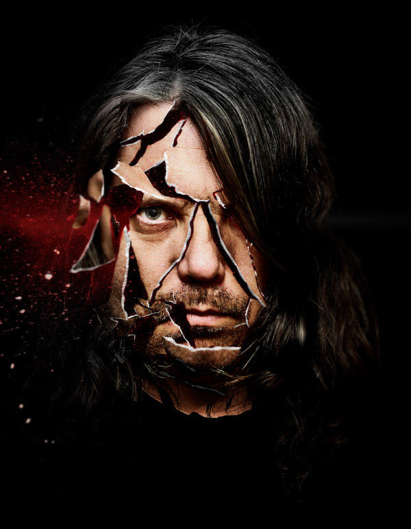
This led me to explore the idea that her identities were all multi-faceted, and she had to choose which sides of herself to show at any given moment. While it's probably a stretch to speculate about this based on one song, I think that there is evident inner turmoil in the lyrics about needing to keep someone under your spell and living in that moment rather than be lost looking towards the future or the past. So, I followed the tutorial by TipTut below on how to create a ripped paper effect similar to my inspiration photo above.
Inpiration Paris
Tearing Effect

Color Inspiration
Identity Inspiration

sketch 1

Sketch 2

sketch 3

sketch 5

sketch 6

sketch 4
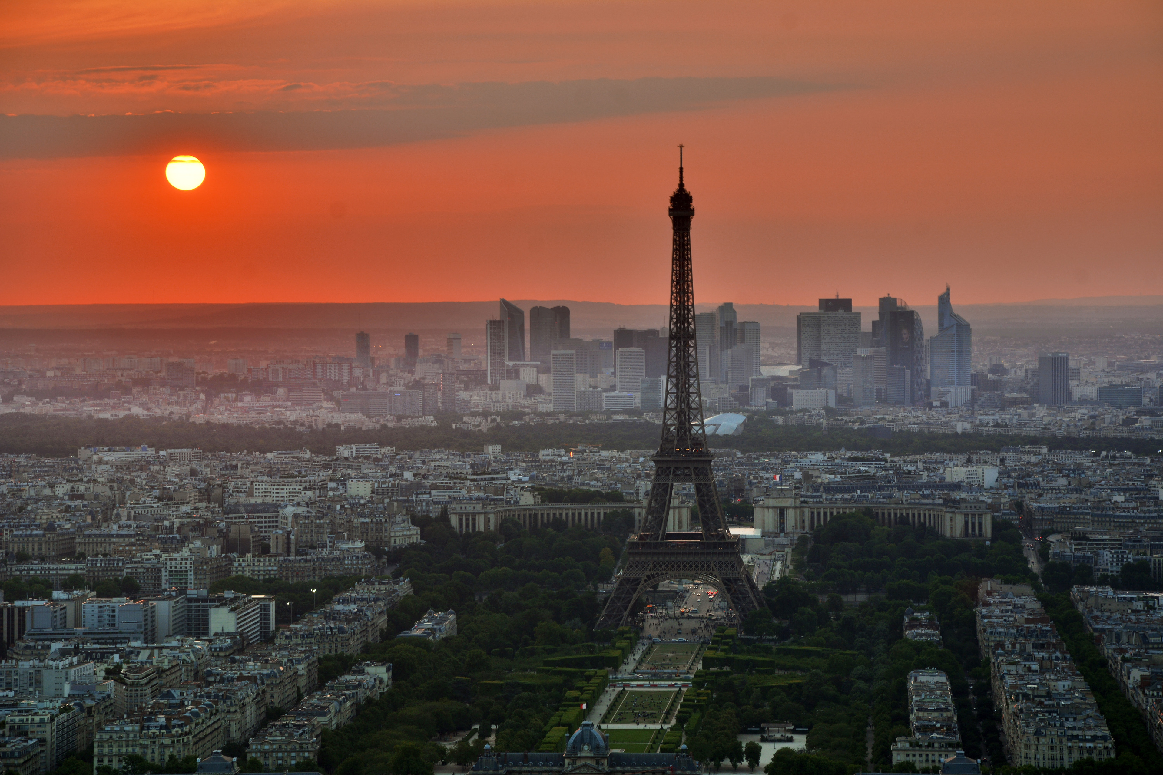
Paris
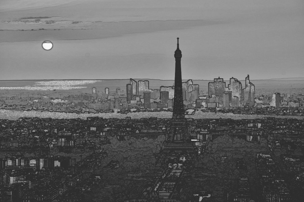
Sketch Effect after Tutorial
Subject

Tearing Effect Rough Draft
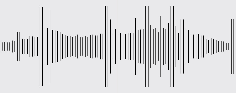
Audio levels from I Put A Spell On You
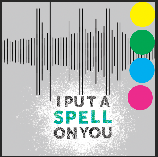
color scheme
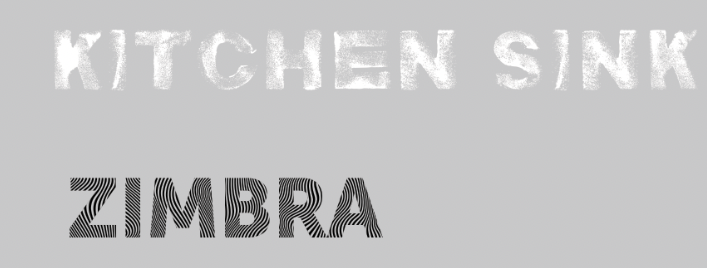
Fonts Used
I didn't quite go as far with the paper ripping effect as I might have, if I hadn't decided to show the splitting of Simone's identities through color rather than the paper effect. I ended up enjoying the contrast and the pop art style it brought to the piece which gave it more of a stark contrast
Faded into the background of the album cover is a sketch of the Parisian skyline, and I wanted it to be that way because I didn’t want to have the city of Paris competing with the subject of the album, (who is not Nina Simone, for this assignment we weren't allowed to use actual pictures of the artists). All the images used we're royalty-free from Unsplash. To get the Paris skyline to look like a drawing, I followed this tutorial by Becky Kilimnik. I recorded, screenshot, and then added in audio bars from the actual song to convey the power that Simone's voice held.
To increase the contrast between the backdrop and foreground, I continued the artistic theme and used a splatter brush to whiteout the background. This inspired my choice for the subhead text, uniquely named Kitchen Sink. It fits the brushed look of the album and gives it more life. As for the heading text, I actually wanted a font that emulated the audio waves on the cover, and I think Zimbra does just that. I layered the letters in SPELL with colors from the subject to give it an extra bit of emphasis, and I think it turned out really well.
I'm so proud of the work I've done on this project and have learned more than expected, so I hope you can say the same. Thank you for reading!