Given the opportunity to redo one assignment, I had to choose my first project: the T-Shirt Design. We chose a positive and negative trait that defined our personality, one color, one shape, and our first or last name to emulate these traits through design. My words were Beamish Sciolist.

Shape Design: Take 2
Name Design: Take 2
Shape Mockup: Take 2
Original Shape Mockup
Name Mockup: Take 2
Original Name Mockup
Scroll for Creative Process
Creative Process
To start, I had to revisit my mindset from a few months ago. What were the exact definitions of beamish and sciolist, as I still believe that the words themselves were not the cause of my lackluster performance the first time around. To be beamish means bright, beaming with optimism, promise, or achievement. Sciolist, on the other hand, means to be a person who pretends to be knowledgeable or well-informed. To reconnect with the meanings of these words, I created a word association map for each, and started to gather inspiration for designs.
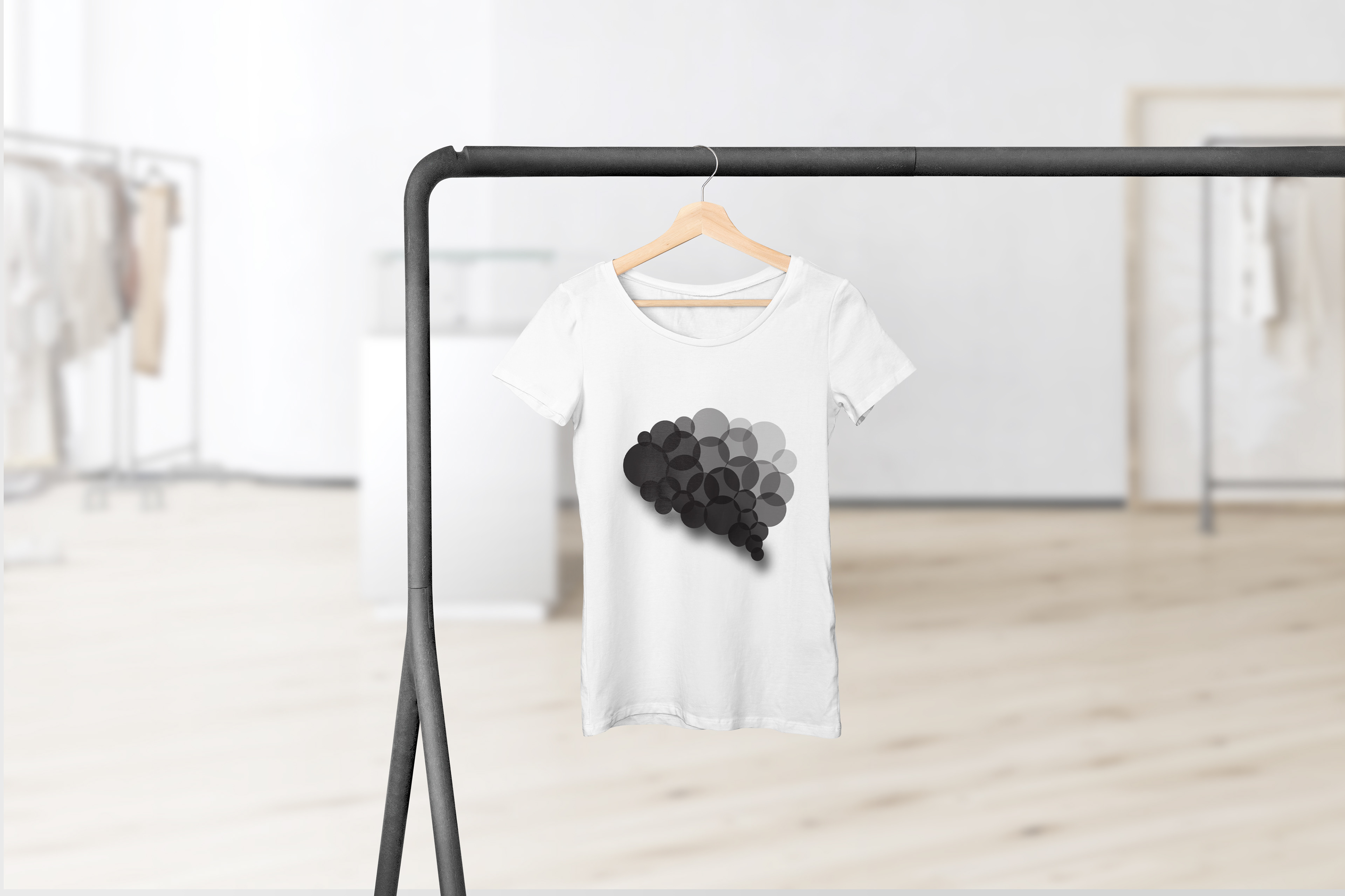
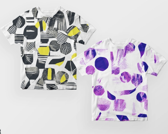
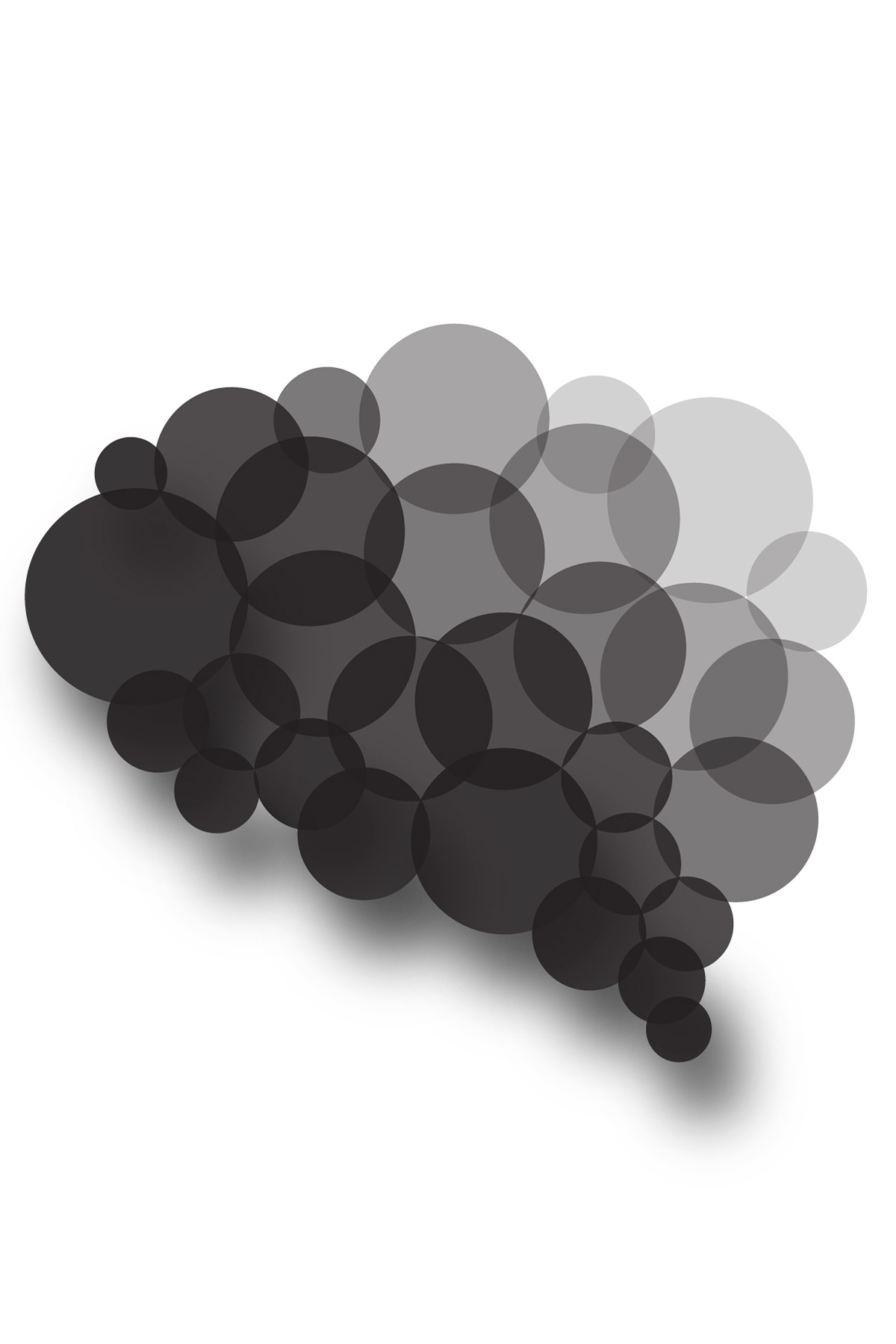
I began reworking the negative word/shape design first because I felt that was where I had the most room for improvement. My original design was a specific layout of circles that faded upwards. This was supposed to be a brain formation and the fade represented the lack of knowledge, or loss of it, over time. According to my design feedback, however, people were slightly unsure of what it was. One said a thought bubble while another cited the house from Disney Pixar's UP.
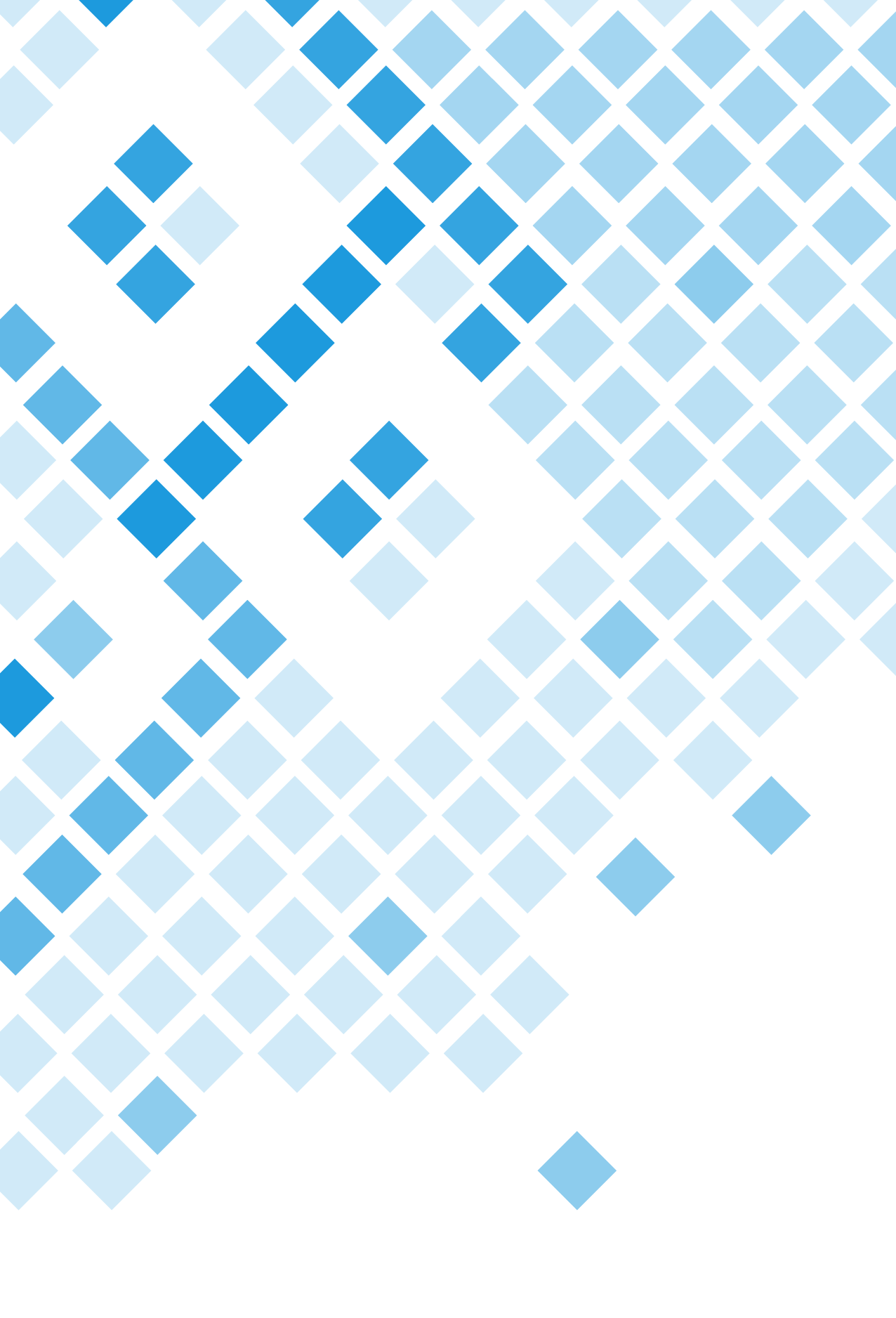
So, armed with that information, I played with several different shape ideas and the opacities of those shapes to create color variation. I was torn between sticking with circles or exploring other shapes. Intrigued be the idea of overlapping rhombuses to portray the ever-evolving human mind, I created two separate drafts for the shape design. I decided to go with a bright blue pantone color because this assignment's purpose was to help us delve deeper into who we are as designers, and in an earlier project, I had decided that a lighter Pantone blue fit my branding. The brighter blue worked better however, because this allowed for bigger contrast payoff between opacities.

Word Association
Shape Inspiration
Name Inspiration
Shape Inspiration
Name Inspiration
Name Inspiration

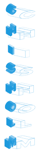
Shape Design Rough Sketches
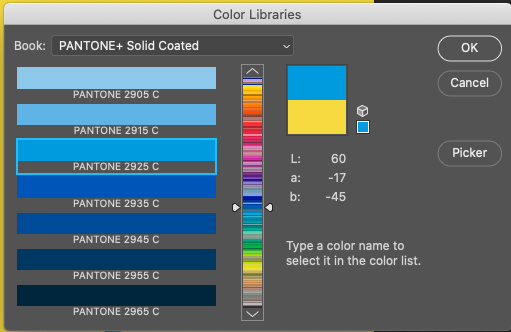
PANTONE 2925
Draft 1
Chest Design
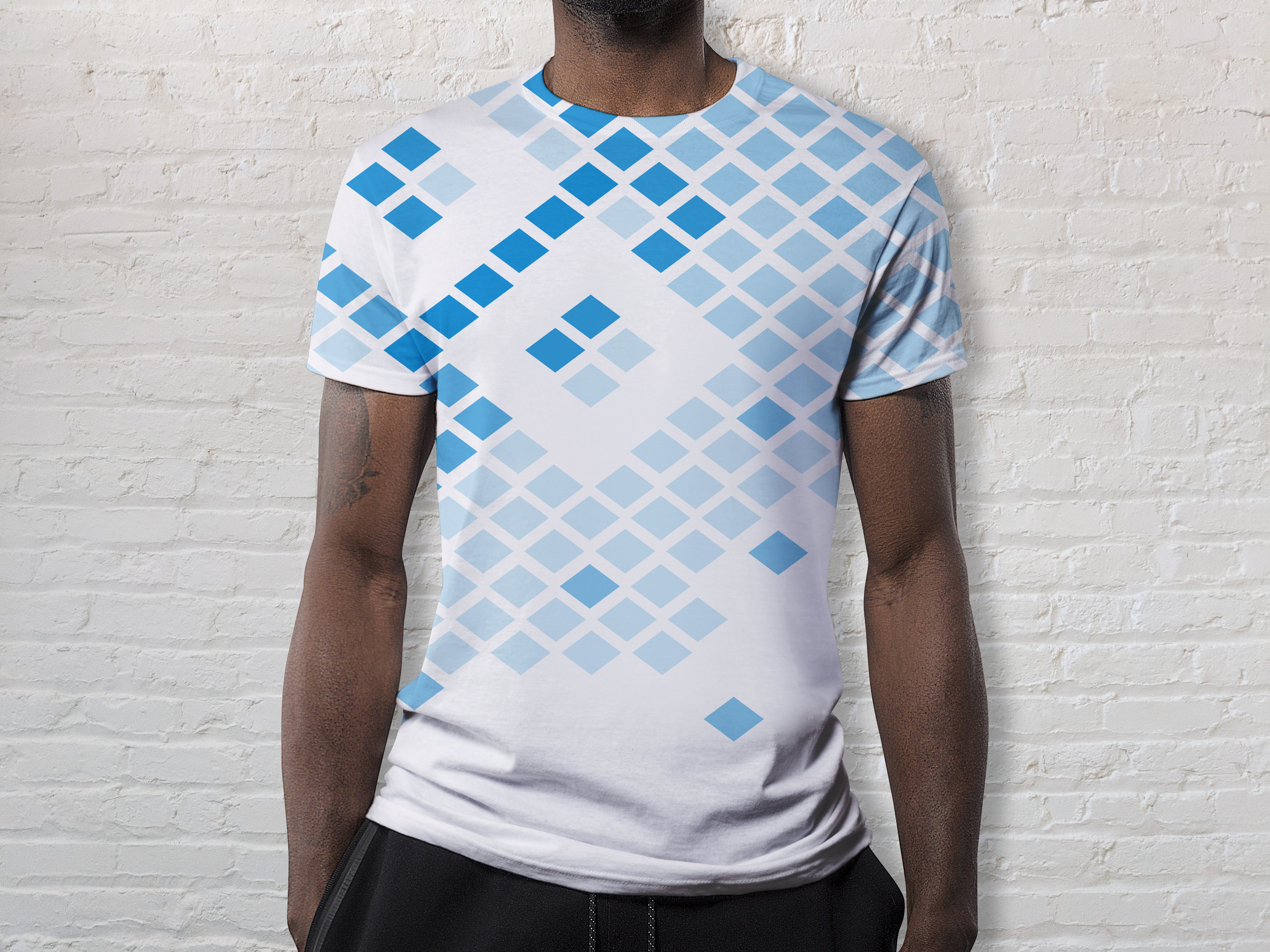
Full shirt design
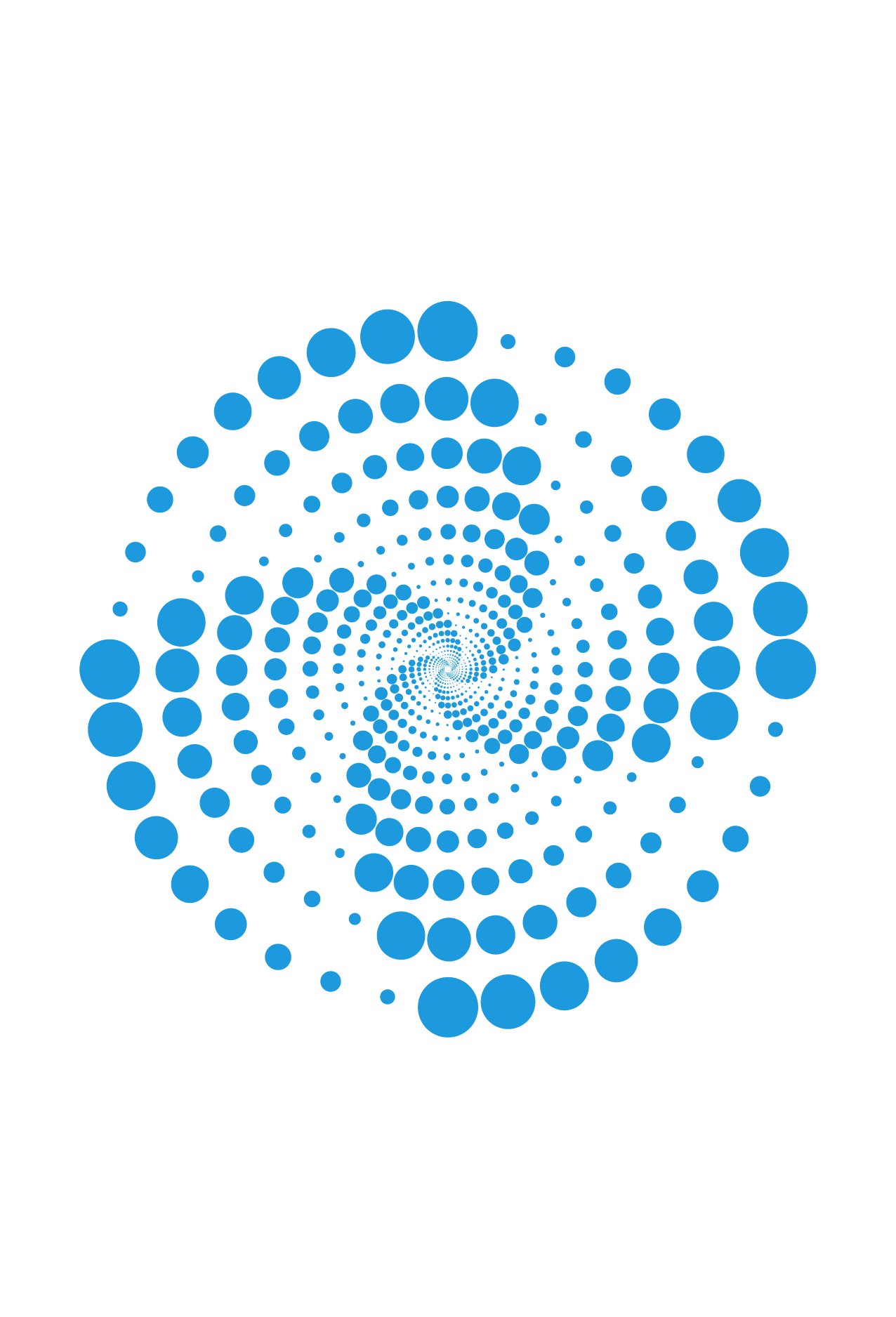
Ultimately, however, I felt the my first draft design lacked visual direction and it was kind of all over the place. So, I went back to my original design and really thought about how I could portray the unraveling of the mind or the impermanence of knowledge.
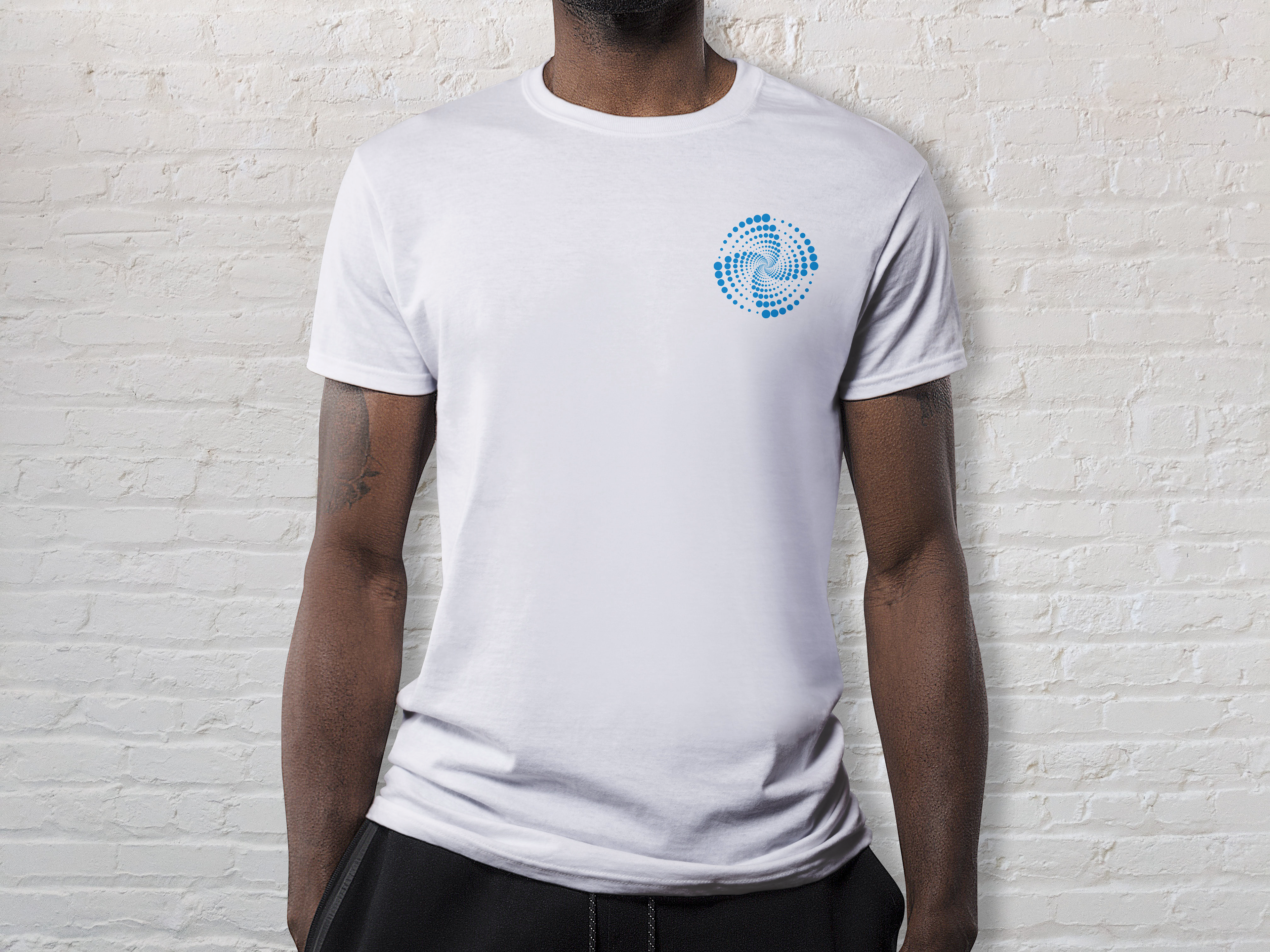
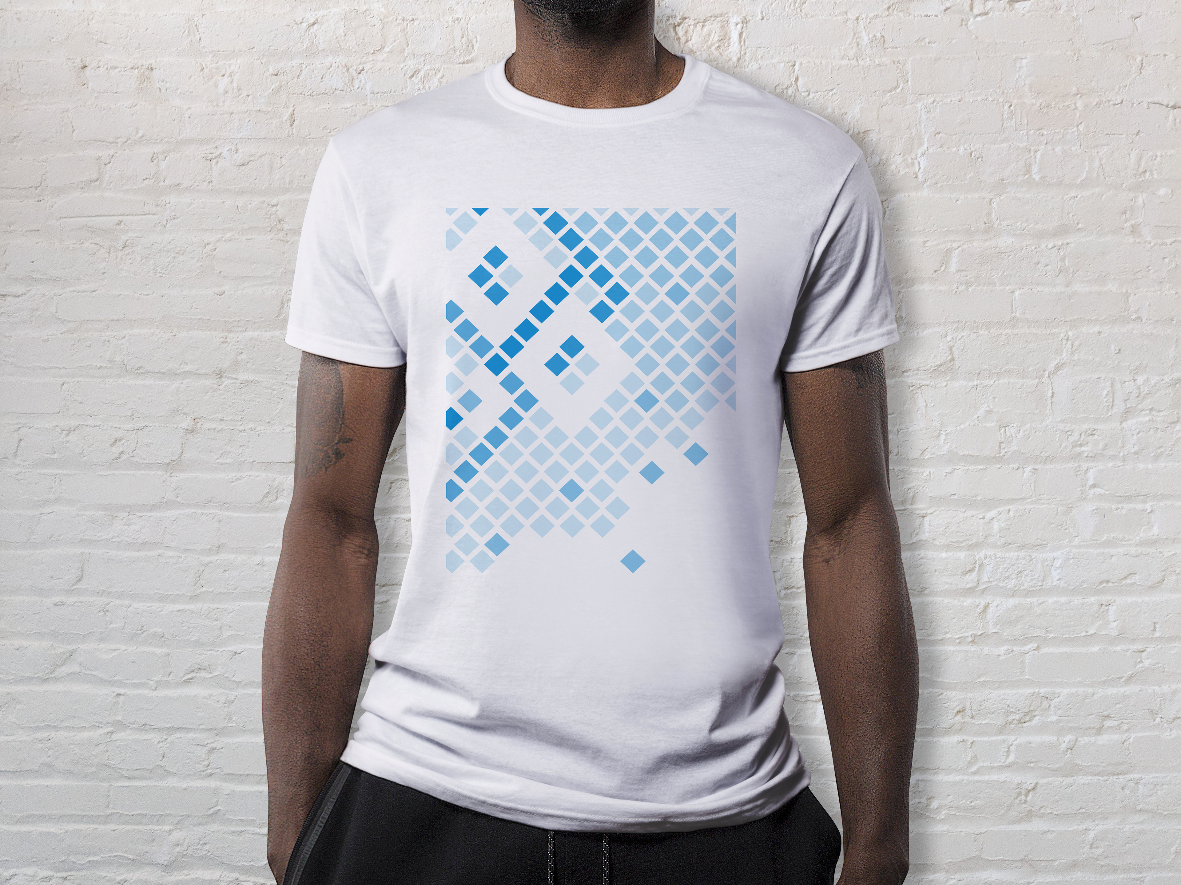
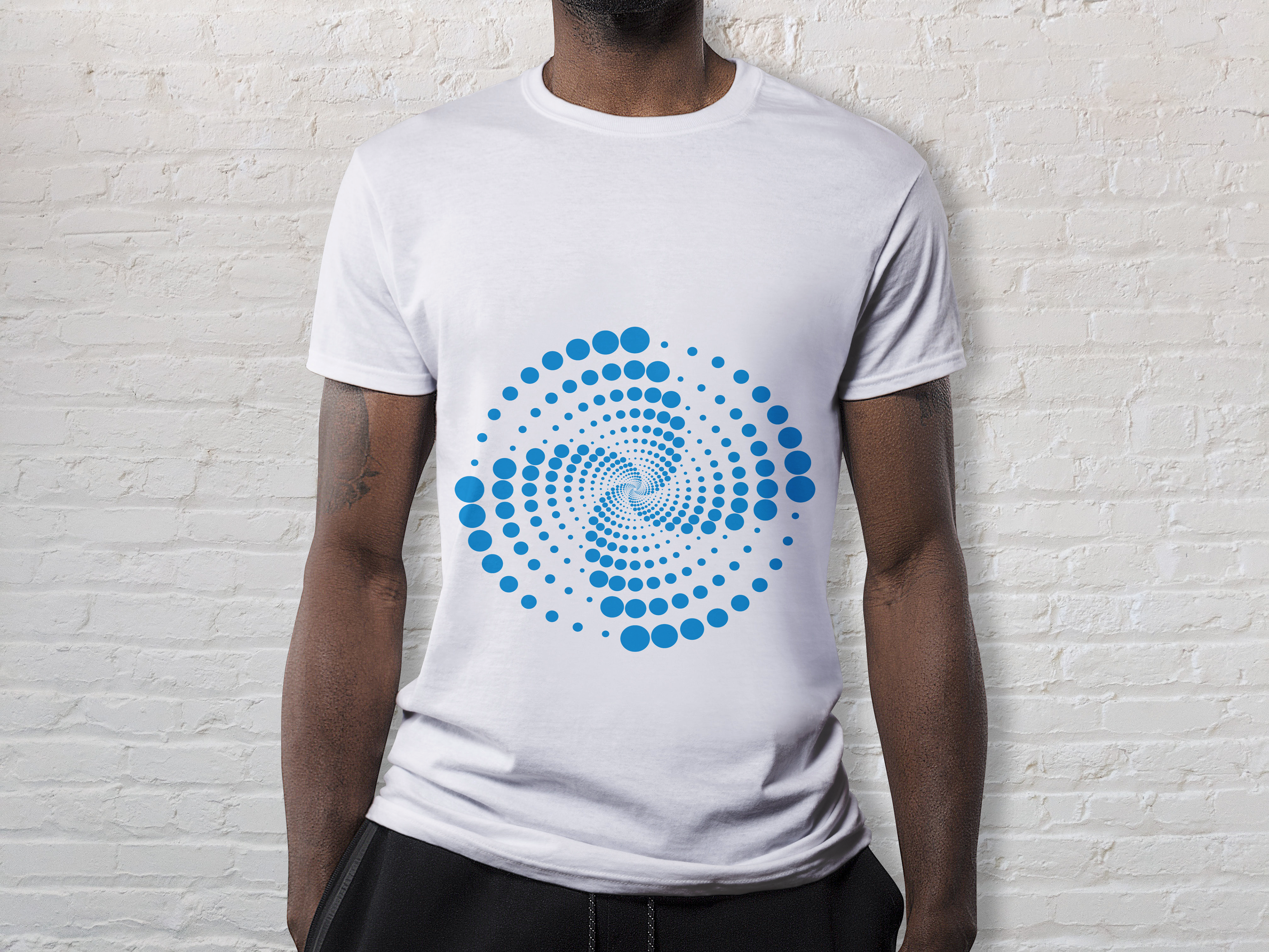
I jumped to the idea of a mind spiral, how your thoughts can spiral in a never-ending loop, making connections where there seemingly aren't any. This is an idea I first read about in John Green's, Turtle's All the Way Down. I'm so pleased with the design that I came up with. It's simple, mesmerizing, and communicates the idea beautifully. I decided to leave the t-shirt white for this design to make the color truly pop, but instead of doing a full chest design, I thought that the chest pocket design further emulates the simplicity of the mind spiral.
Original
Take 2 Design
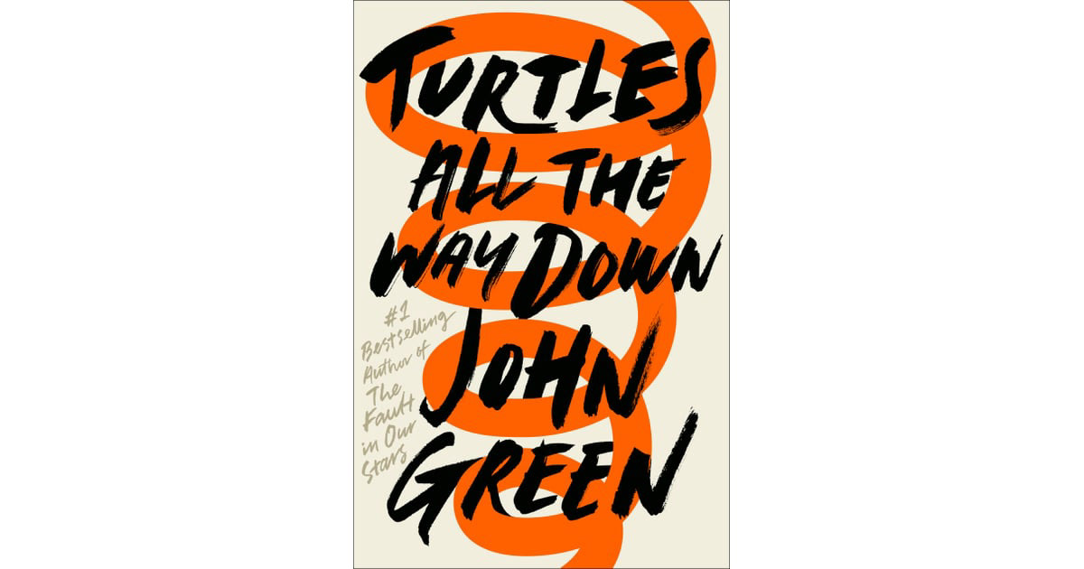
John Green - Mind Spiral Inspiration
Placement Draft

Placement Final Mockup
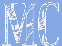
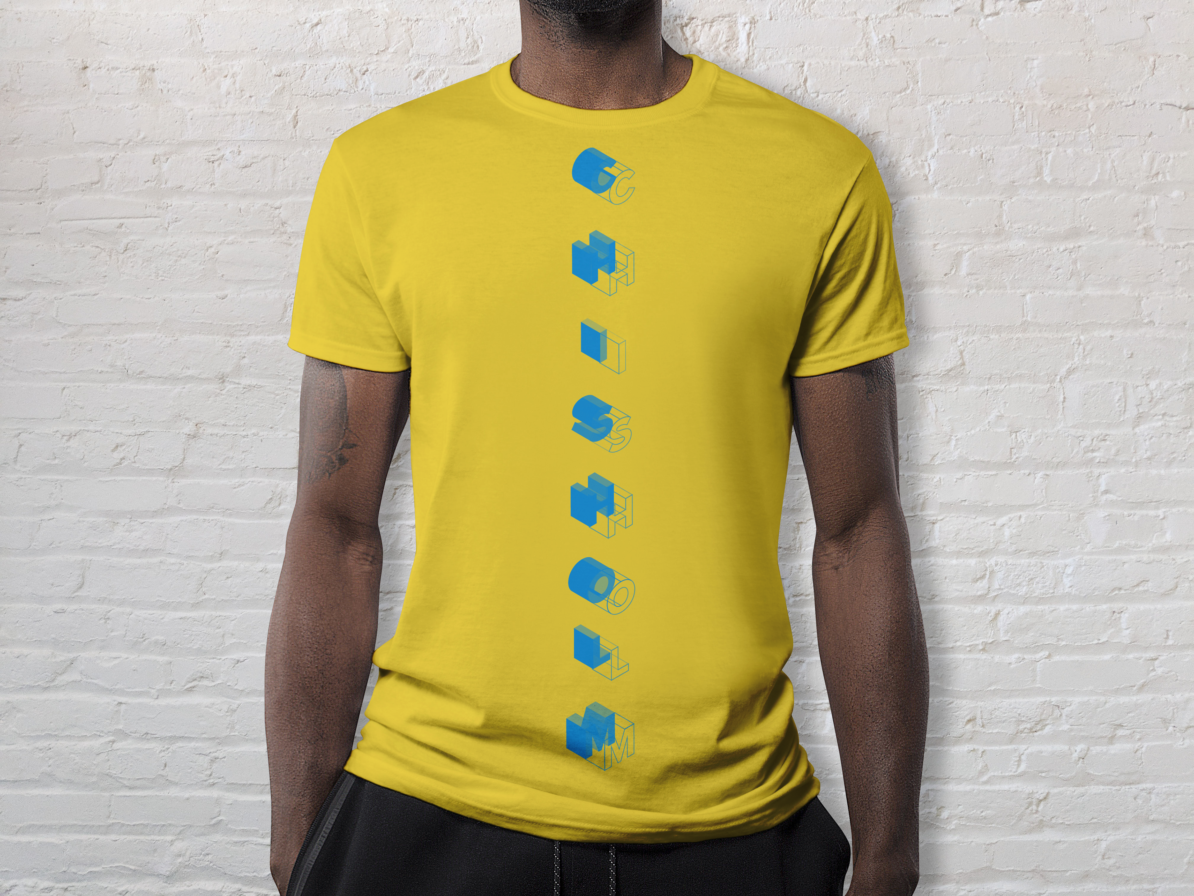
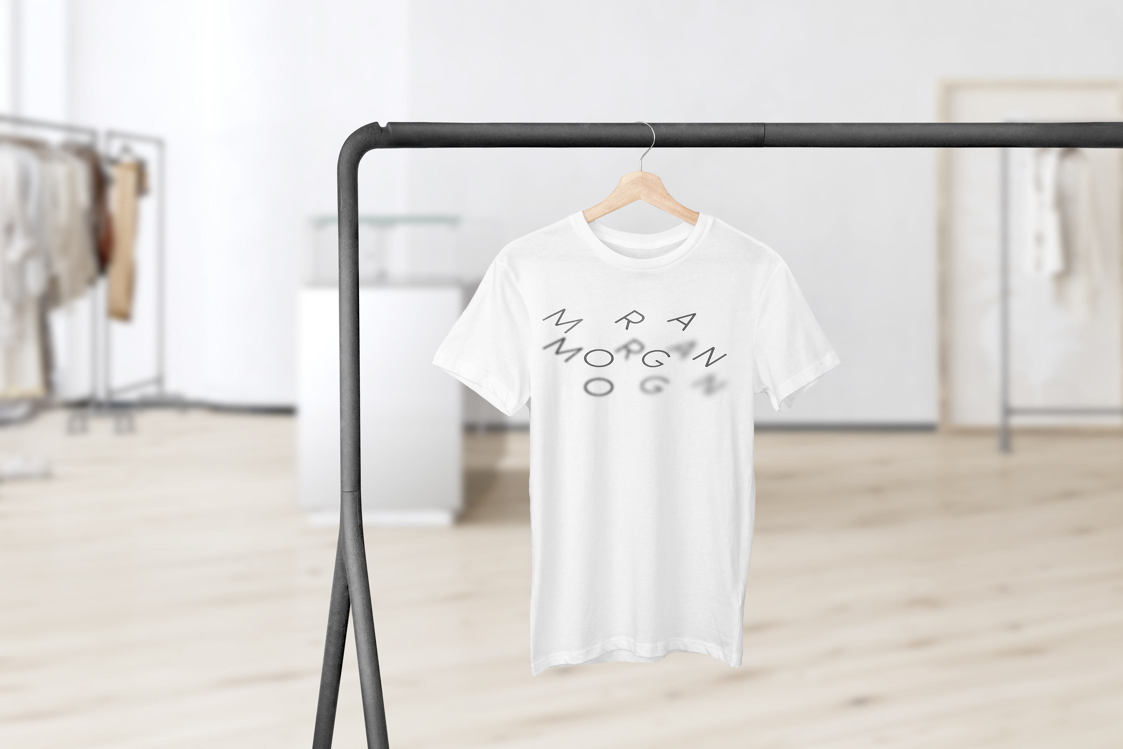
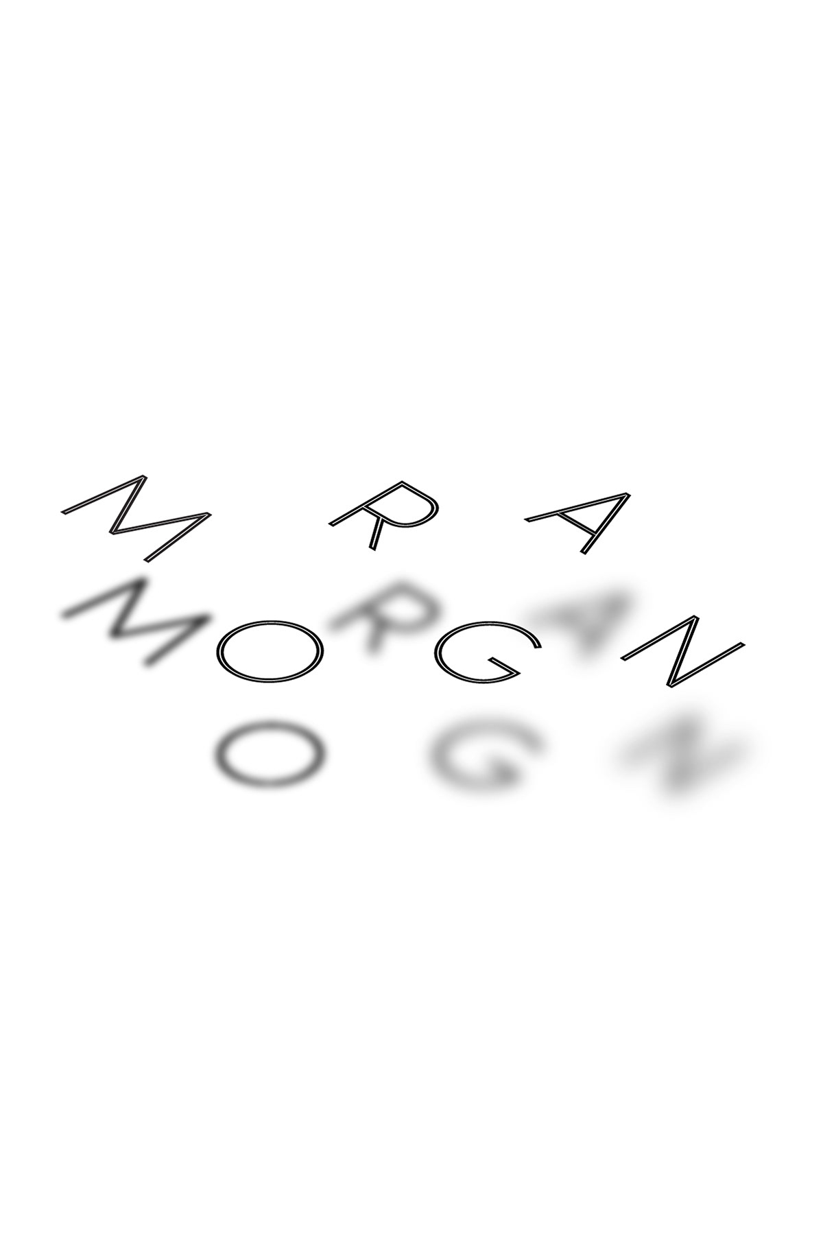
For my name design, I wanted to focus on the word beamish, which is my positive trait. The flaws in my original design were linked to the hierarchy of the text and the visibility for each shadow if it were to be printed on an actual t-shirt. I wanted to continue the theme of portraying light beams through typography in this design, but I wasn't sure how I wanted to accomplish that.
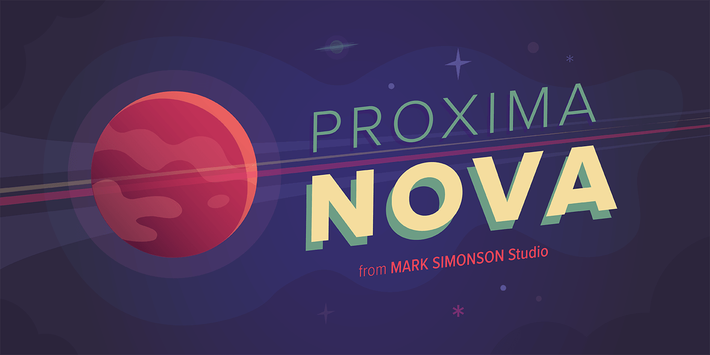
In my sketching, I explored different forms of repetition and reflection at different opacities to create the illusion of like and shadow. I also pondered manipulating each letter to form a lightbulb, but I didn't want to be too literal. For the font we had a limited number to choose from and I originally used Sofia Light Pro. However, I decided to switch to Proxima Nova because it is a clean, versatile san serif font that pretty much looks good in any position from display headings to body copy.
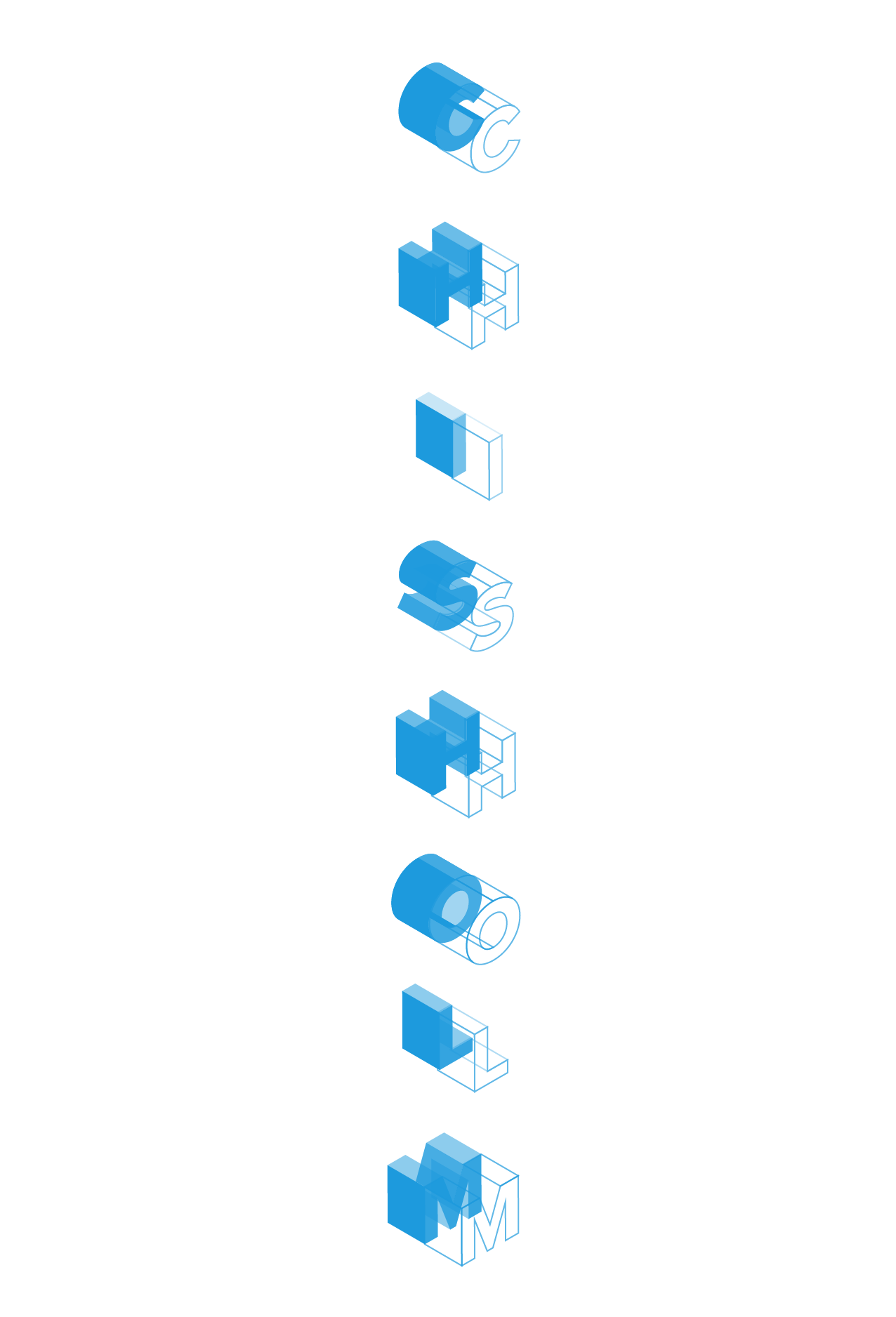
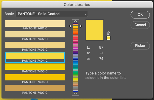
The design I ended up choosing required manipulating the text similarly to the first project. Only instead of shifting the text to be visible from a top down perspective, I shifted each letter isometrically right and expanded the letters so that they became 3D shapes. From there, I was able to individually shift the opacities of each side so that it gave the effect of highlights and shadows I was looking for. Finally, I made a copy of each letter outlined it instead of filling it. By lining up the filled letters, the outline letters, and removing any unnecessary lines, it created the beam effect you in the "Name Design Take 2" image. For the final mockup, I decided to make the t-shirt Pantone 7404, which is a nice golden yellow to really accentuate the blue and look more like a beam of light.
One thing I wish I'd been able to accomplish in this design was make the beam letters longer and still in sync with the filled letters (see my failed attempt named draft), but otherwise, I'm really pleased with how the design turned out and I think I've improved my design skills immensely since the start of the semester. It's been amazing to learn and do so many different styles of design, and undertake so many different projects, that I've gained a better understanding of myself as a designer because of it.

Name Design Take 2
Draft
Original
Shirt Pantone Color
Proxima nova Inspiration
Typography Inspiration

Name Rough Sketches

Name Design Final Mockup

Shape Design Final Mockup
Thank you so much for reading!