For this project, I was given creative freedom to create a deliverable that would broaden my portfolio. With that in mind, I created a website design to showcase the Marvel Cinematic Universe's movies, tv shows, and characters for the people who attend Marvel viewings, but have no idea what's going on. Thus, the Chronicler was born.
Below is a prototype of what the website could look and feel like scrolling through it. This was created on Adobe XD with the purpose of submission for my final design course of spring 2021. This is not fully fleshed out, but I have every intention of revisiting this project in the future to give it more depth and make improvements.
Scroll for Creative Process
Research Methods
To start, I had to think like I wasn't a Marvel Cinematic Universe (MCU) nerd. While I don't think it's a stretch to say a large audience of people have heard about the MCU, it doesn't mean that they fully understand it. With over ten years of content already streaming, interwoven plot lines & character arcs, and new projects being launched each year, it's easy to be overwhelmed by the sheer wealth of information.
I had to research designs of current streaming platforms and cinema websites like: Netflix, Amazon Prime Video, Imdb, The Guardian, or Rotten Tomatoes. This was helpful in determining current trends of design in cinema layout and formatting information.
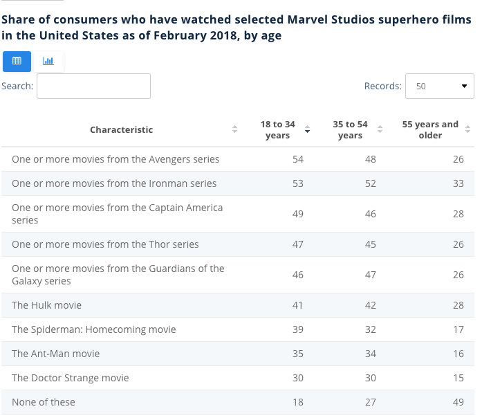
According to a study done by Jose Gabriel Navarro, published on August 12, 2021 through Statista, "In the United States, around 54 percent of adults aged 18 to 34 have seen one or more of the films from Marvel’s ‘The Avengers’ series. This viewership share is not surprising given that all of the currently released Avengers films rank among the top ten movies of all time in terms of box office revenue. This study proved my earlier assumption correct in that a large age range of audience members view Marvel movies, though the majority still lies with 18-34-year-olds.
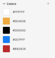
Knowing that I was designing for a younger to middle-aged audience age range caused me to first look at the color palates I wanted to draw from. I knew from the start I wanted to look back at the color palettes from different Marvel comics to inspire the color scheme.
This lead me toward a strong primary color scheme that I felt balanced each other really well and gave body copy high contrast to make everything legible. This is the color palate I ended up going with.
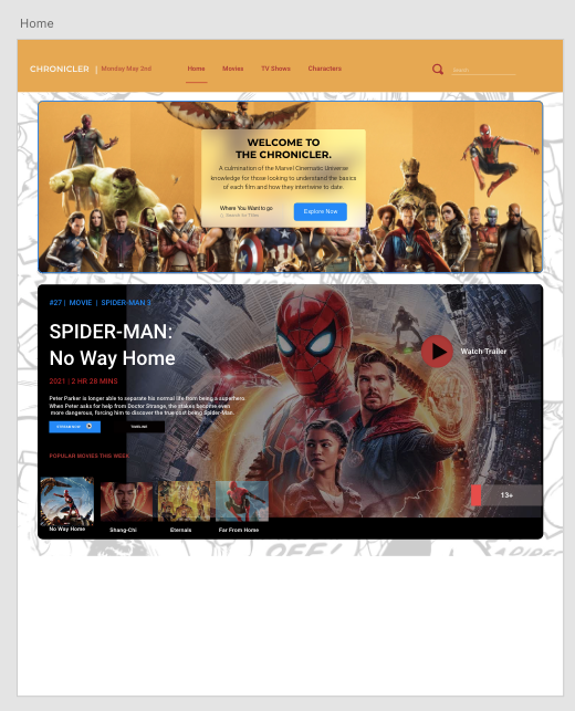
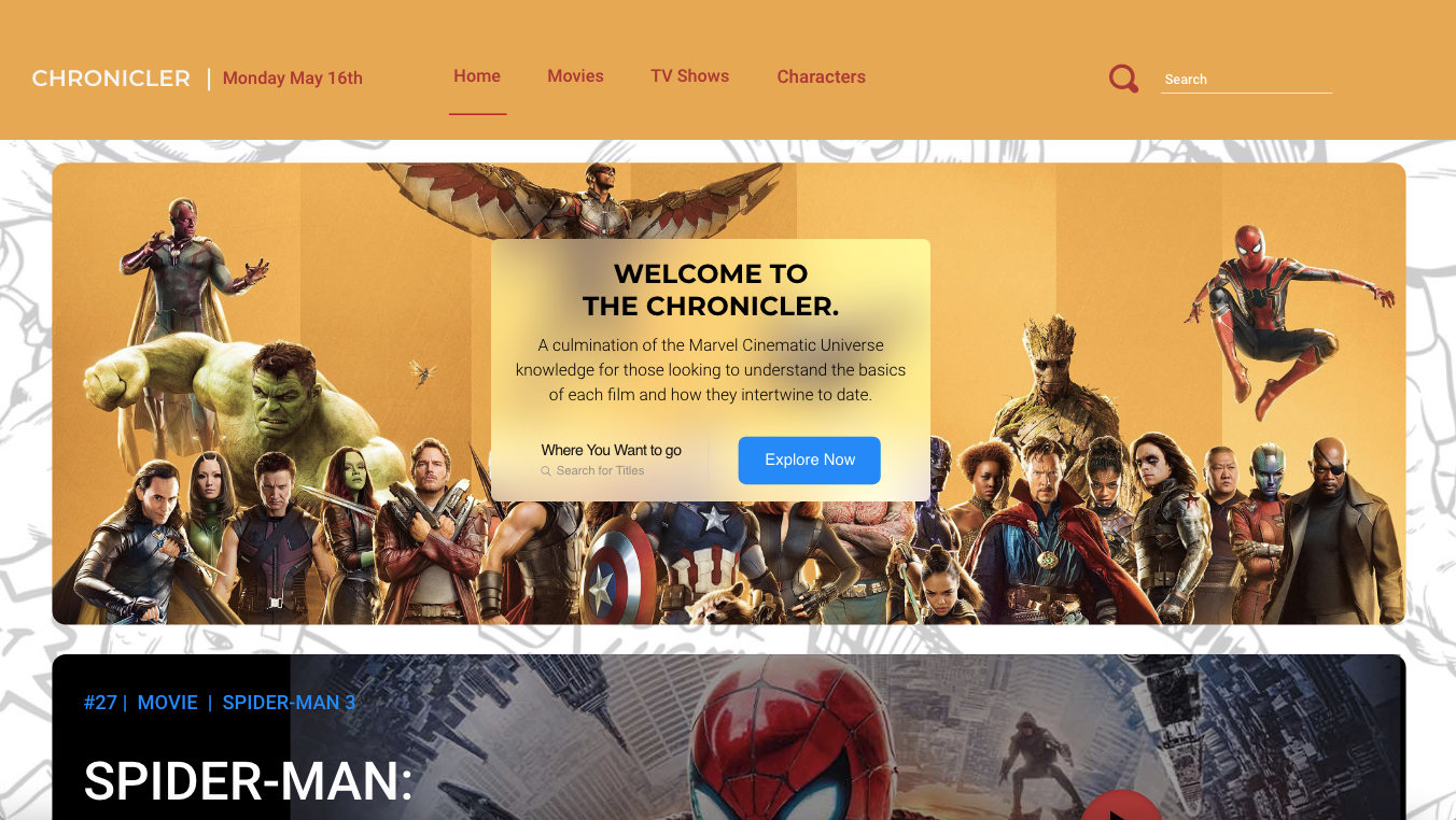
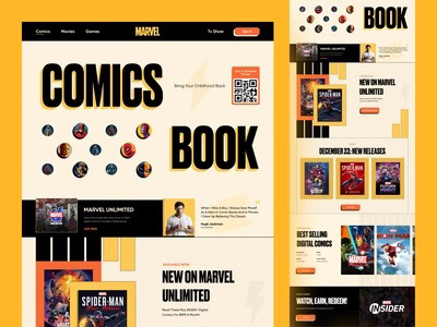
Next, I designed my website layout (shown above). This is the Home page, which includes the standard yellow navigation bar with a typographic logo across the top left-hand side, a banner with all the main MCU characters showcasing the explore feature, followed by a carousel design of the latest and most popular MCU movies to date. I thought this would be a great way to welcome people to the site, because odds are they're coming with questions about the latest installment.
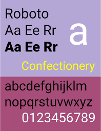
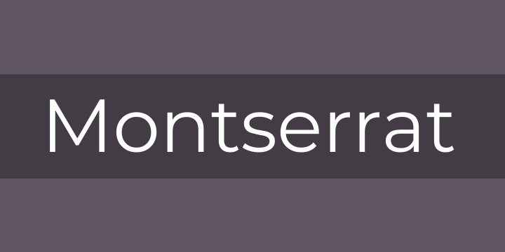
In terms of fonts used, I wanted it to be as open and inviting as possible. Readability was a must across digital screens so a typeface evoking that of a comic book was a non-starter. Therefore, I decided to pair two of my favorite digital fonts, Montserrat, praised for its geometry and readability in headings and body copy, along with Roboto, which is perfect for body copy on digital screens.
It allows letterforms to sit according to their natural width. It has friendly and open curves that make it very pleasing to read on screen. Since there were so many different font weights to choose from, it was very simple to remain using these two typeface throughout the entirety of the design and still have dimension and variety.
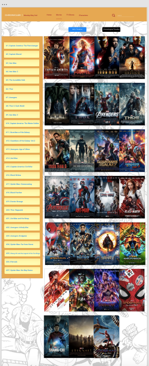
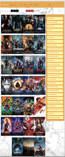

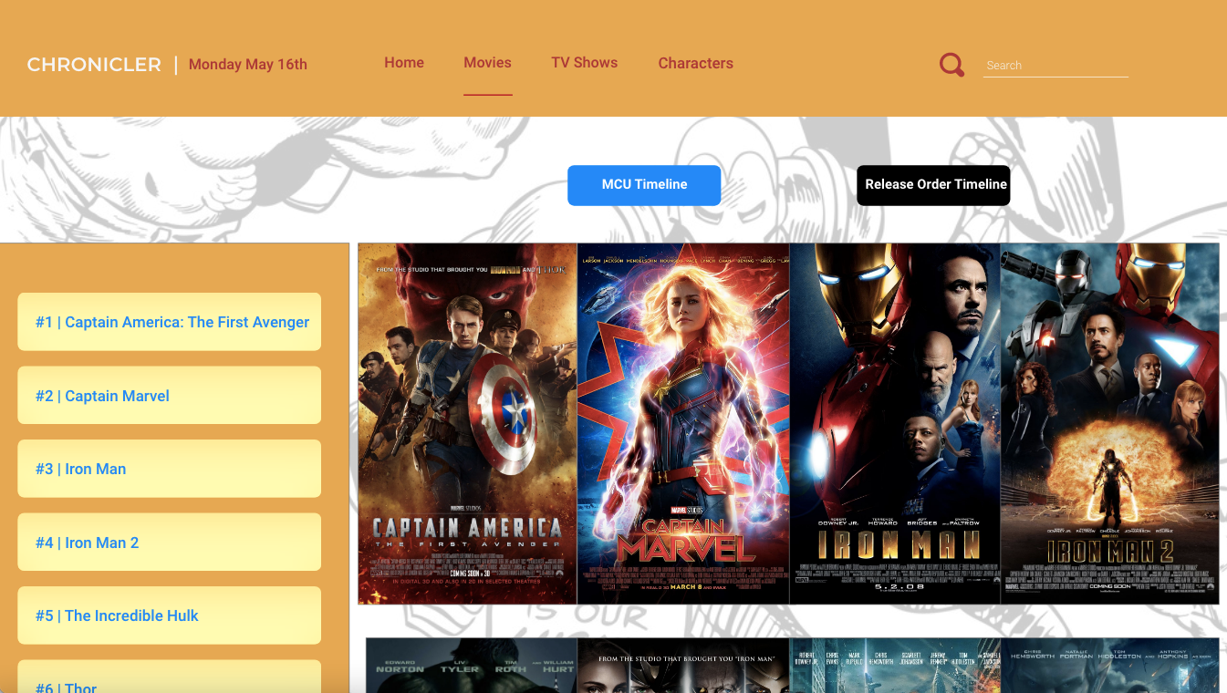
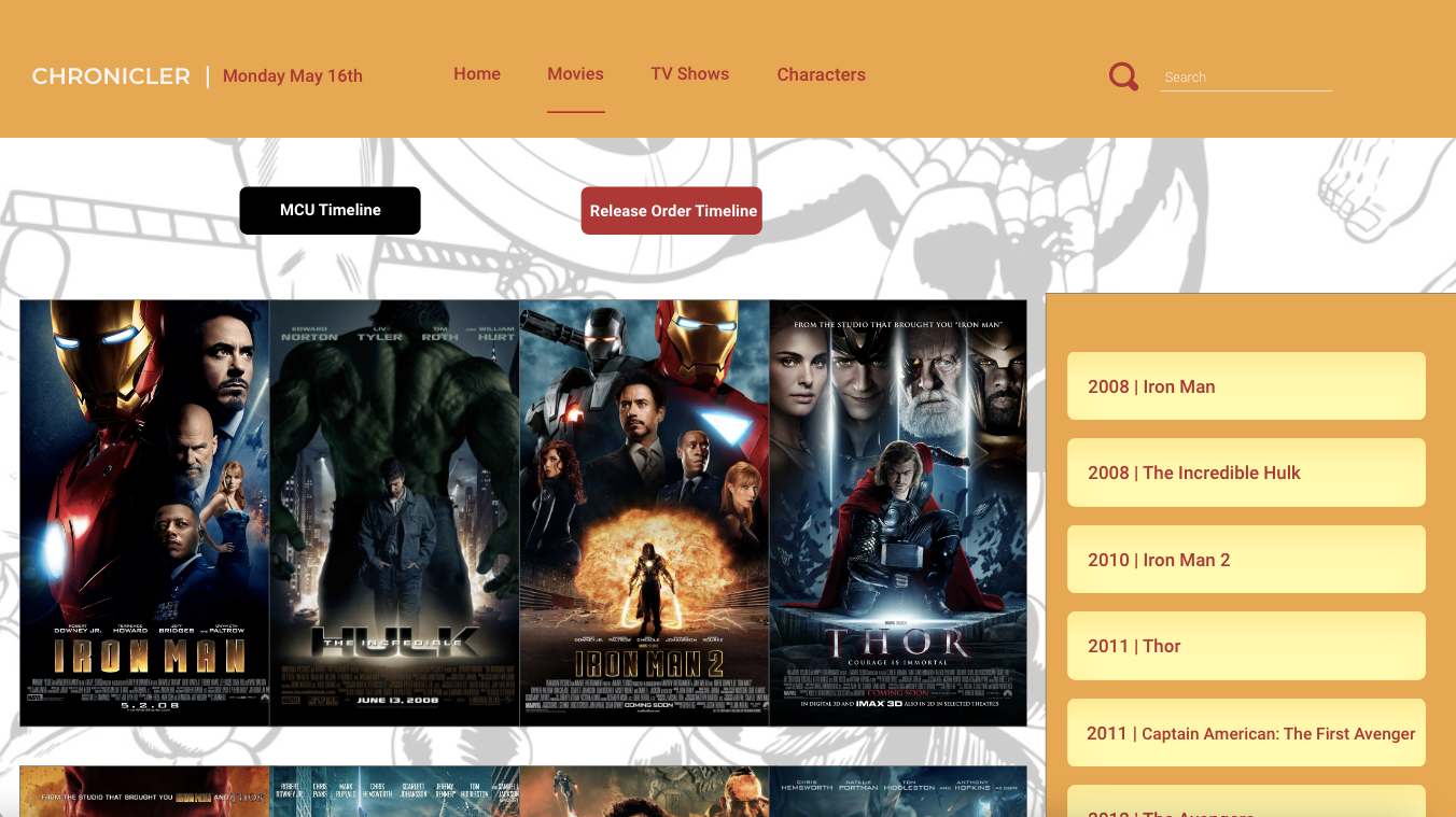
Next, I worked on the layout of the buttons and movie title images. This was very important to me that I use design elements to differentiate the MCU Timeline (the order that the storyline follow) and the Release Date Timeline (the order from which the movies were released in theaters. Making both pages follow the same layout but prioritize different colors and alignments was a great way to do this because it maintains the cohesion of the website while showing viewers that these are indeed different screens.
Then, because I wanted this website to feel as real as possible, I experimented with some hover techniques that would allow viewers to mouse over any one of the movie titles and get the order number, the title, and a brief logline. This quickly became one of the most painstaking design elements to nail because I had to place each one by hand 54 times. Twice for each movie listed. In the video below I explain the hover states I added across the website, as well as hover states I hope to add in the future. The timeline buttons don't currently have hover states added to them due to time constraints, but the darker yellow overlaid with the lighter yellow really works as it follows the shape and look of my other buttons, but bring some balance to a page that is (putting it mildly) a riot of color due to all the movie posters.
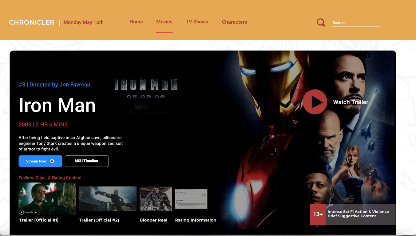
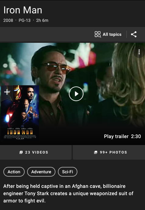
Additionally, I wanted a few movie information pages, and am very grateful my professor only urged me to do one for now. However, I feel were I landed design wise really shows what this could look like if expanded to include TV shows and start a character index.
For this page I took a lot of inspiration from Imdb and Netflix, however, I organized everything in a more visually appealing way, and this is what a cinema website could look like in light mode. I don't really understand the appeal of always having these movie title shrouded in black and grey. The contrast created between the dark movie banner and light comic strip backdrop really makes it standout and highlights the color scheme in a more appealing way.
One thing I wish I had time to realize in a more optimal way is the ratings and audience comments section. I would have loved to figure out how to blur the section with a button overlay that says I'm okay with spoilers as well as figure out a way to depict the user's upvote down vote system. As of right now those ratings are supplied by Google, but if this were a large website with numerous users, I would provide the Rotten Tomatoes, IMDb, and Metacritic scores along with an average score provided by Chronicler users. I would have love to have a slider or hoverable rating system to show that the most important ratings are the ones given by users.
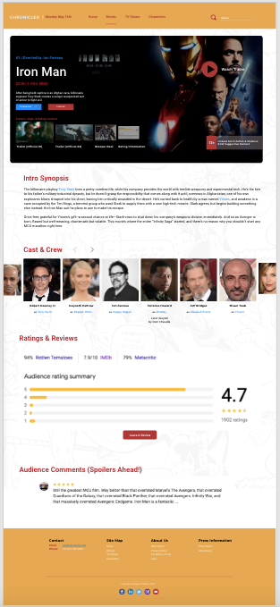
The last thing I did was design the site footer and prototyping, which links the pages together as shown in the first video. This project taught where web design can go and how much I can choose to expand on different elements if I want to. Nothing is ever fully finished and now, I take inspiration from that as we can always strive to improve even our best work. This project has been a favorite of mine with how close I am to the MCU, but it also brings me joy to know that I'm creating something that should exist but doesn't. Each streaming platform or movie review channel has their own specific style, instead I propose that we build the web design around the franchise to support cohesion and so that viewers can search with confidence, knowing that they'll find the information they're looking for in one place.
Thank you for reading this far.