Scroll for Creative Process
For this project, my designs went through several iterations. I had to decide what symbol, of the Disney movie Tangled, that I wanted to showcase. From the start, I knew hair had to play a role, but the accompanying symbols were what originally gave me pause. I thought about including paper lanterns, towers, and even ducklings, however, the briefing is what decided for me in the end. This is a minimalist poster focused on abstracting something that is the essence of the movie, so I chose the simplest symbols I could think of: a sun and frying pan.
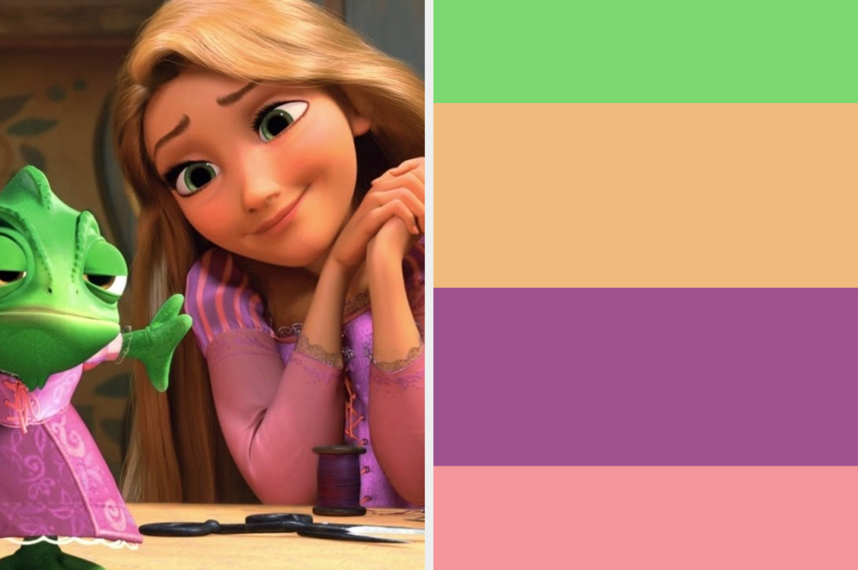
After determining my prominent elements I wanted to feature, next came the color palette. The pink and purple were inspired by the main colors in Rapunzel's dress. The hair, however was much more difficult to land on. I ended up doing more natural gold-blonde colors rather than going for a bright yellow to pay homage to the shift in animation style from traditional sketch animation to 3D rendered animation. Tangled was one of the first movies that embraced 3D rendered animation.
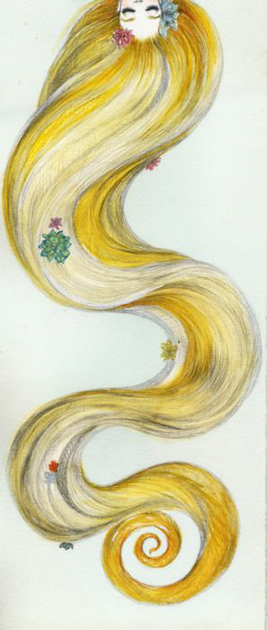
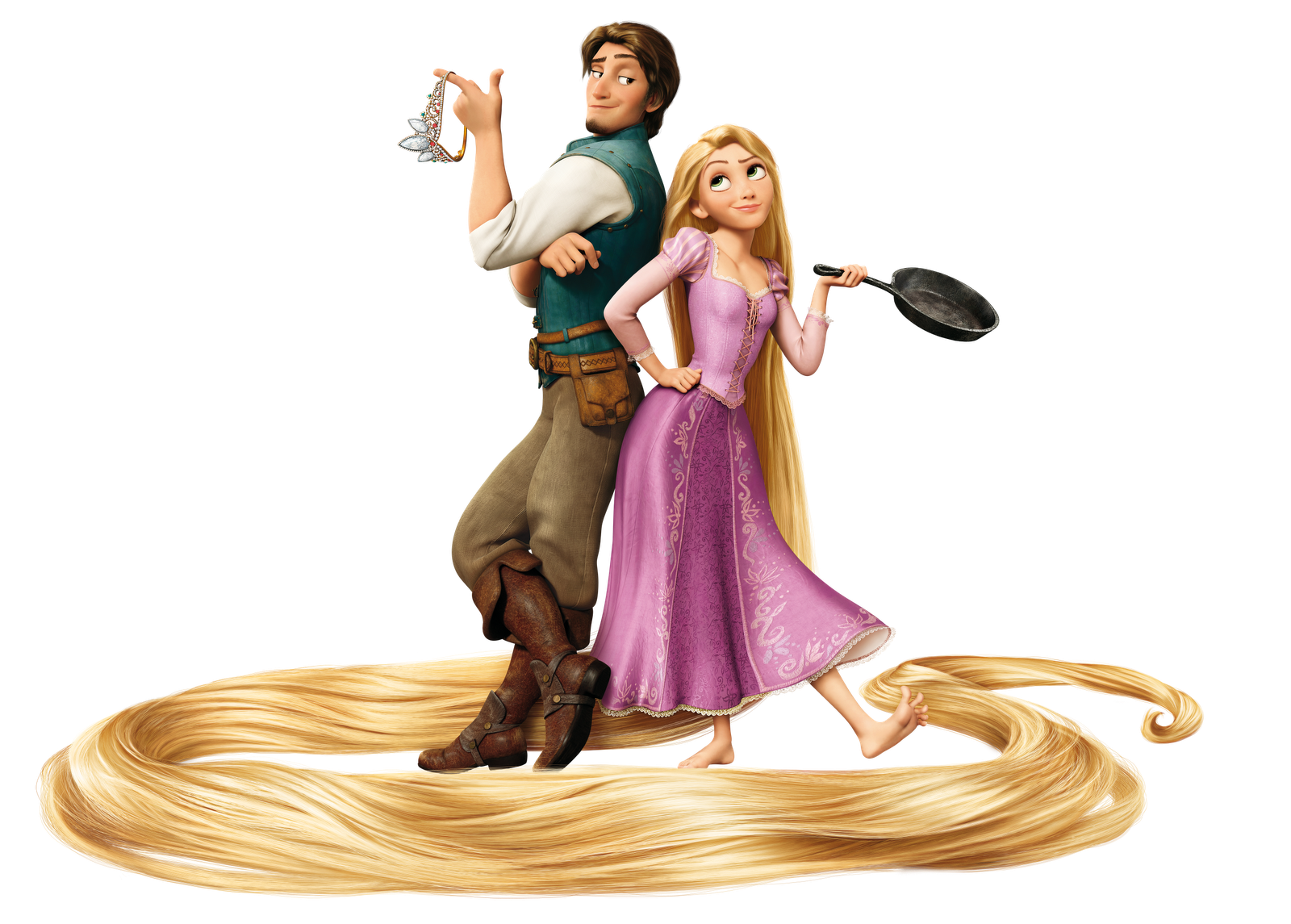
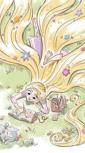
The images to the right gave me some inspiration in the formation of Rapunzel's hair on the poster. I wanted to highlight the signature loops and spirals her hair is known for while also giving her hair a unique personality in itself.
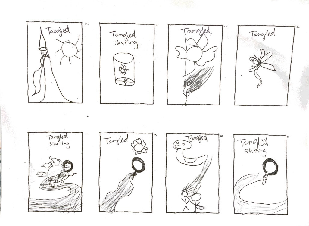
Initial Thumbnails
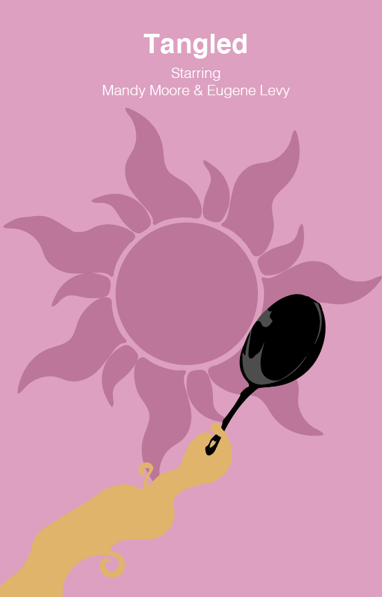
First Draft
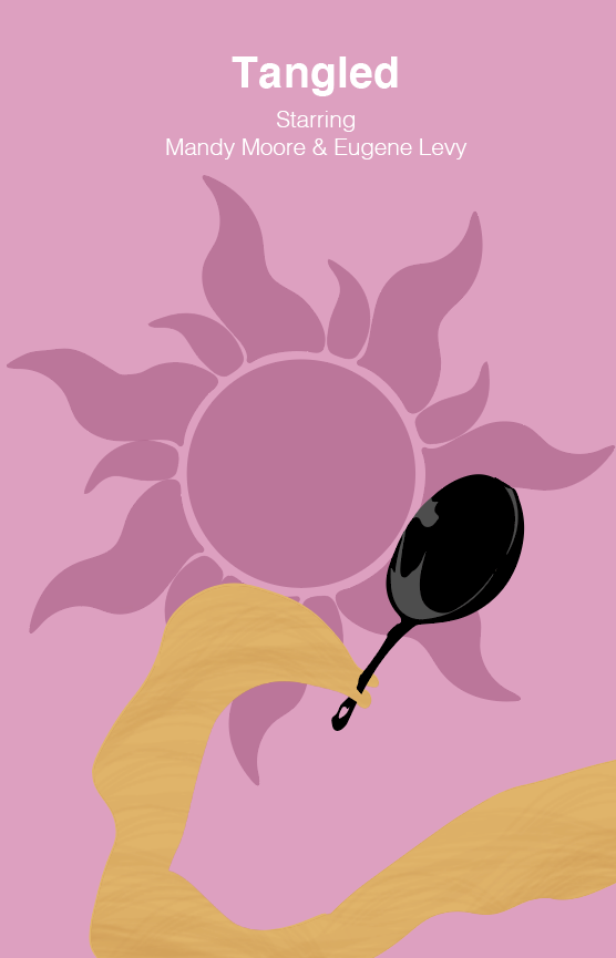
Second Draft
These were some of my initial sketches that helped me determine that the hair and frying pan were what I wanted to focus on. The amount of time I spent trying to figure out how to texture the hair was INSANE. I tried individually hand drawing the streaks of darker hair. Obviously, I gave up after a half hour.
I even attempted to use Photoshop hair texture brushes to give that missing texture to my hair design. Needless to say, I still wasn't satisfied with the result as it persisted in looking like a blob.
FINAL DRAFT
My final version didn't come to fruition until I spoke with my professor about how I could overcome this challenge. The name of the game was adding depth and dimension with simple shapes.
I altered the frying pan with different levels of grey to give it that depth it was missing, I resized the sun in the background so that it wasn't so dominant, and, per my professor's suggestion, I layered different opacities of the hair colors together to give it the illusion of hair texture. I gave myself more freedom to experiment with the hair loops and curves, which I think was also instrumental in getting to the final poster design.
Thank you for reading about my process!
