For this project, we had to design 5 different patterns that with a different emphasis on each pattern: geometric, abstract, typographic, character, and minimalist.
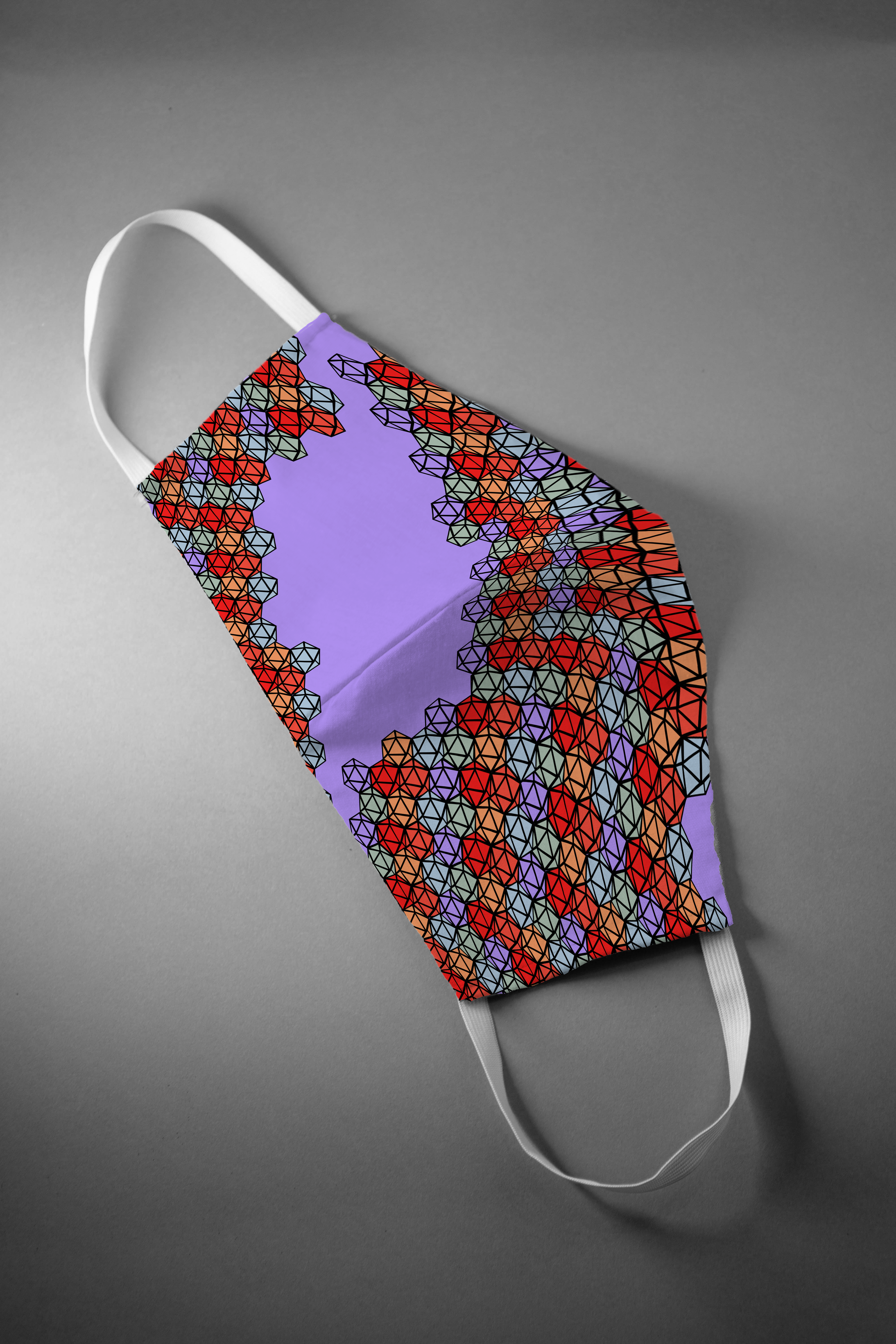
Geometric Mockup
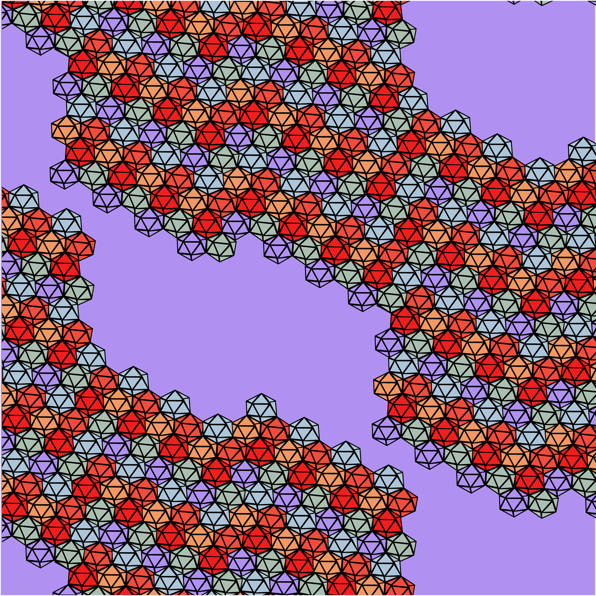
Geometric Pattern
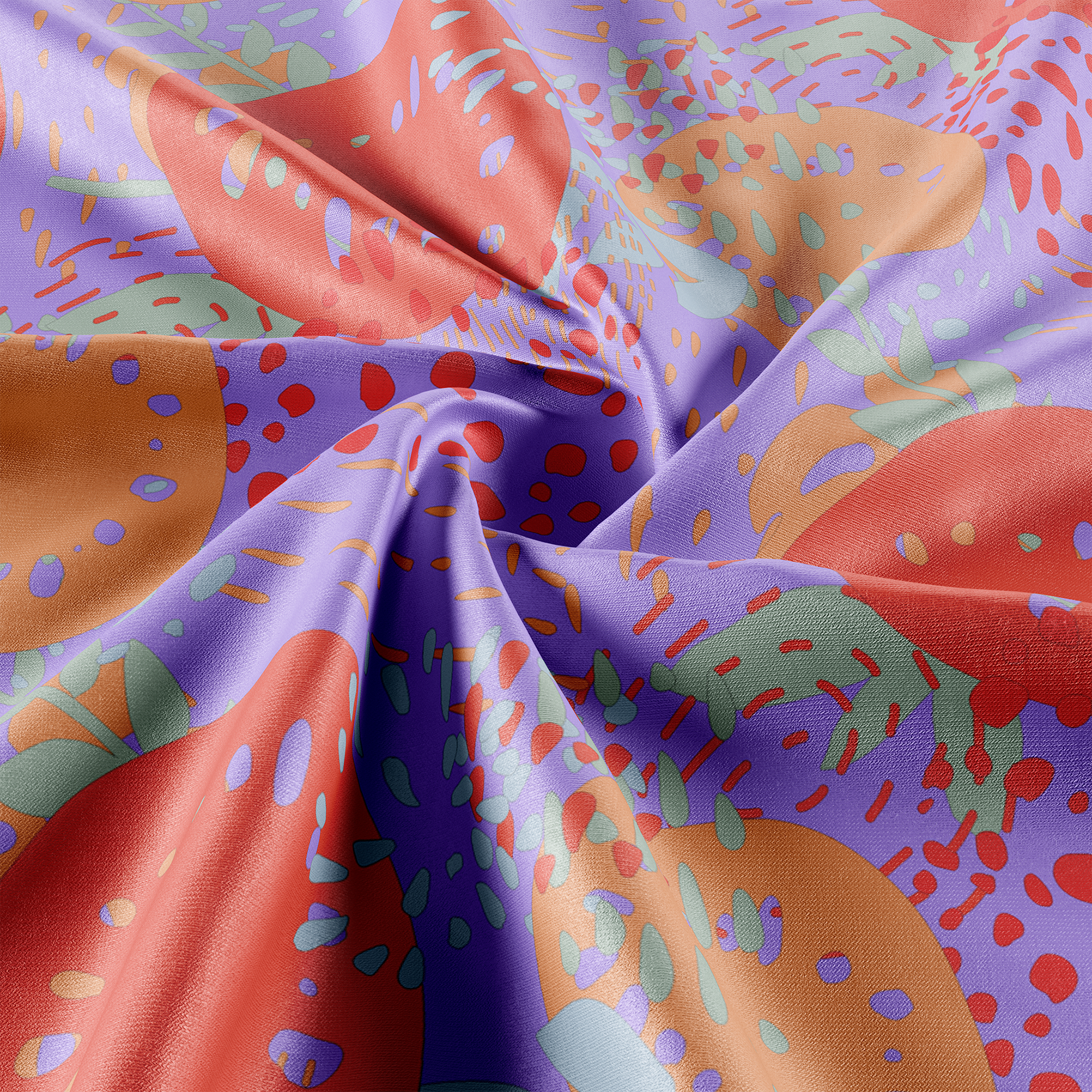
Abstract Mockup

Abstract Pattern
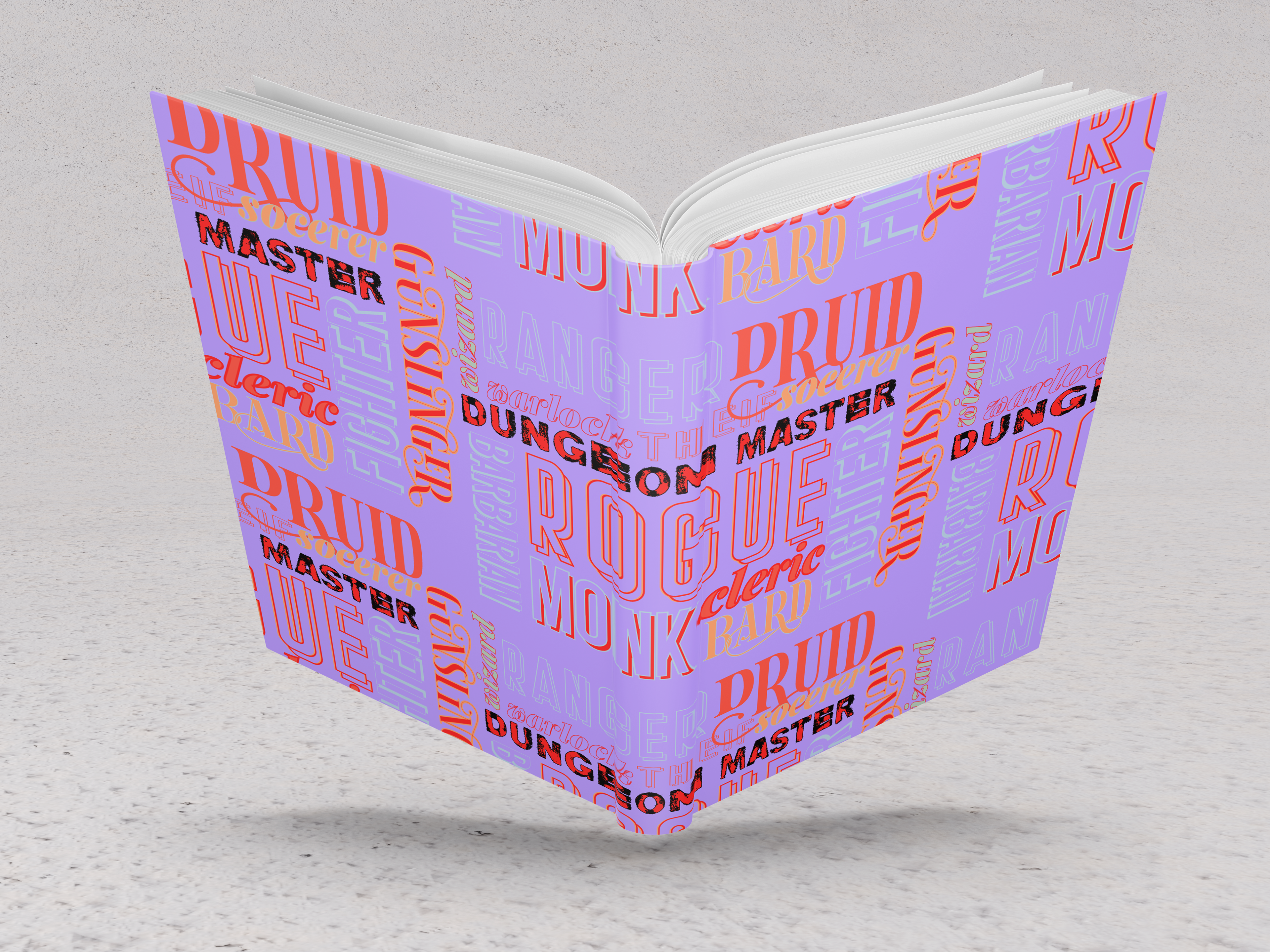
Typographic Mockup
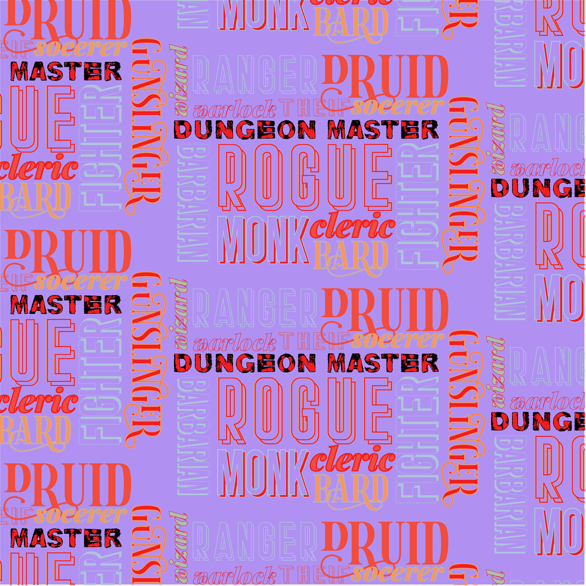
Typographic Pattern
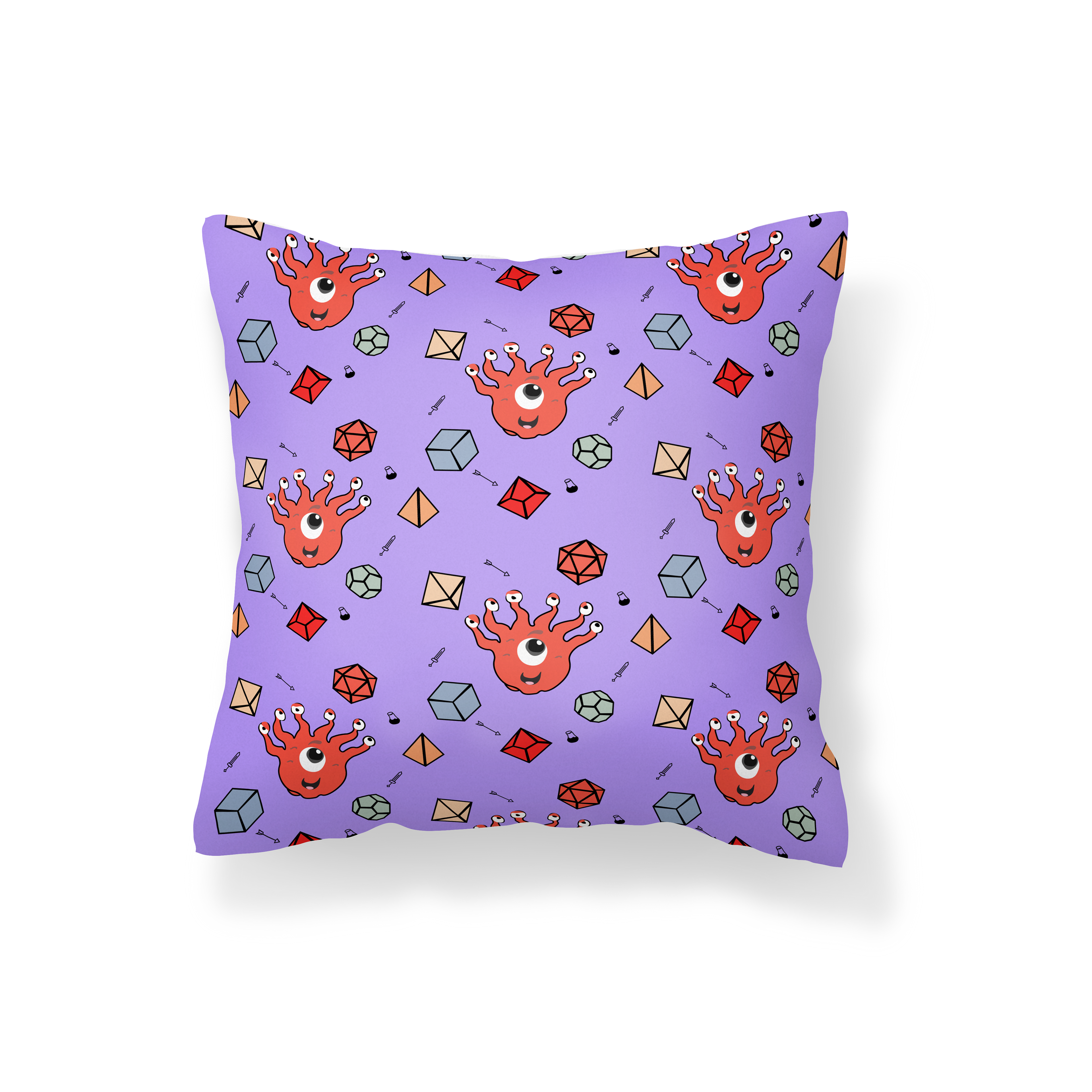
Character Mockup
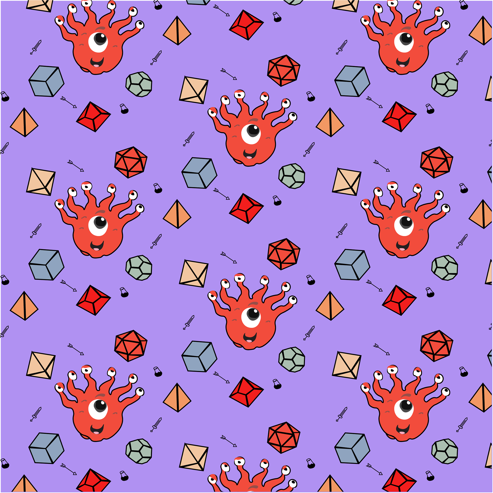
Character Pattern
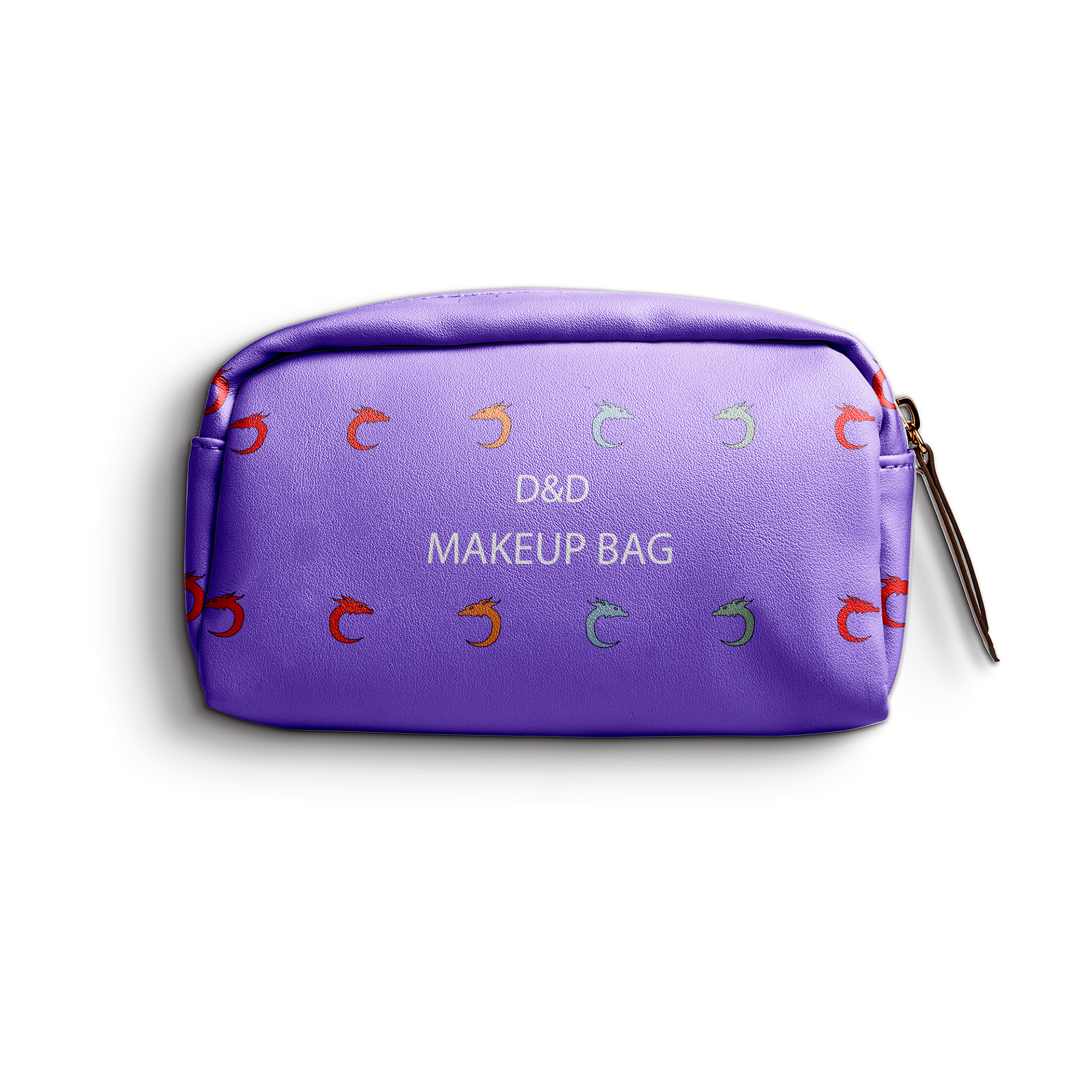
Minimalist Mockup
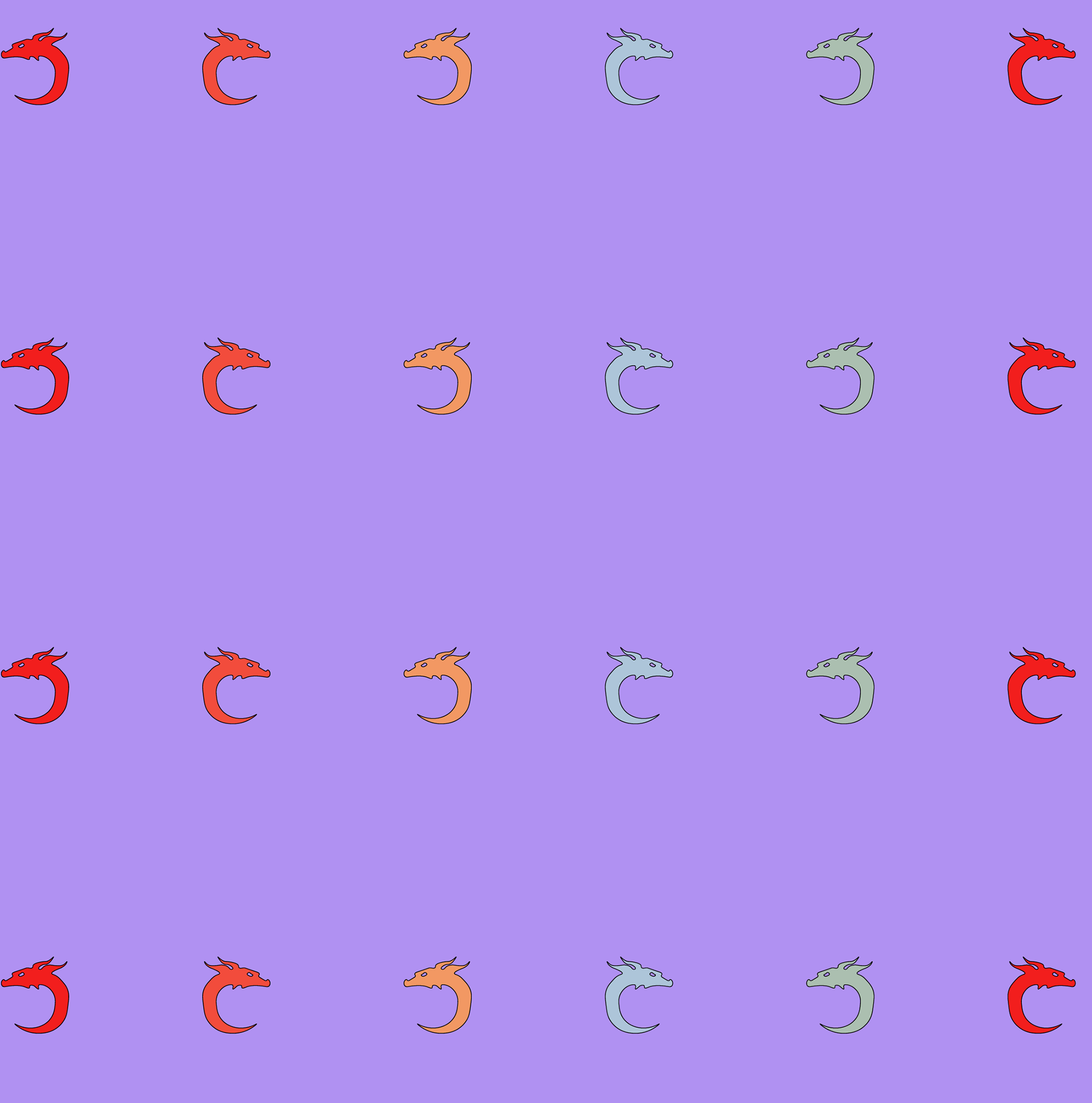
Minimalist Pattern
Scroll for Creative Process
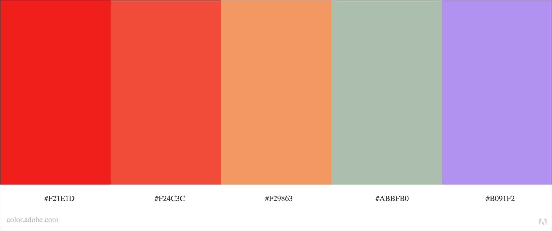
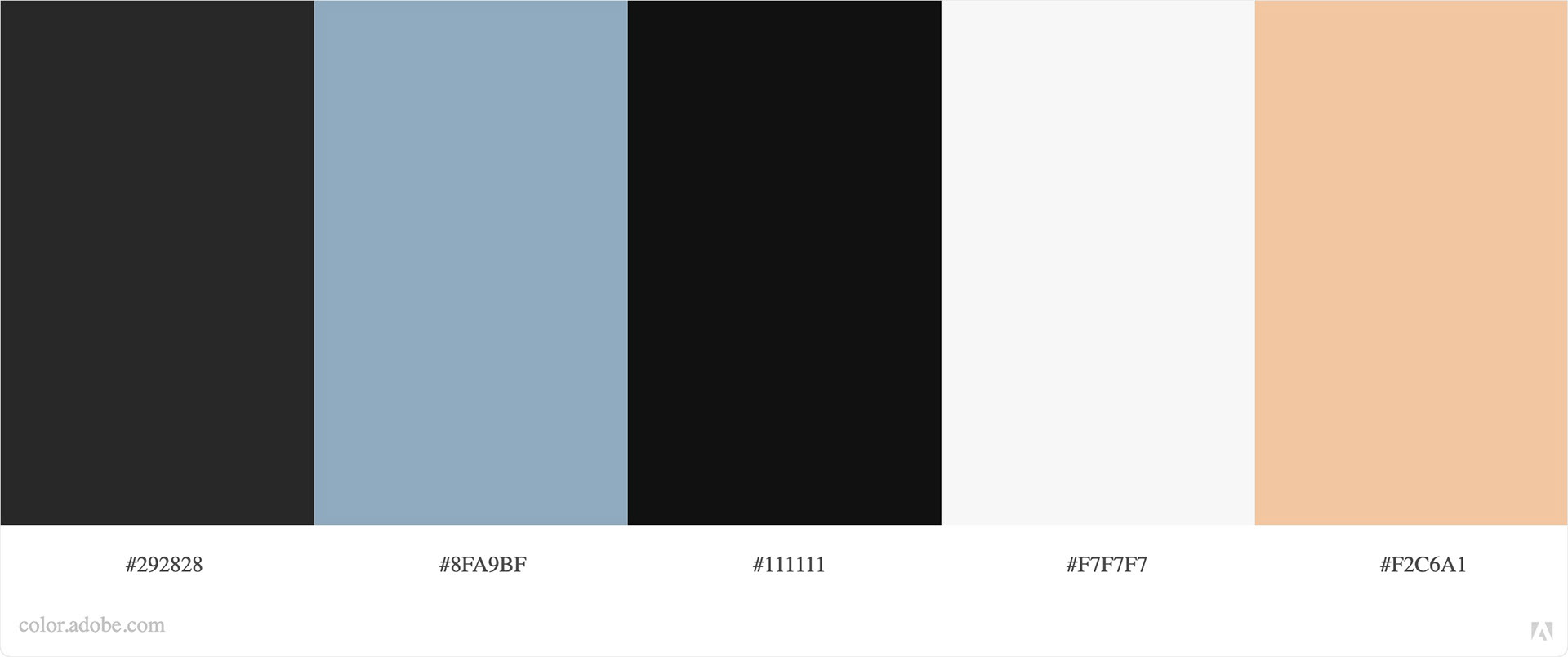
With the previous project, I felt I was more successful developing a color palette first, so that is how I started my brainstorming stage for this assignment as well. I wanted to go for a cheery, playful mood since the weather is beginning to get nicer and preparation for midterms week in full swing, I needed something bright and colorful in my life. I knew that I wanted this color scheme to flow through all 5 patterns and be realized in one cohesive theme. Since I had just been talking to my sister, I got the idea of doing D&D related patterns.
D&D means so much to my siblings, and there's so many different directions these patterns could have gone because D&D is such a multifaceted subject. So, I decided that my color scheme would reflect a PG-rated D&D experience.

minimalist inspiration
abstract inspiration
abstract inspiration
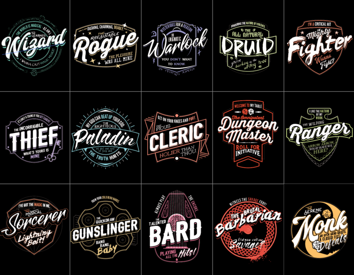
Typography inspiration
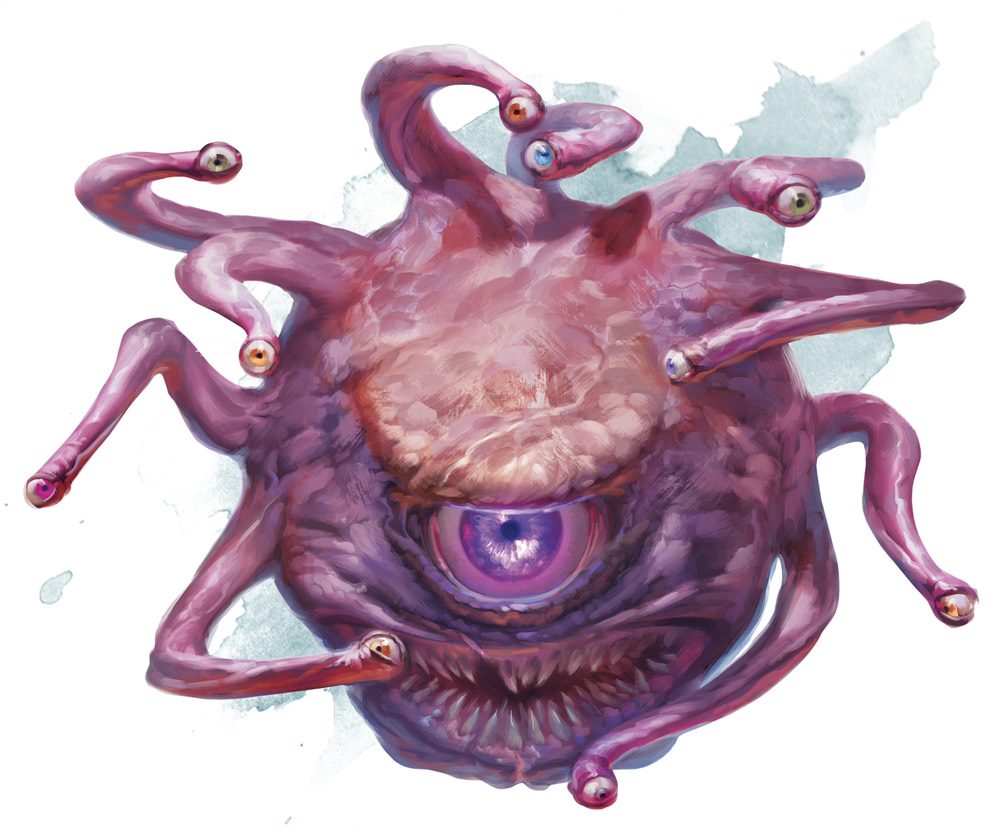
Beholder (not PG) definitely run!
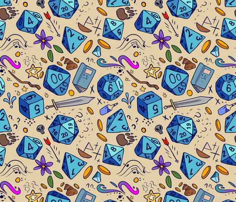
character inspiration
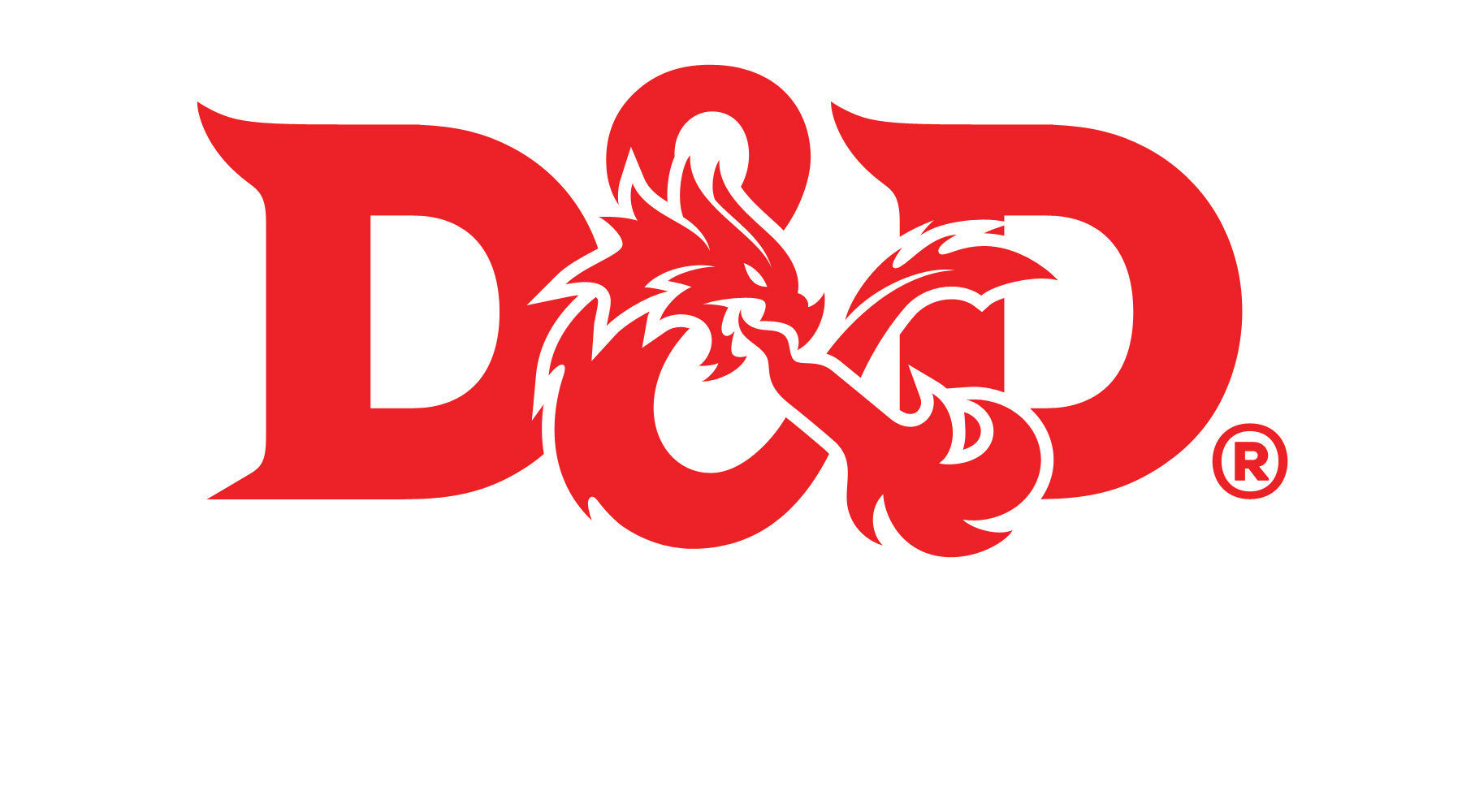
D&D logo
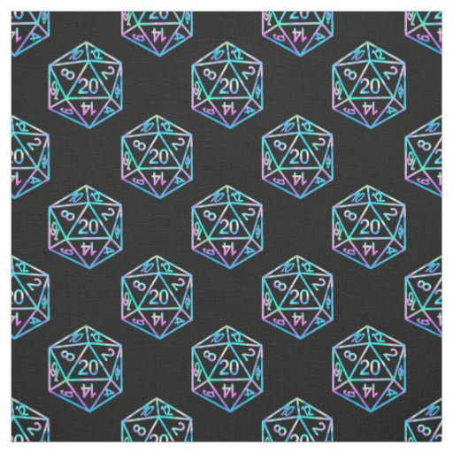
Geometric inspiration
Geometric Pattern
Doing the geometric pattern first was what initially made me believe that D&D was a great theme idea. The dice with all different sides and shapes make it simple to create an aesthetic geometric pattern. However my pattern itself went through several iterations before I was finally happy with the result.
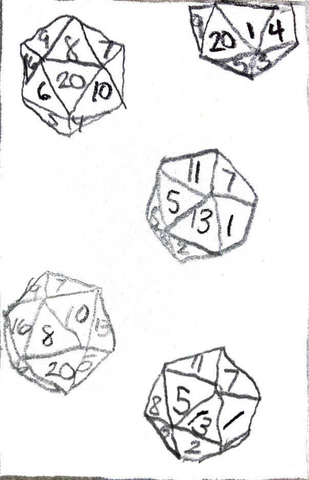
Sketch 1
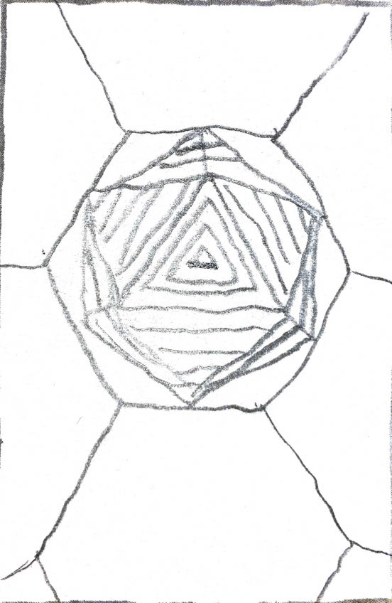
Sketch 2
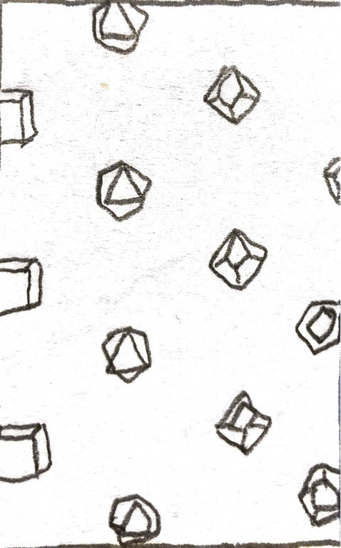
Sketch 3
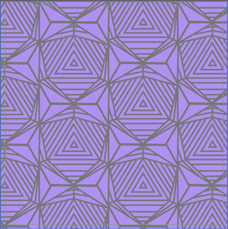
First Draft
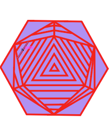
Second Draft
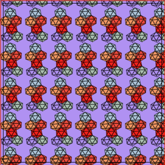
Third Draft
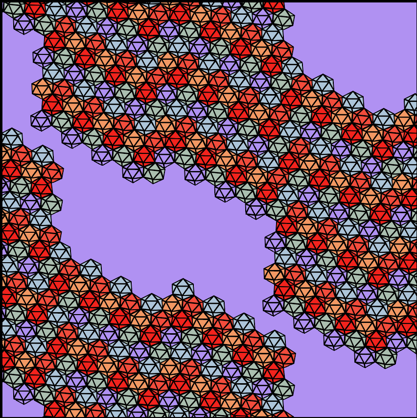
Fourth Draft
I said that I did the geometric pattern first, and I did in a very simple way. But after seeing how the other five patterns came together I went back to edit it and make the color theme cohesive throughout the project. Shout out to my professor for giving us all an extension on this because without it, I don't think I would've had the time to go back and change this pattern for the better. I'm so pleased with the way that it turned out, and I could definitely see this as a mask pattern which is why I opted for a mask mockup.
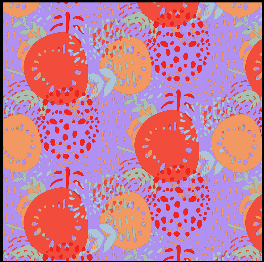
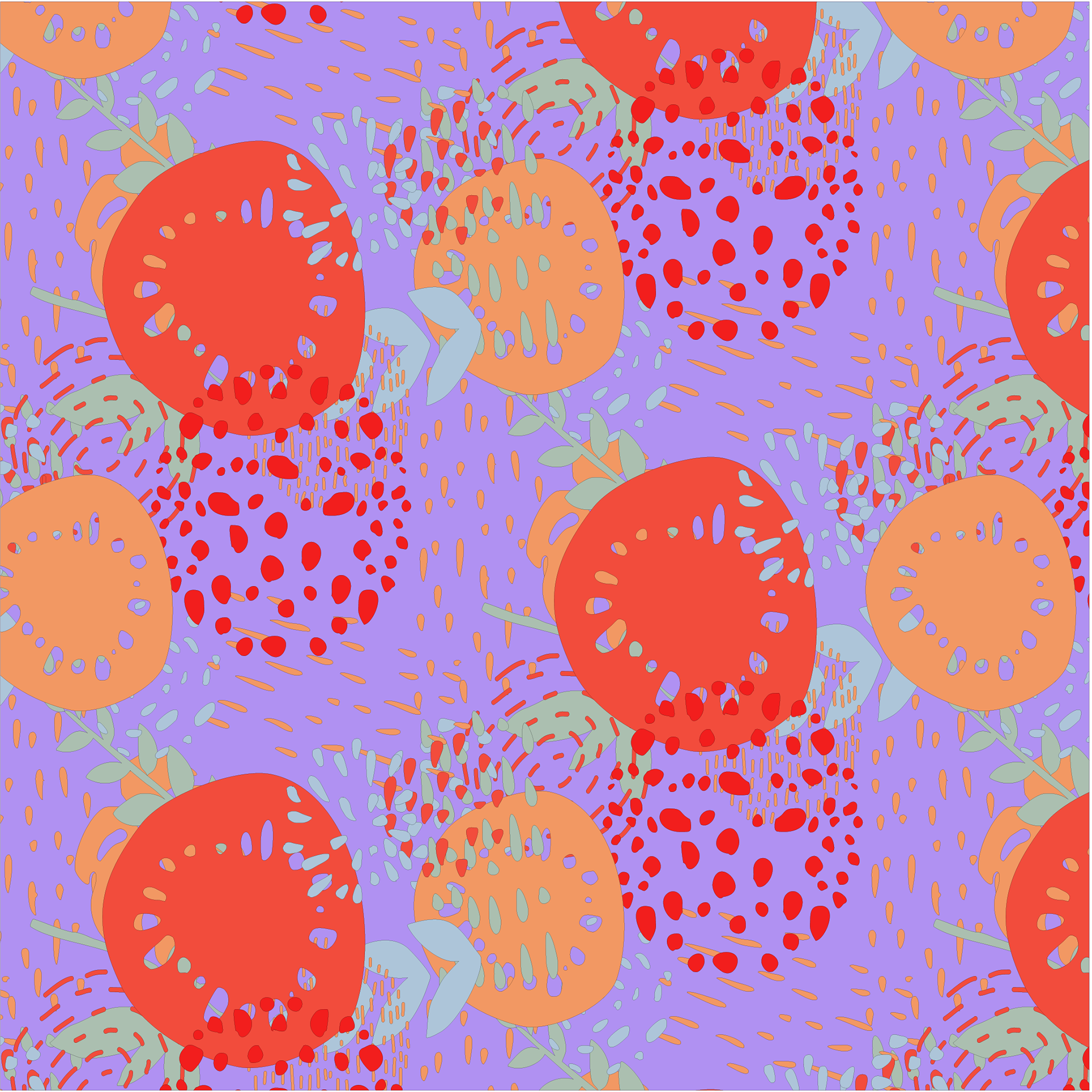
Abstract Pattern
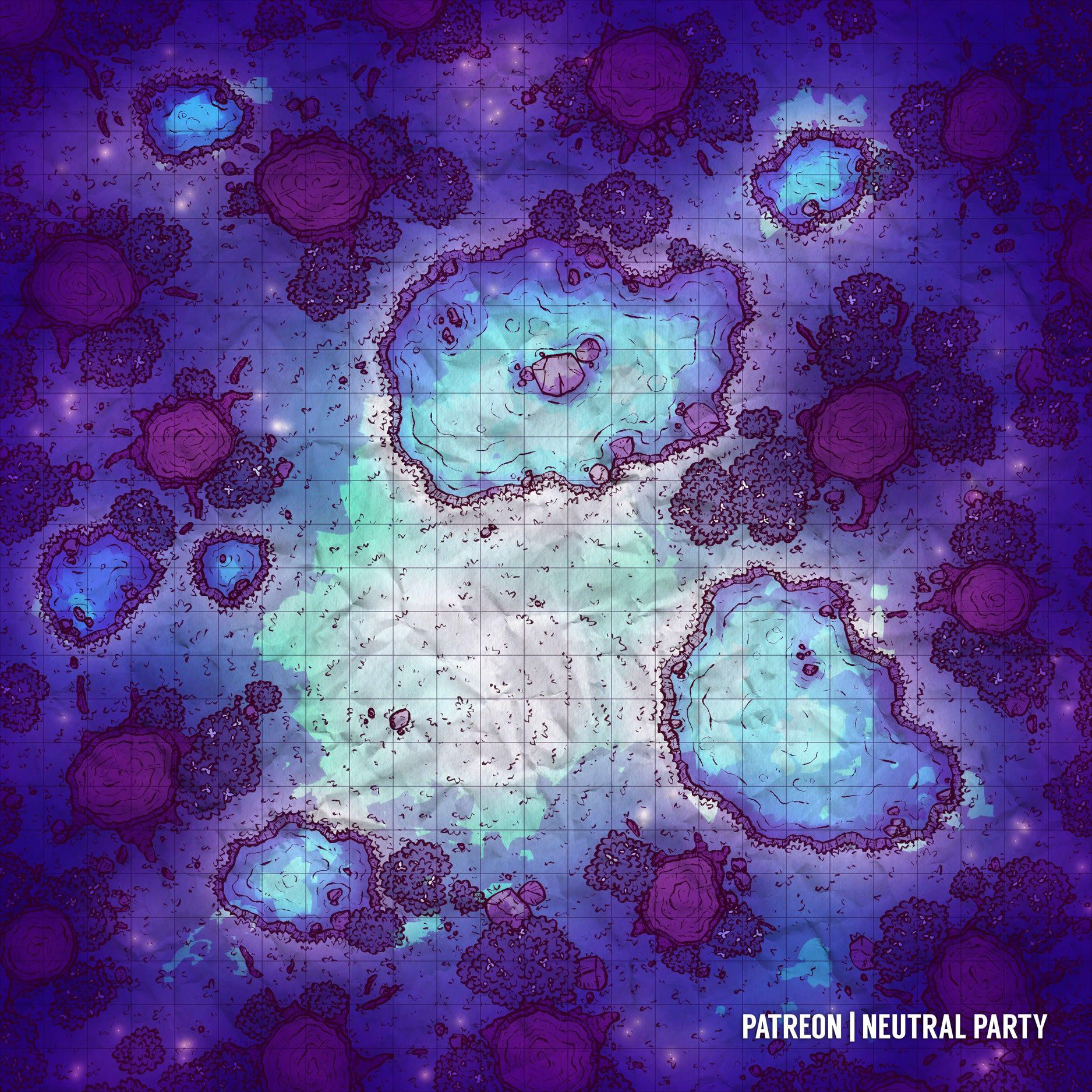
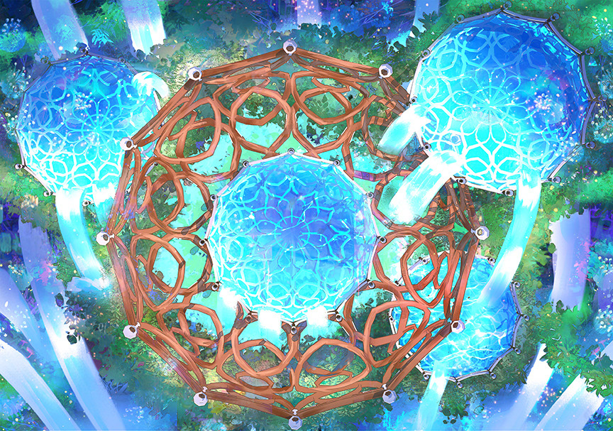
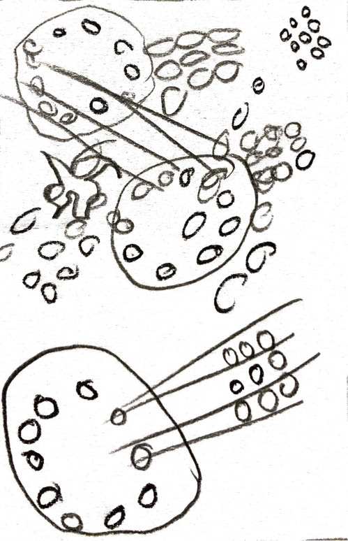
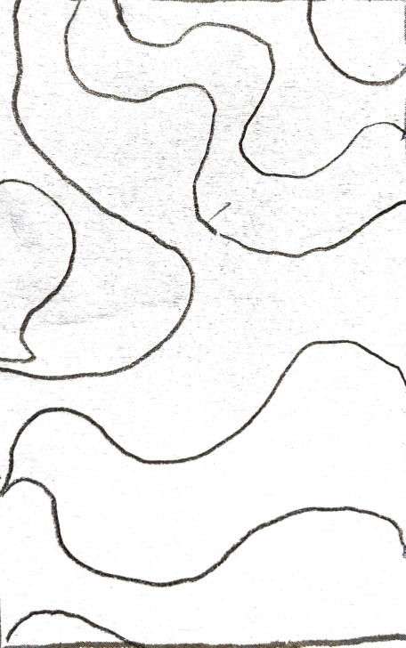
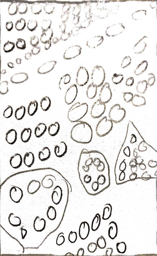
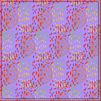
I think that I struggled the most with the abstract pattern because while I know what abstraction is, I wasn't sure how to implement it into my D&D theme. As I showed above, I drew inspiration for this from the wilderness mats that help you get a sense of where you are during combat.
First Draft
Second Draft
Final Draft
Typography Pattern
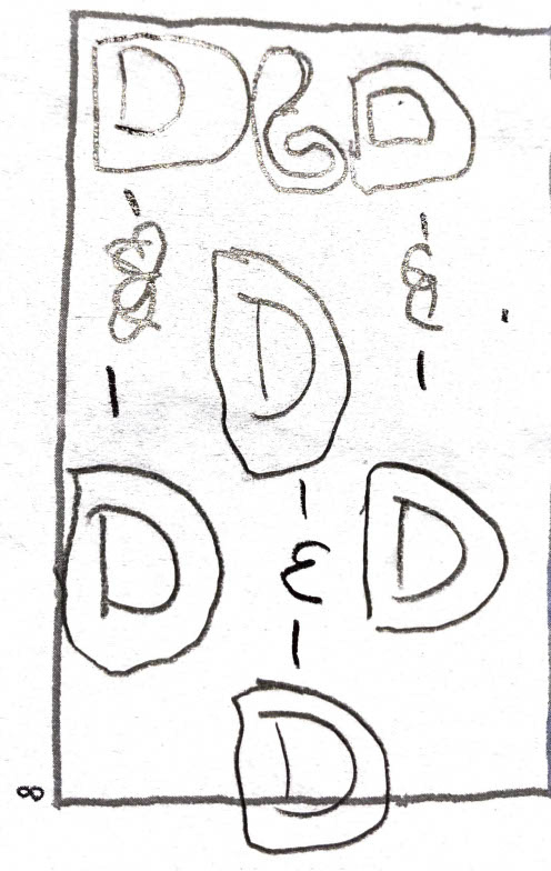
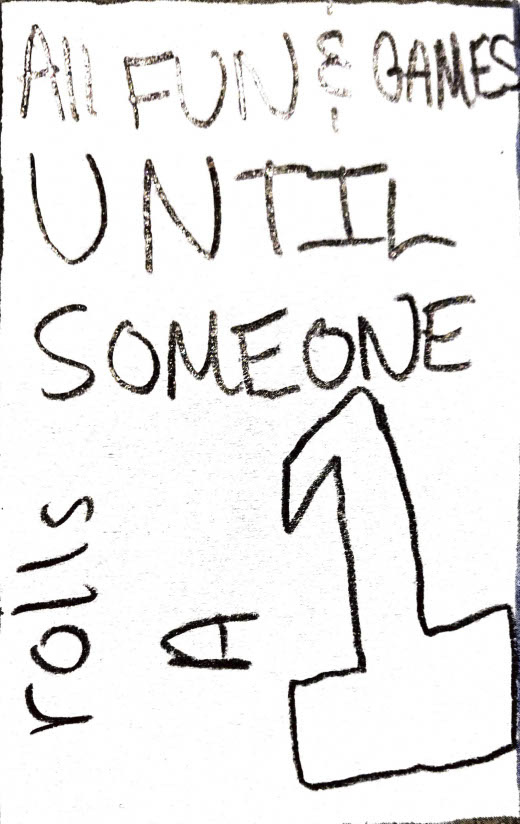
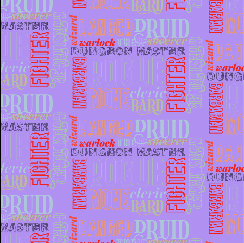
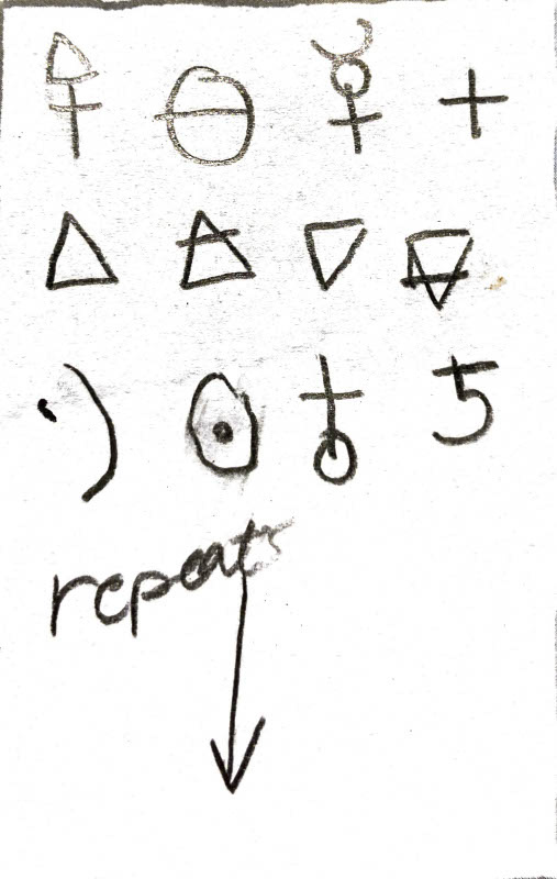
I think I had the most fun with this pattern because I had no idea how exactly I wanted to position everything, I just knew that I wanted my font and color choices to reflect the characteristic of that class type. There are several class types in D&D, (there are more than the ones I highlighted in the pattern) and I knew that it would look too confusing if each class had a different font. So, I limited myself to 4 fonts. I used Playfair Display for the sophisticated/magically-talented classes, Stockport for the melee combat classes, Herina GT the mixed classes, and, finally, Kitchen Sink for the dungeon master.
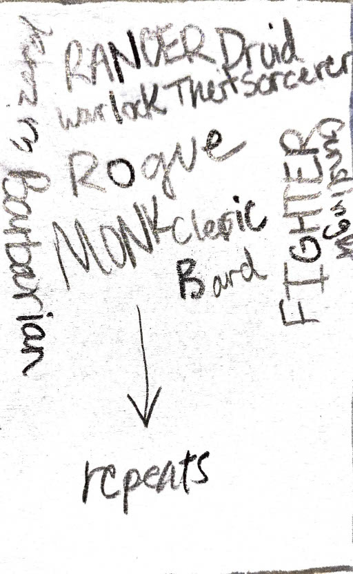
First Draft

Final Draft
Obviously, I fiddled with positioning and colors more than twice, but I think that this shows a nice juxtaposition of two points during my process. I think the color scheme I chose gives a nice, vibrant range to make the different classes leap out at you, and I think that the fonts do a wonderful job of showcasing the personality of the classes without clashing against each other.
Character Pattern
The character pattern is the most adorable of all of my patterns, hands down. I thought about doing a dragon, a beholder, or an owlbear (All mythic monsters of D&D 5th edition). Ultimately, I chose the beholder because of its popularity and simplicity in design.
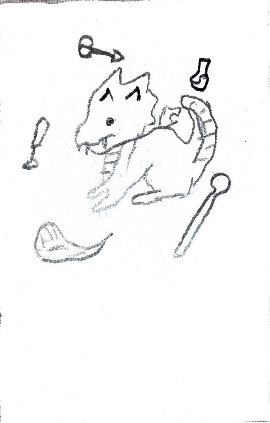
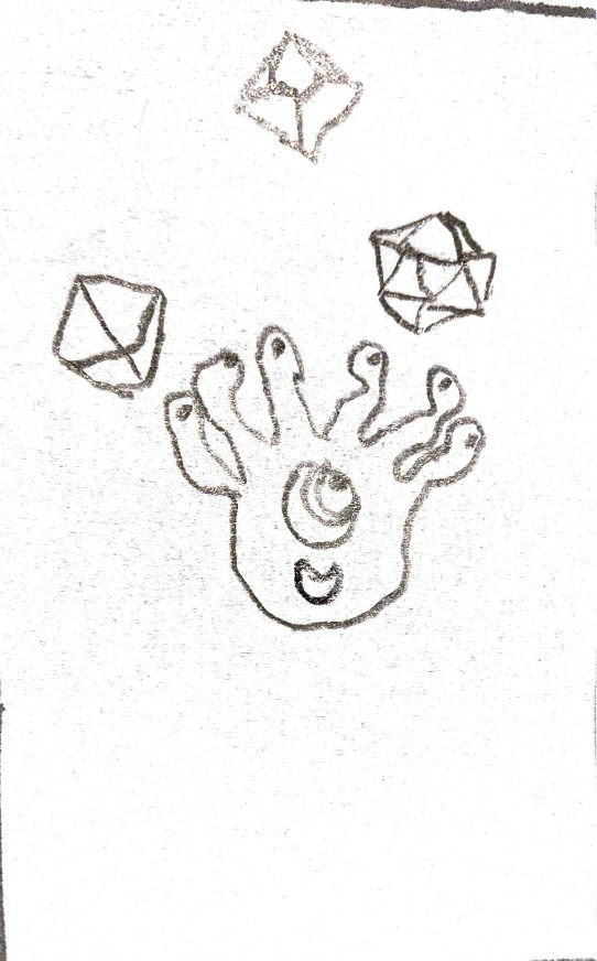
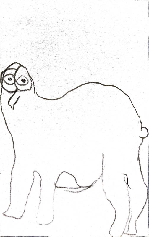
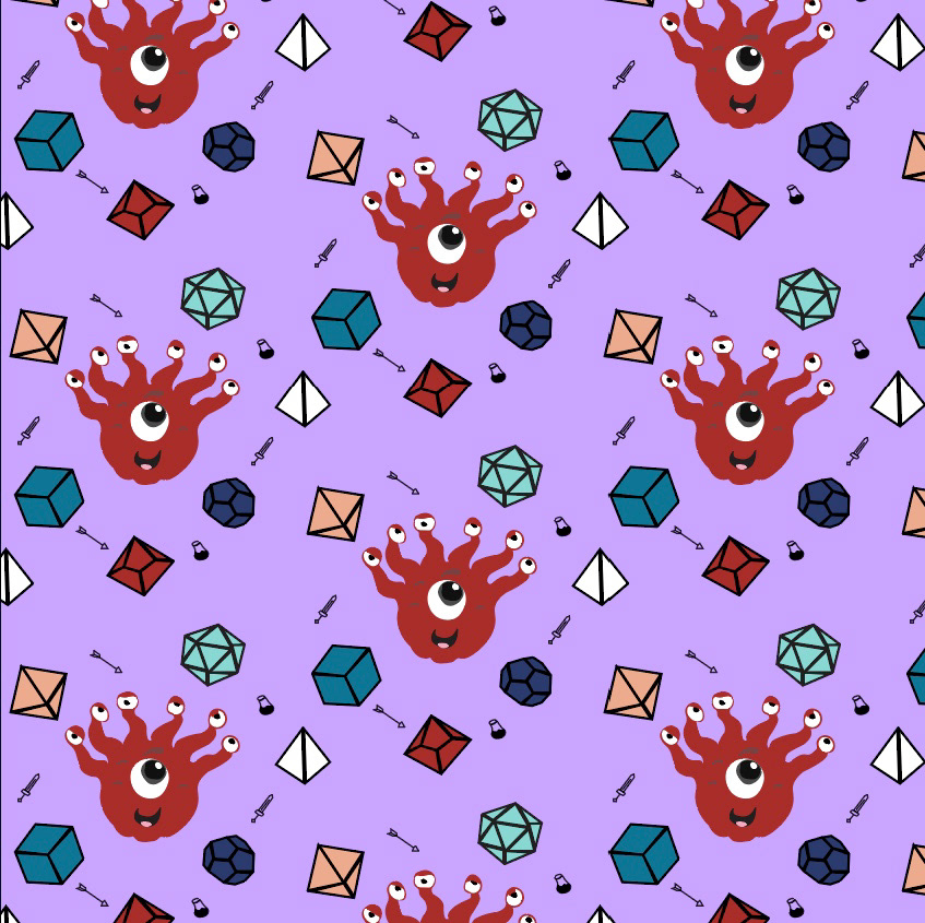
First Draft
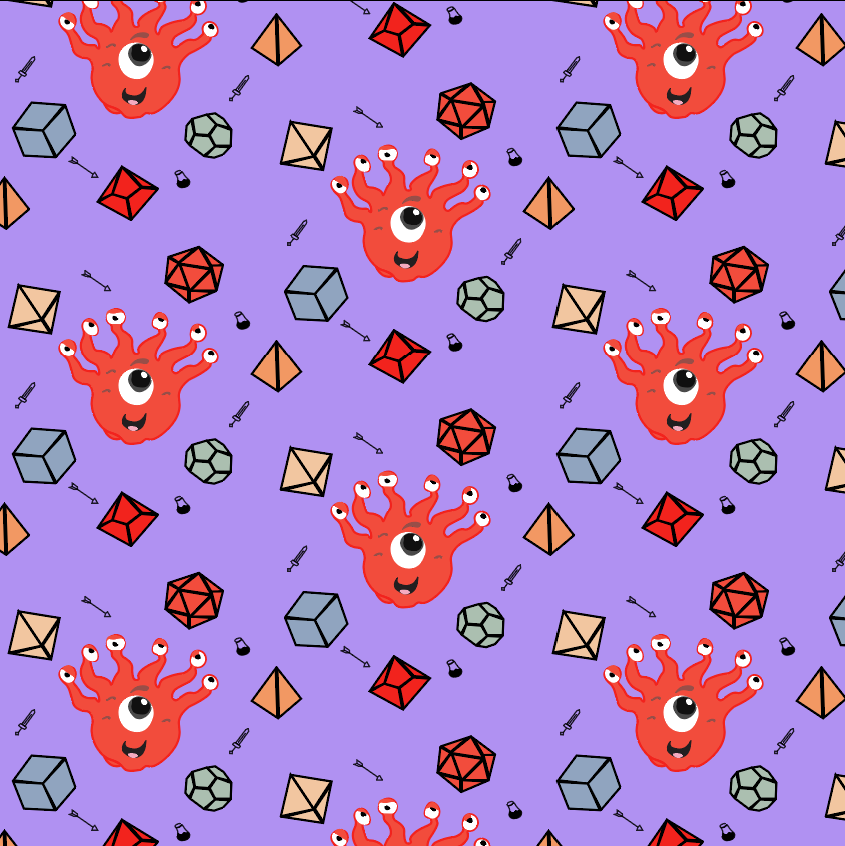
Second Draft

Final Draft
Minimal Pattern
I struggled with the minimalist design because simplicity is the opposite of what I do. I've known that less is usually more when it comes to design, but I still haven't fully mastered knowing when to stop tweaking. A designer could tweak their work forever and never be fully satisfied with it. The final thing I wanted to add to my patterns was a dragon because you can't say dungeons without dragons, but I didn't know hot to simplify my design. So, I didn't know where to go with this final design until I talked to my brother about my problems.
He was the one who recommended that I look at older versions of pokemon's dragon logo (inspiration section). This inspired me to create simplistic, clear dragon pattern that I ended up with.
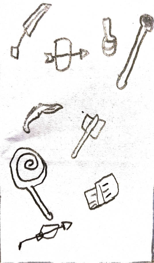
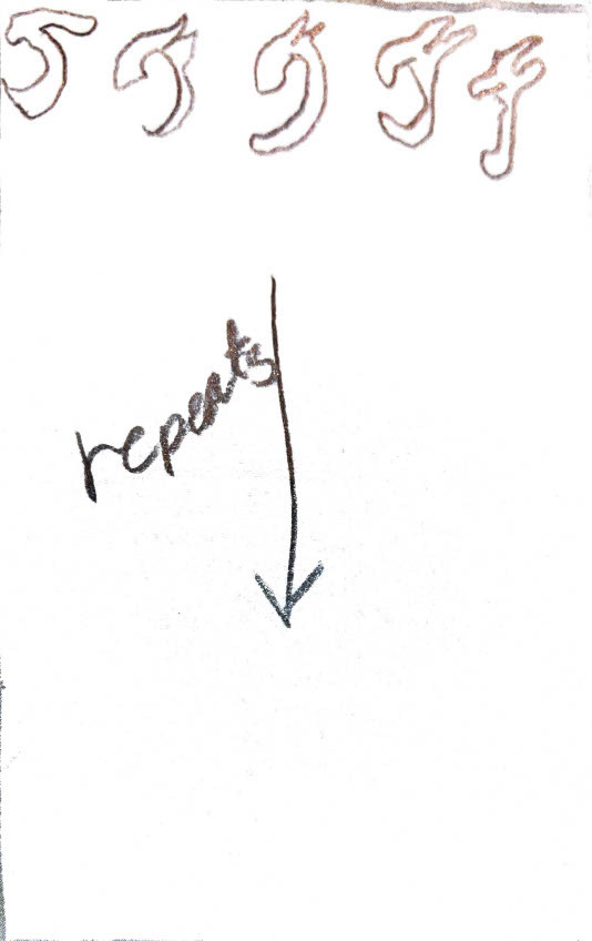
I am surprisingly happy with how this pattern ended up because you can tell what it is, and it fits well with the rest of the patterns. Though this was definitely my least favorite to actually implement because it was really challenging for me to not complexify the design in any way.
Thank you for reading!
