
Scroll for Creative Process
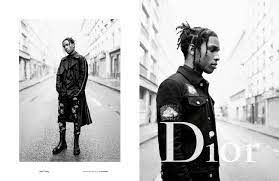
This project is a series of three magazine ads designed for print with a client of our choosing. Looking at the available clients, I chose to work with Plaid, a clothing brand whose focus is selling affordable clothes made from high-quality upcycled materials. Currently, they only sell through their online store and cater toward a target audience of single men and women (ages 25-35) with diverse backgrounds and similar values toward fashion. The client prefers their advertisements to convey a "celebrity-like" style of fashion as well as the affordable nature of their clothes.
To tackle this project, I started by doing research. What does the fashion market look like right now, what are the current trends, and how does Plaid differ from fashion brands that are already established in the industry? These were all questions I needed answers to before I could begin the crucial start to my concept designs.
Research Inspiration

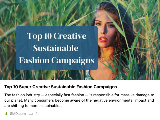
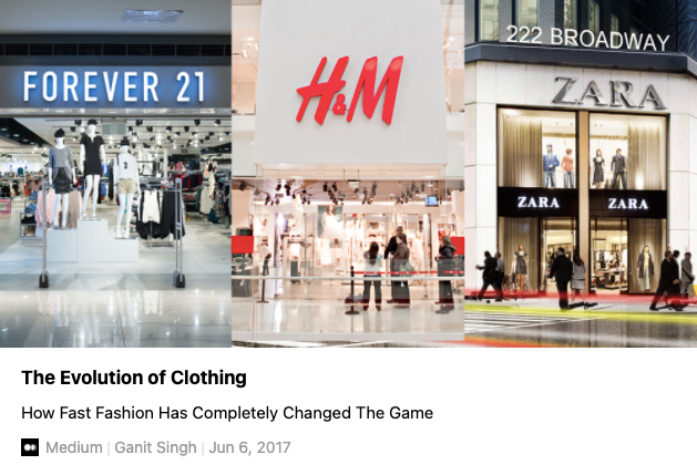
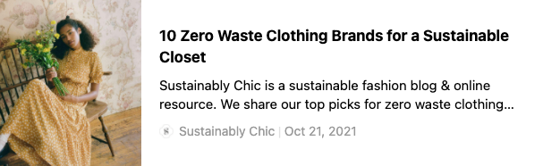
These articles have shown me a lot about the fashion industry and the differences between fast fashion vs. zero waste clothing and finally upcycled and thrifted clothing. These distinctions are necessary to understand as I embark on my project to create three different fashion advertisements for Plaid, a fashion company dedicated to selling upcycled clothing. There is no truly sustainable way to produce fashion the way things are today, so there are only brands that are more sustainable than others. I didn't know that "green-washing", the act of making a bare minimum effort towards sustainable clothing was such a huge problem.
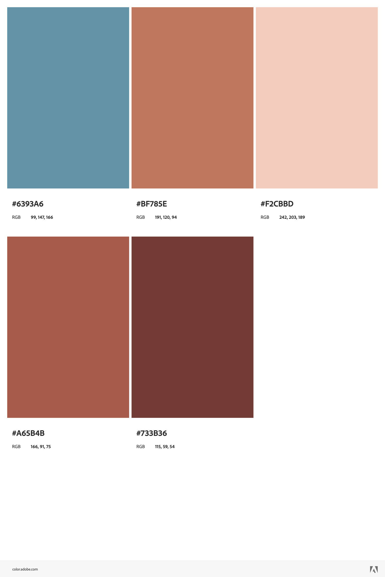
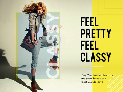
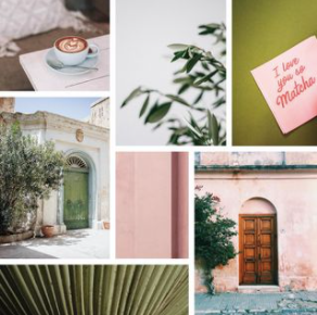
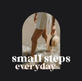
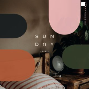
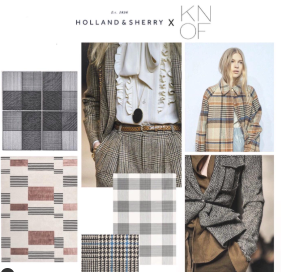
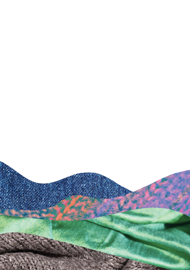
With this new information in mind, I set out to determine my fonts, color palette, and feel for the ads themselves. Pictured to the right are some of the images and colors that helped me narrow my focus for this project. As you can see, I wanted to go for earth tones, and place emphasis on the benefits that upcycling fashion not only for the planet but for the consumer as well. From here I went to work pulling together the fonts I wanted to use, the colors that might work, and figuring out what level of creativity I wanted to implement in the design. The client said they wanted an ad that emulated celebrity fashion. Right now, high fashion advertising is dictated by stark minimalism. I took a risk implementing levity in my design solution because I wanted to showcase the creative freedom that comes along with upcycled clothing. It's cheaper, fun to wear, and good for the planet, so there is no downside to shopping at Plaid, in my opinion.
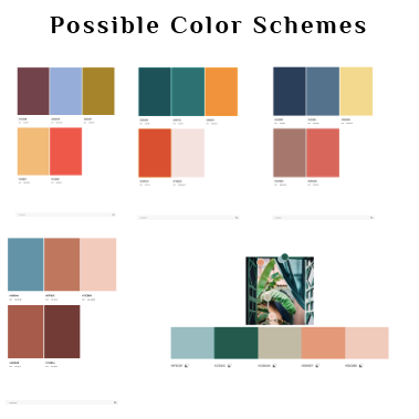
Possible Color Schemes
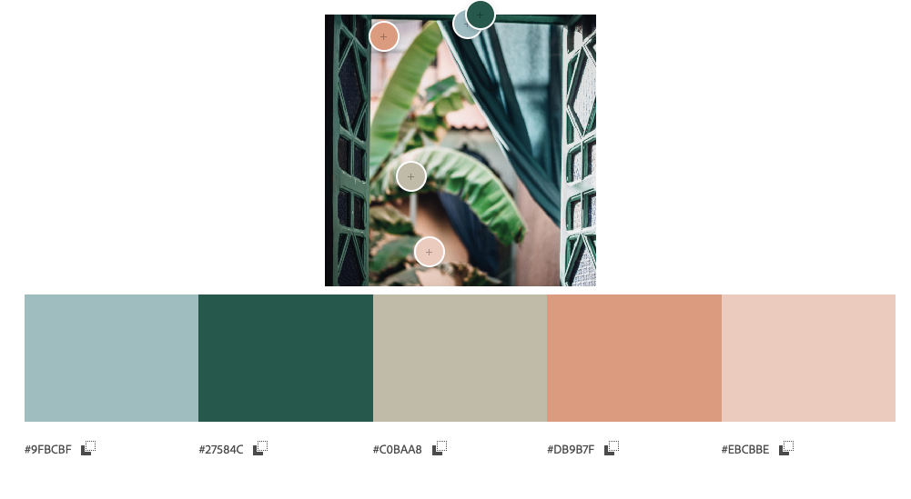
Chosen Color Scheme
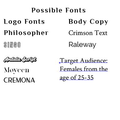
Possible Fonts
Logo take 1
Logo take 2-4
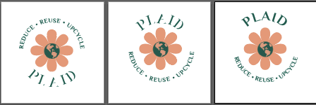
Logo take 5-7
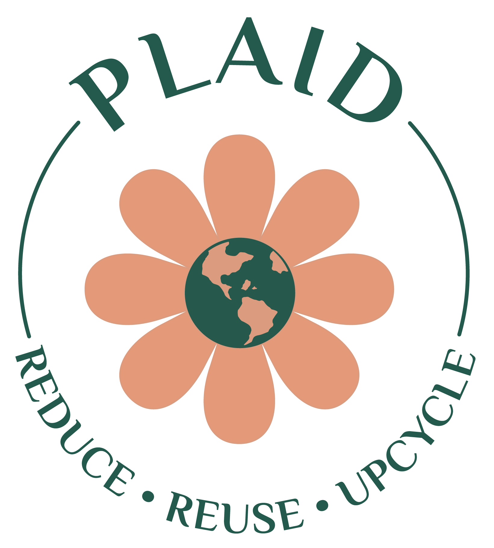
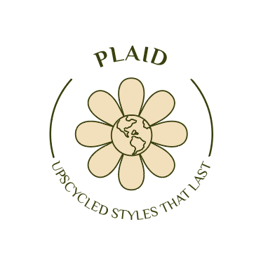
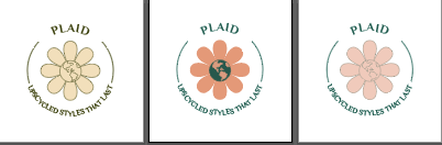
Final Logo take 8
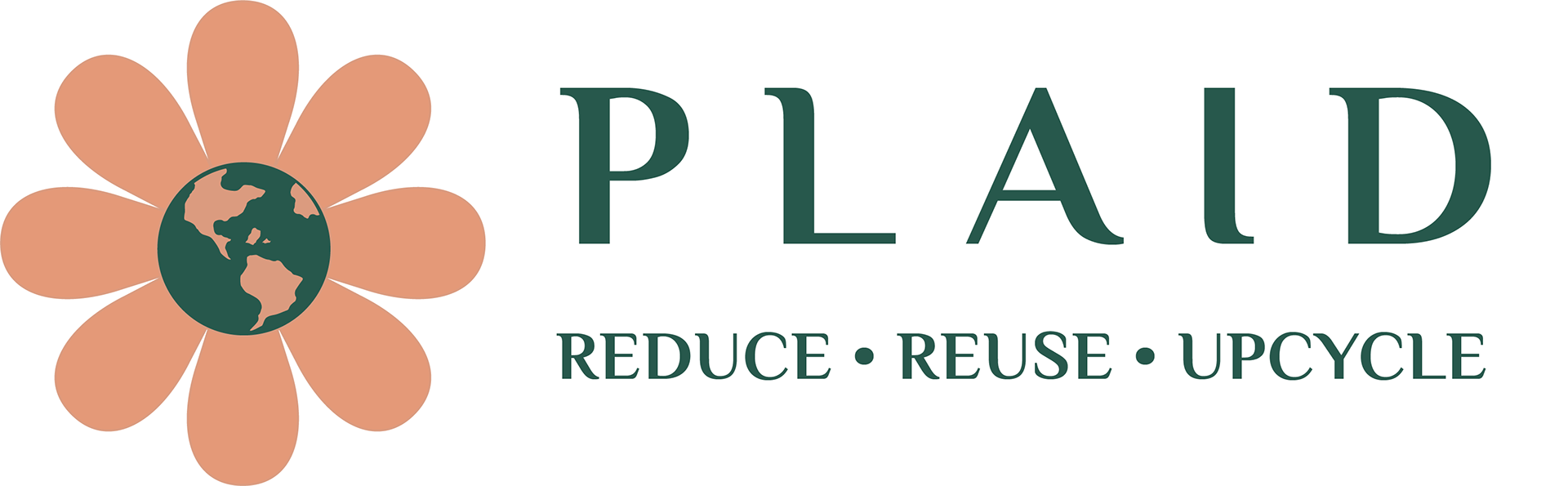
Logo 8 reformat
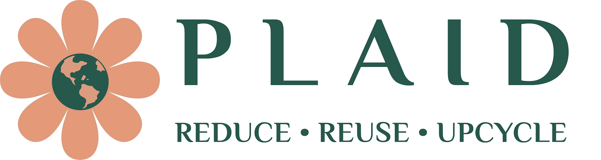
Final logo 8 reformat
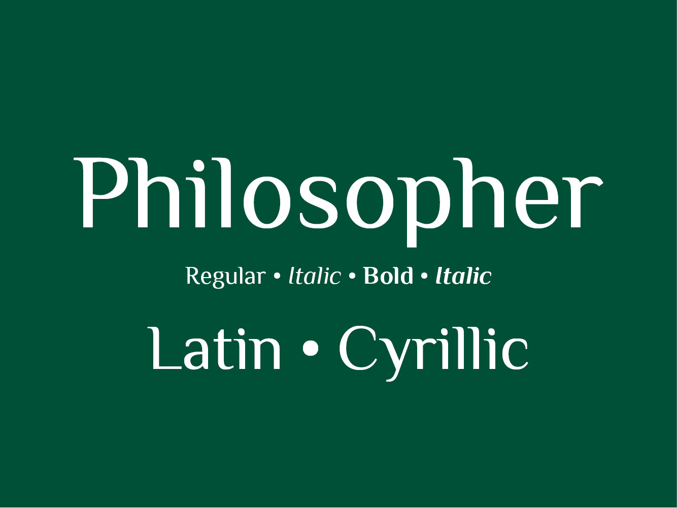
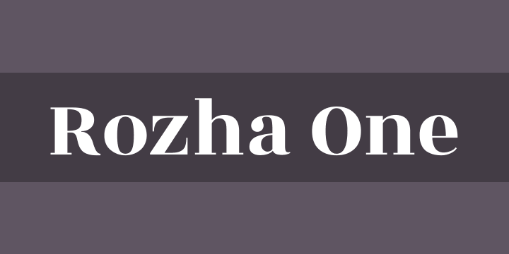
While I probably didn't need to do a logo for Plaid, I think this is one of my best logo designs yet. I love it for its simplicity, while I am biased, I think it completely fits with the Plaid brand. I wanted a symbol that was chic enough for this brand but also paid homage to the planet in a way that wasn't tacky. I think the flower with the planet in the middle blends perfectly and emphasizes the fact that they are a fashion brand that is stylish, and pleasing to look at, as well as having a vested interest in sustainability. Over the course of the design process for the logo, I was able to narrow down my logo font: Philosopher, my heading font: Rozha One, and my body copy font-family: Crimson Text.

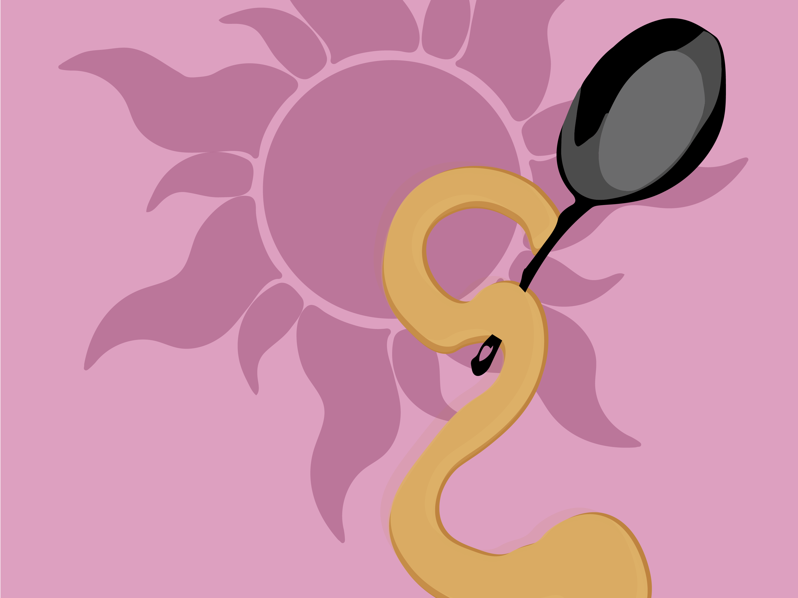
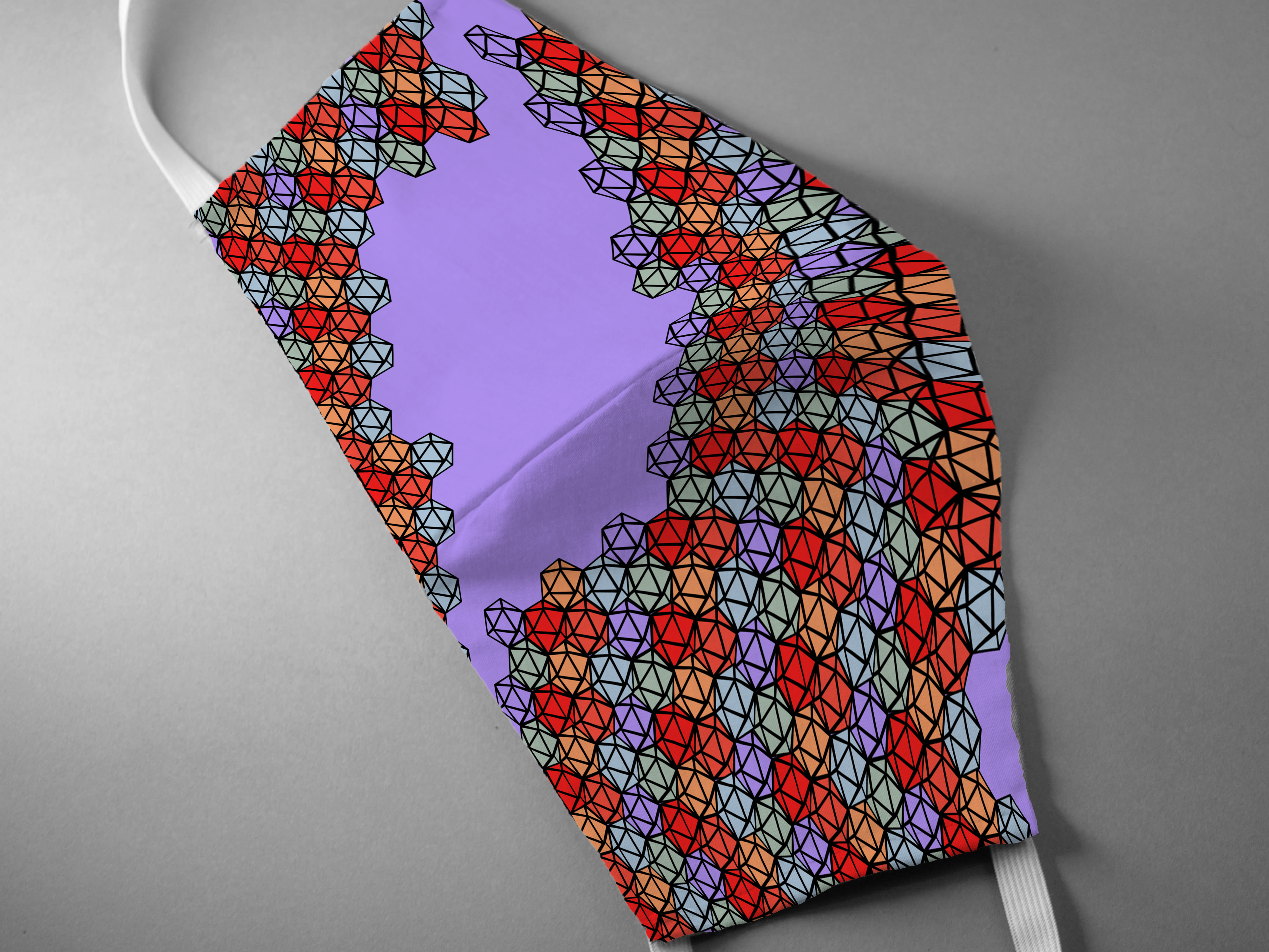
Wave-texture take 1
Wave-texture take 2
Wave-texture take 3
Wave-texture take 4
Wave-texture take 5
Wave-texture take 6
Wave-texture take 7
Wave-texture take 8
Wave-texture take 9
Wave-texture take 10
Wave-texture take 11
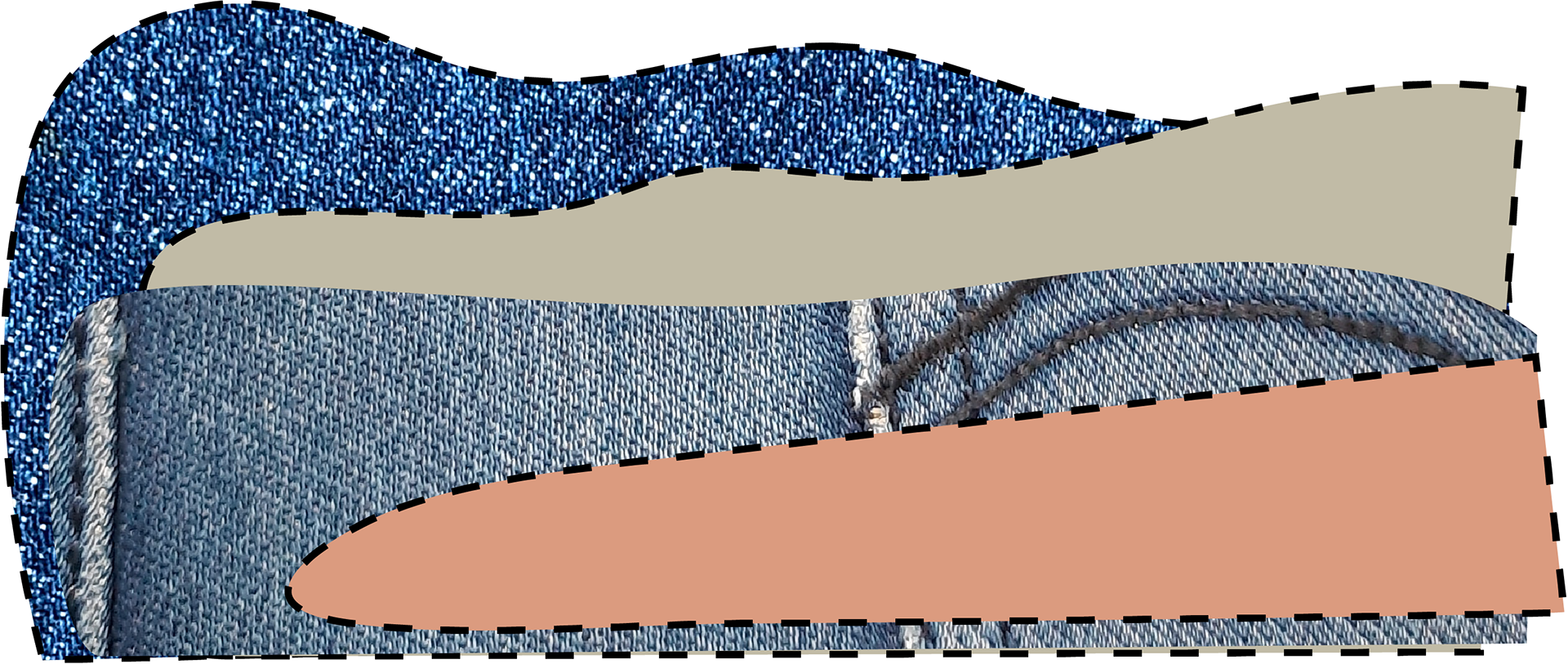
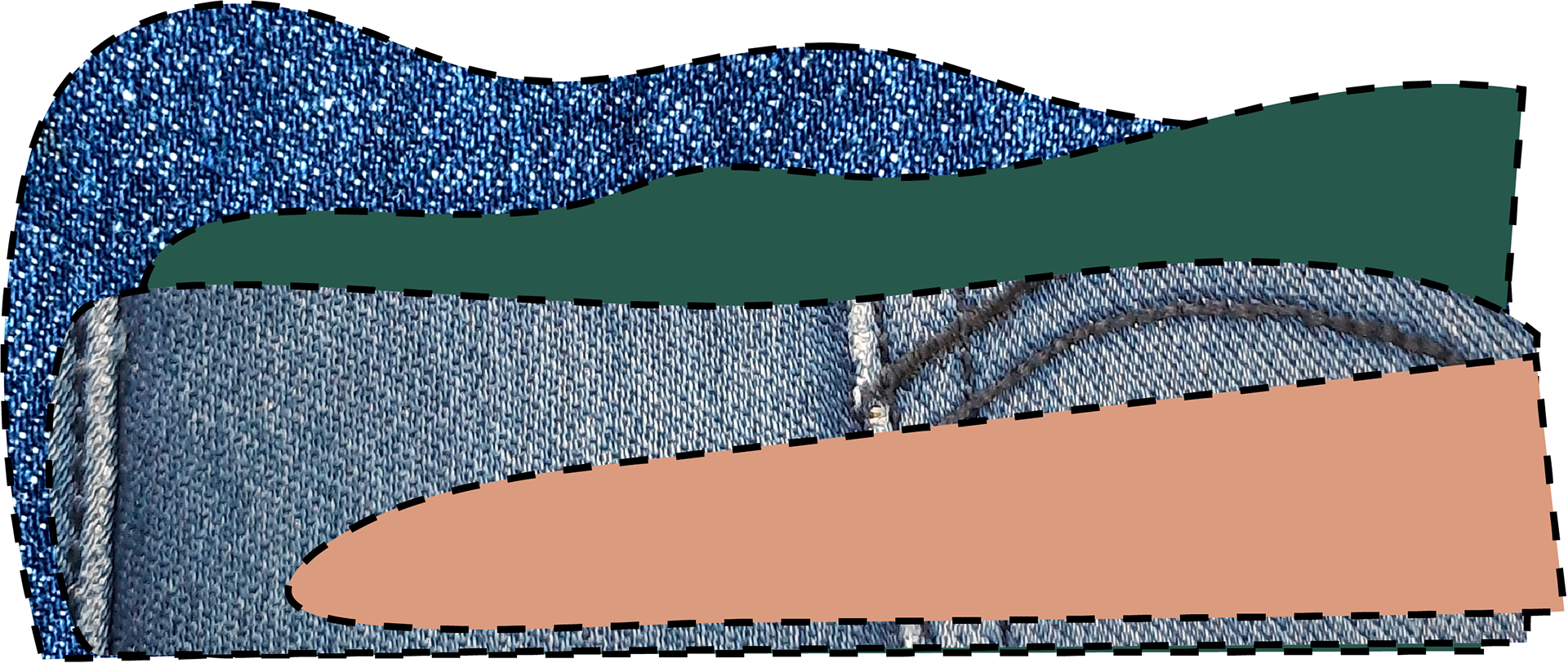
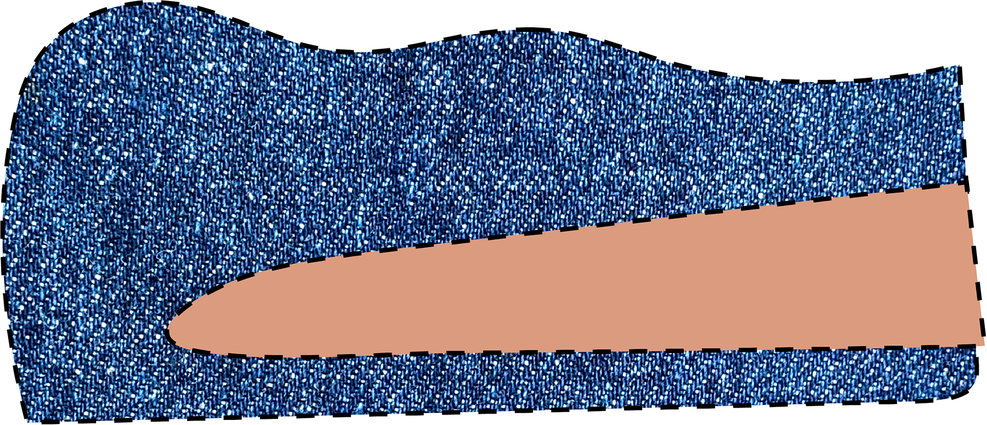
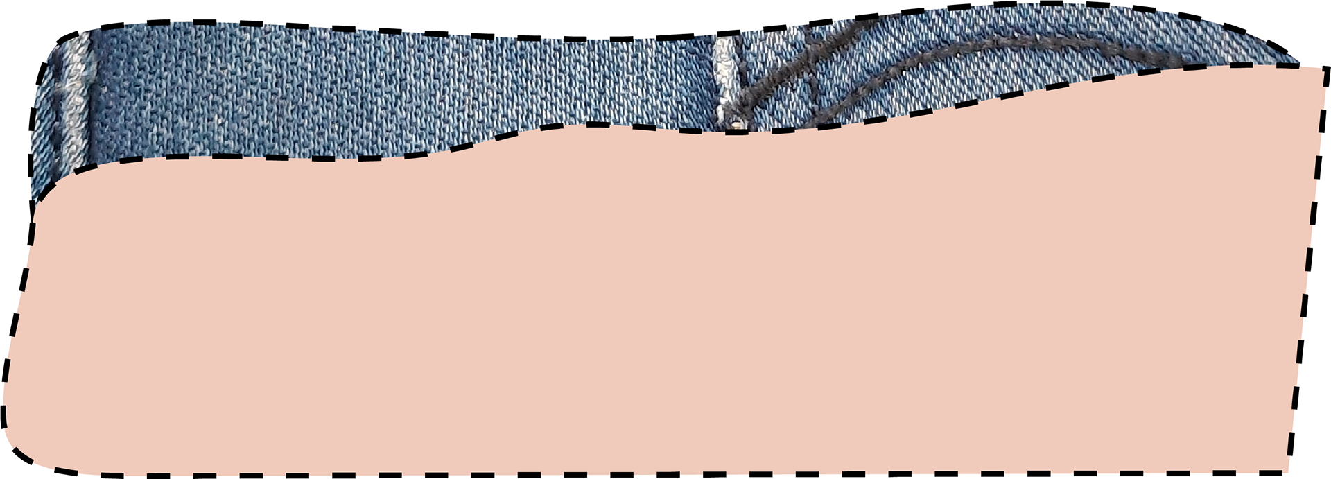
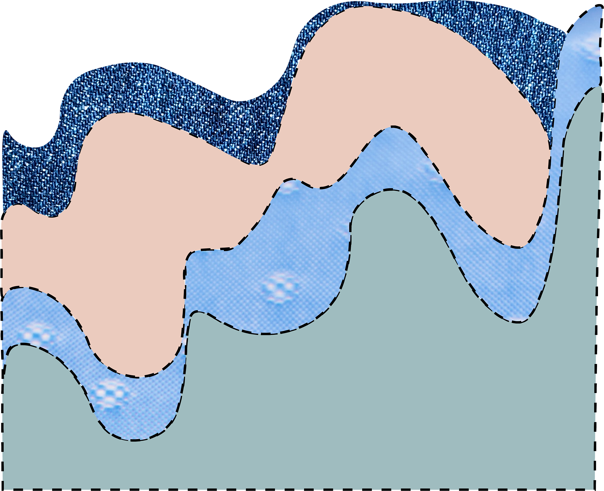
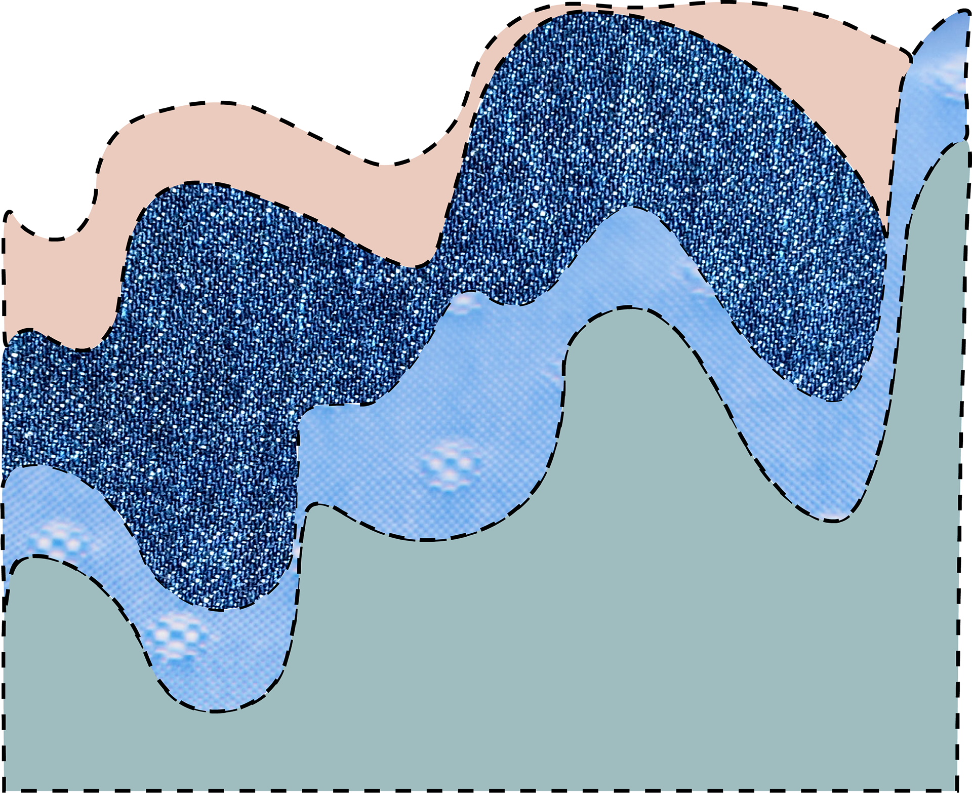
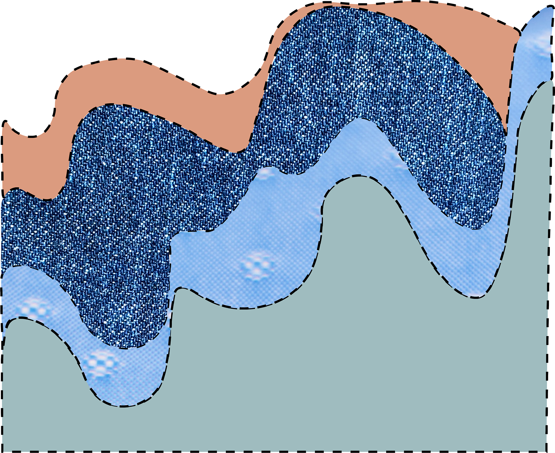
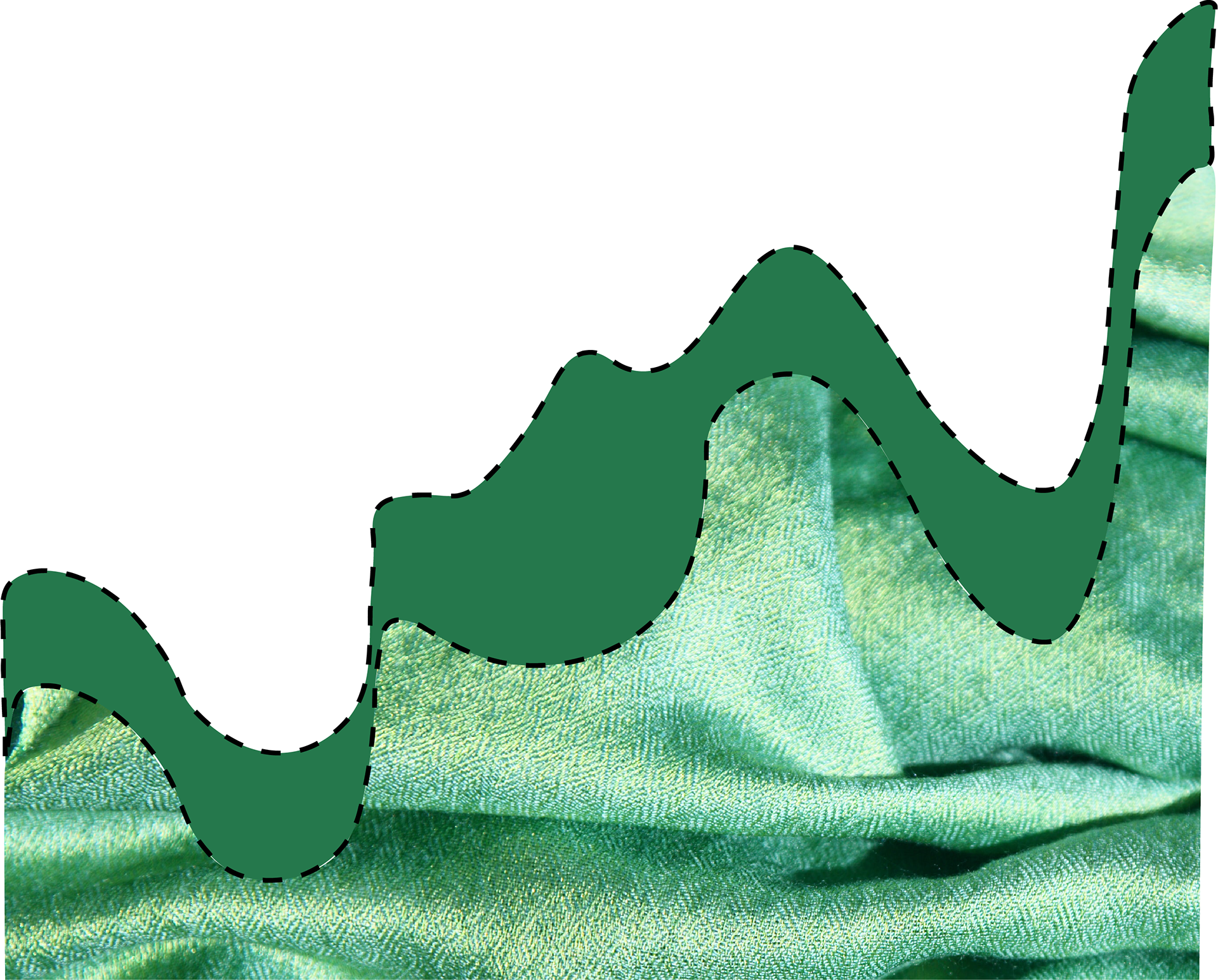
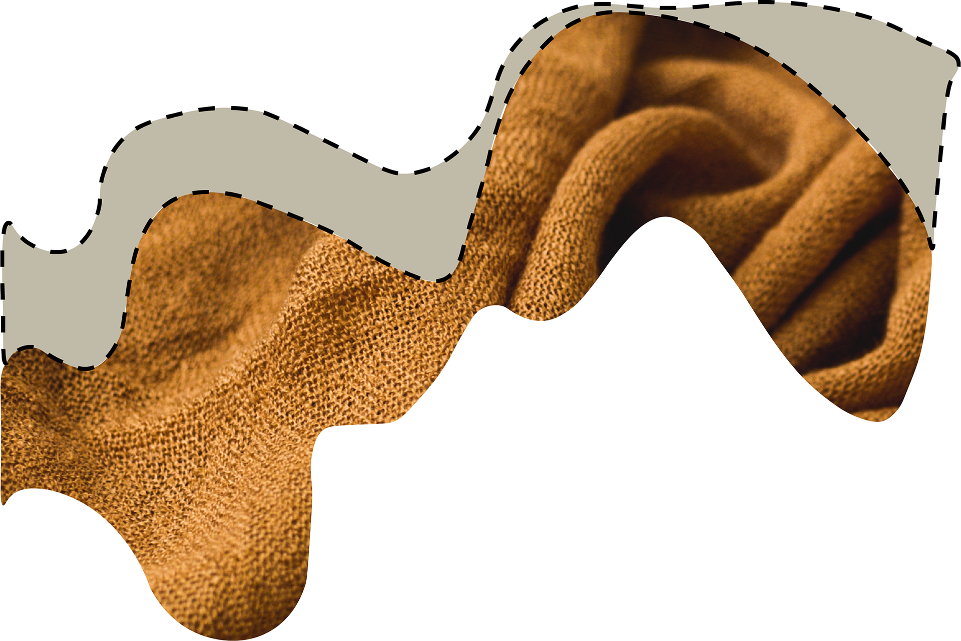
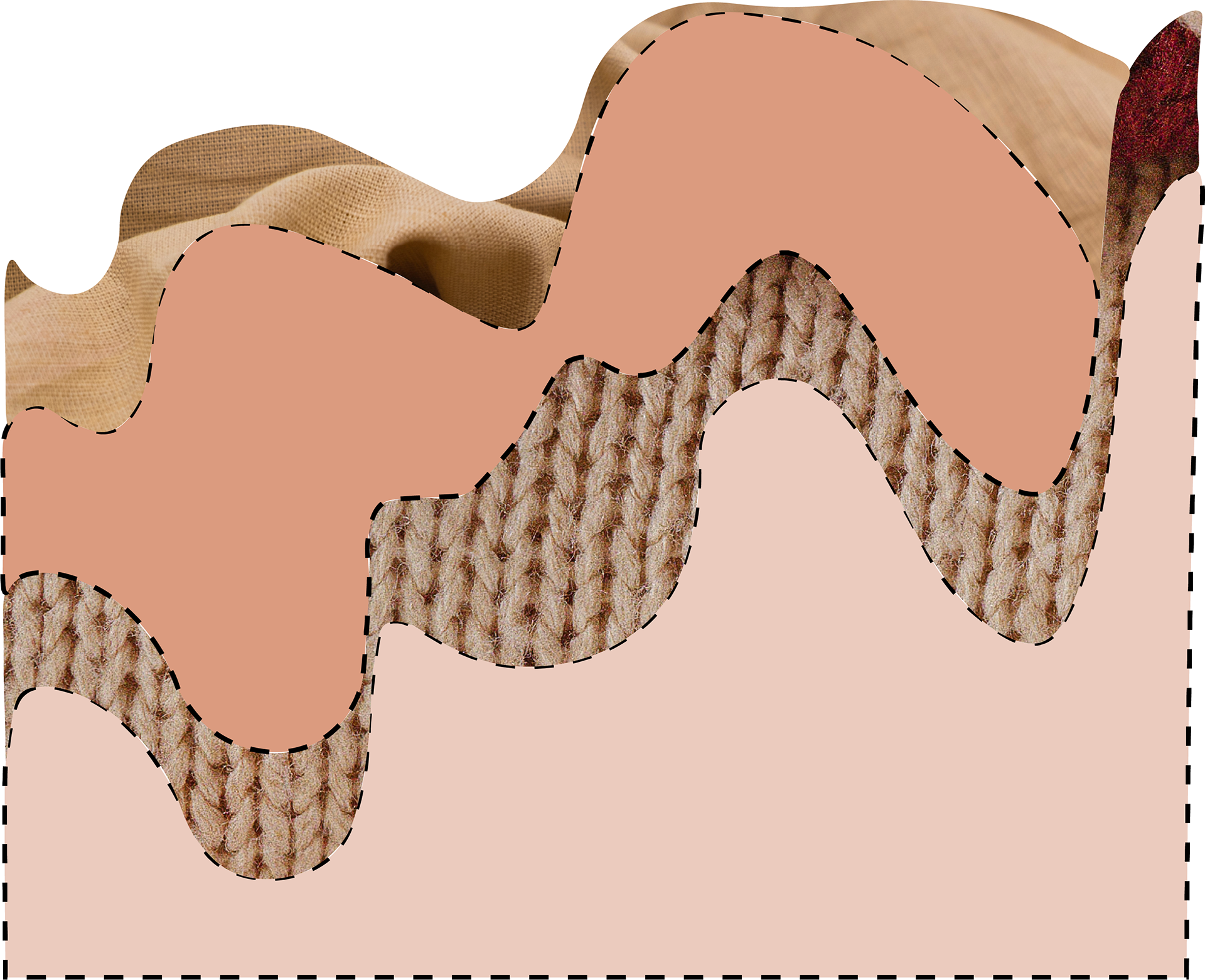
After deciding on fonts and colors, I was inspired to pull textures from different types of fabric into my design. Adding the dashed stroke around the outside of the organic shapes evoked memories of sewing and having something be hand-made. It represents something being high-quality or made with care. I also made this decision to visually show and spark interest in the types of fabrics that could potentially be used in an upcycled clothing piece.
This is definitely where my critiques came in handy for this project though because I was getting so caught up in creating these textured shapes that I couldn't move forward. However, my critique group members pointed out that it was useful to know which model I would use for the ad and to build the secondary elements around the model, and what they look like.
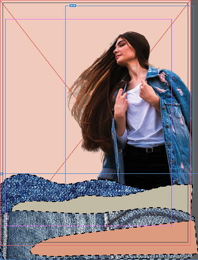
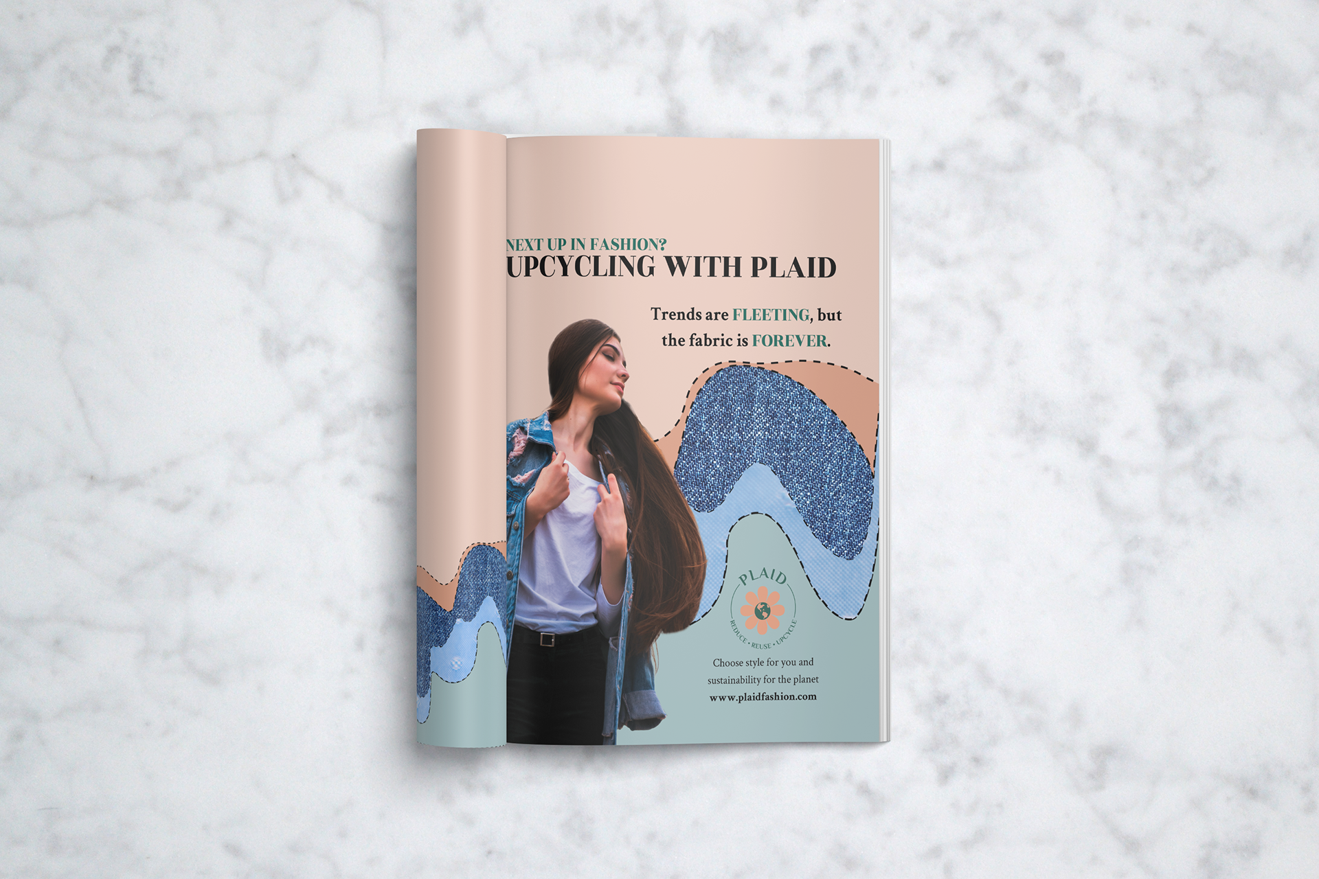
formatting ad 1
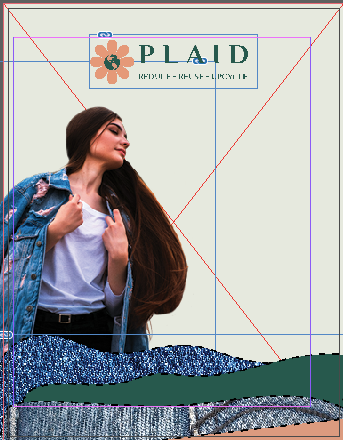
formatting ad 1
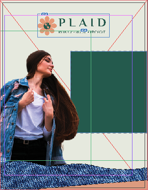
formatting ad 1
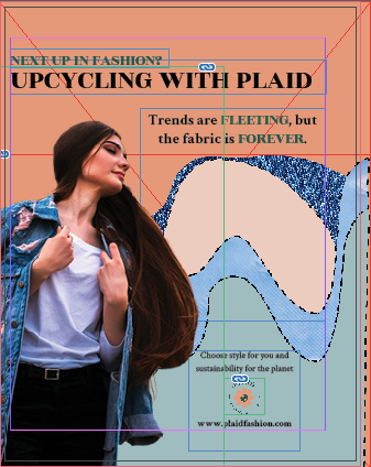
formatting ad 1

formatting ad 1
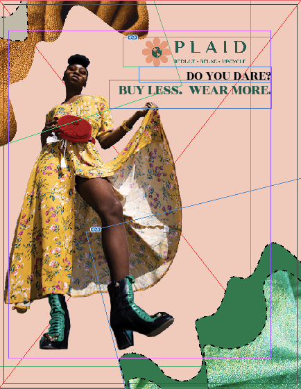
formatting ad 2
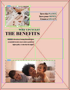
formatting ad 3
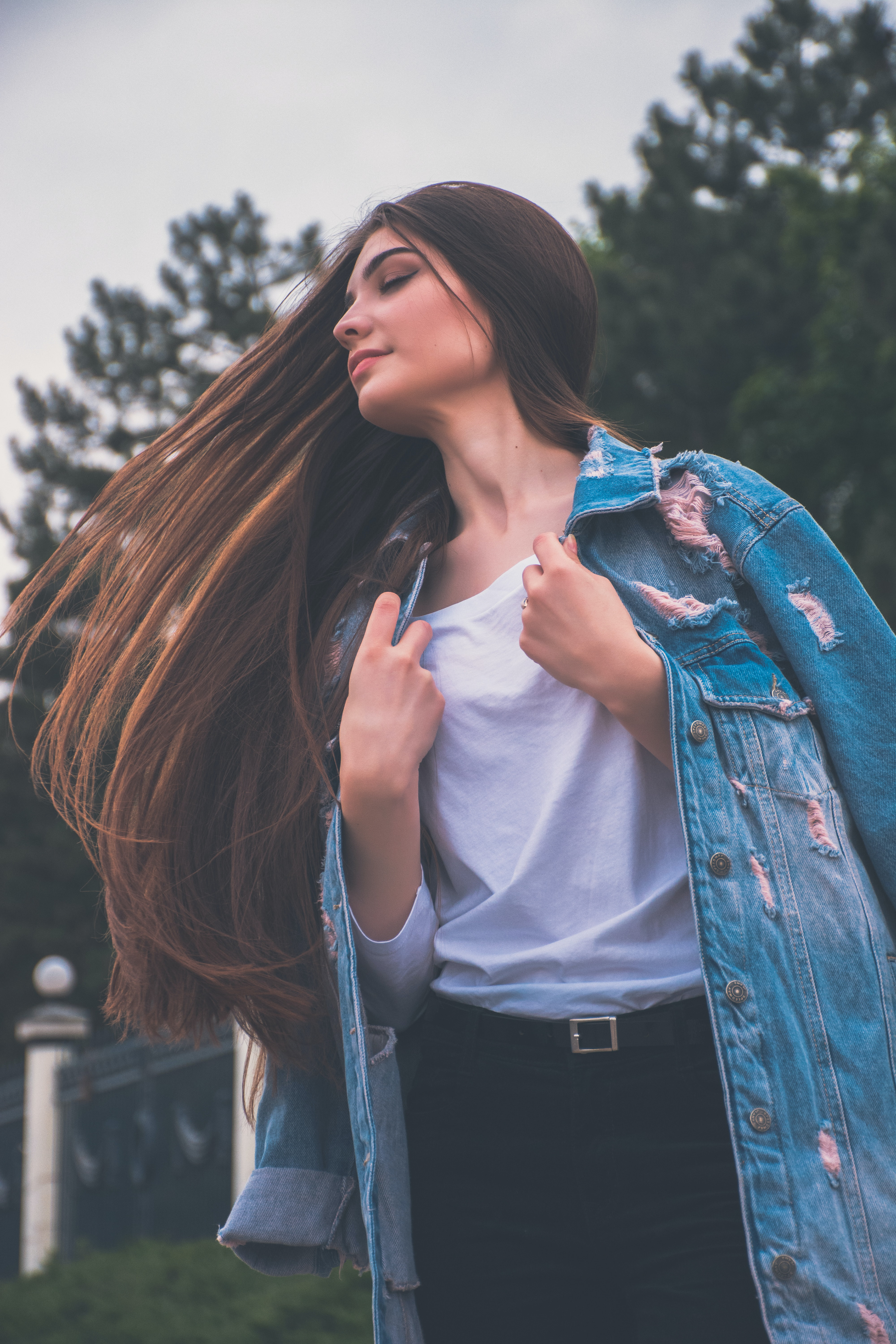
Per my critique members' suggestions, I started working on the editing for these two photos. I'm so glad that I had my memory refreshed on layer masking earlier that week because otherwise, they would not have been nearly as good as they are. I used all of my images from Unsplash, and I only did small amounts of color correction and background deletion, but this process still took me well over 3 hours mostly due to the photo on the left.
Before Edits
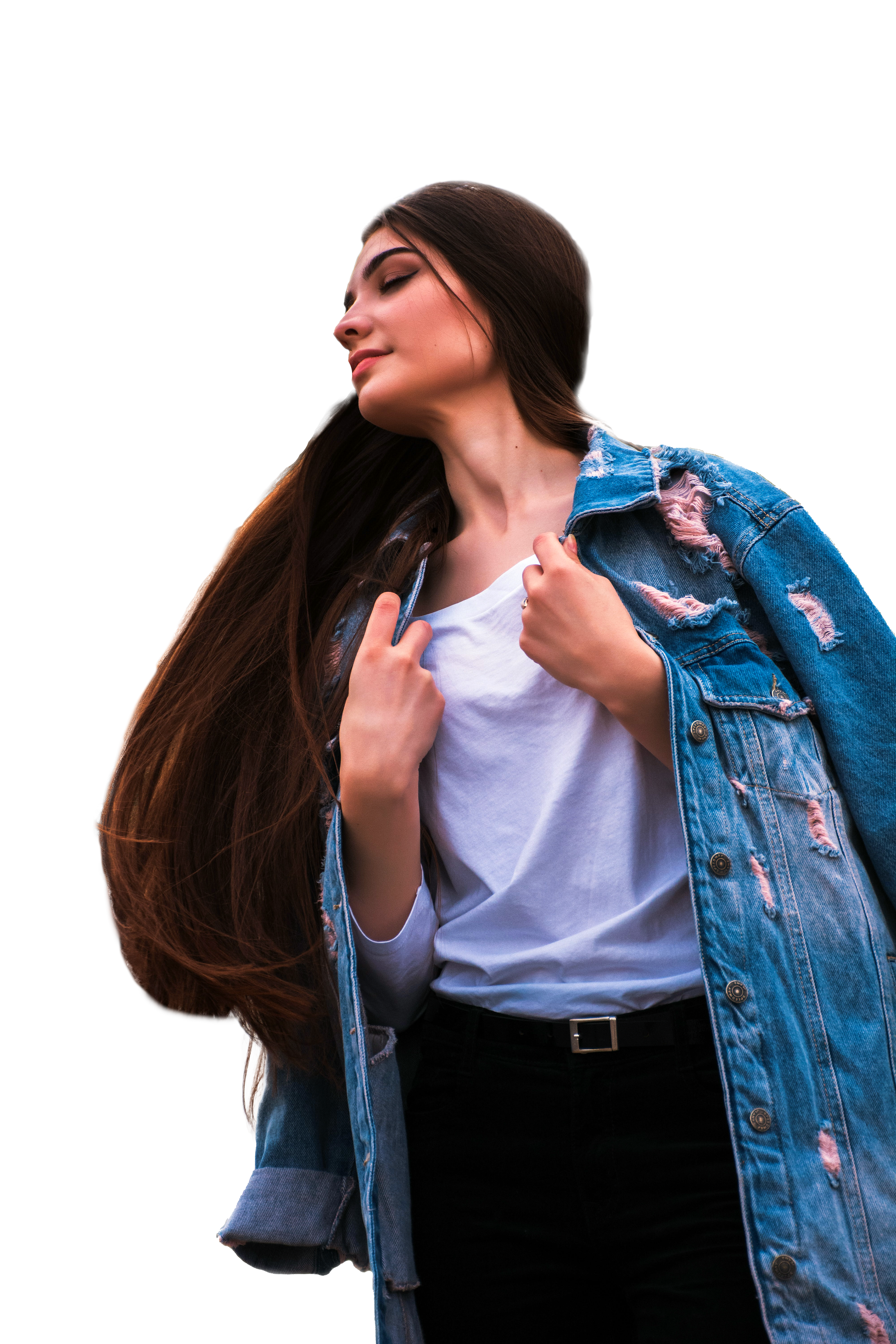
Final Version
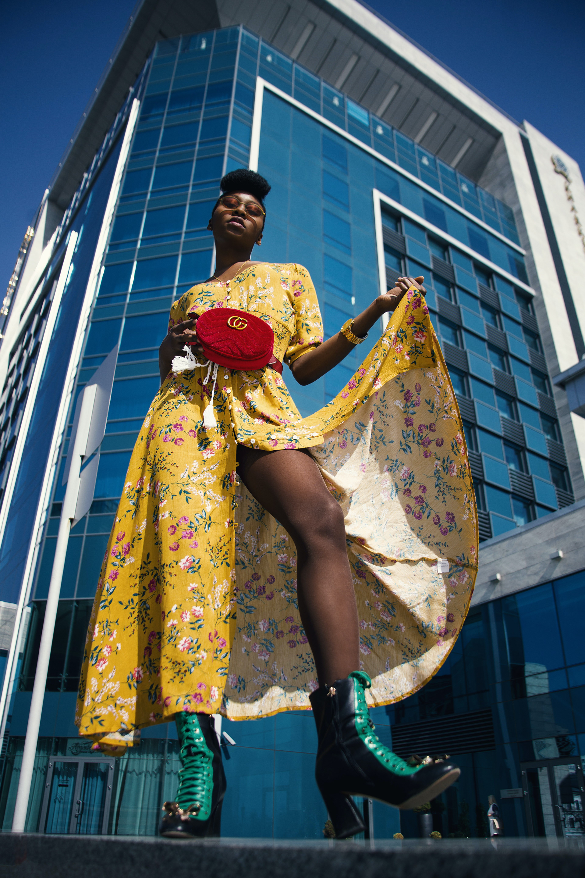
Before Edits
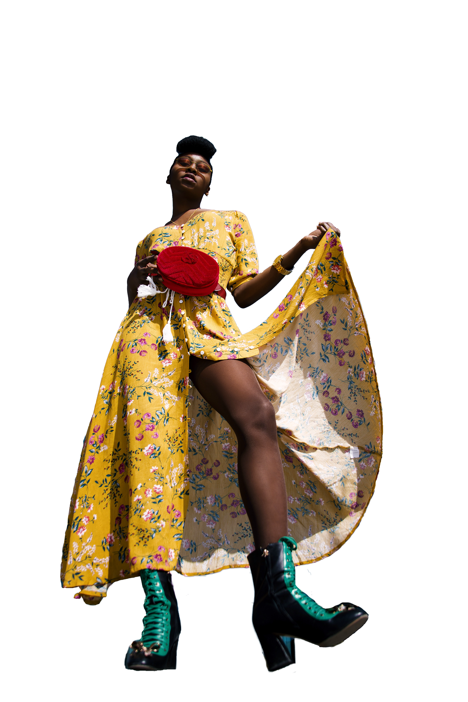
Final Version

Timesheet for Design Project
Design Decisions
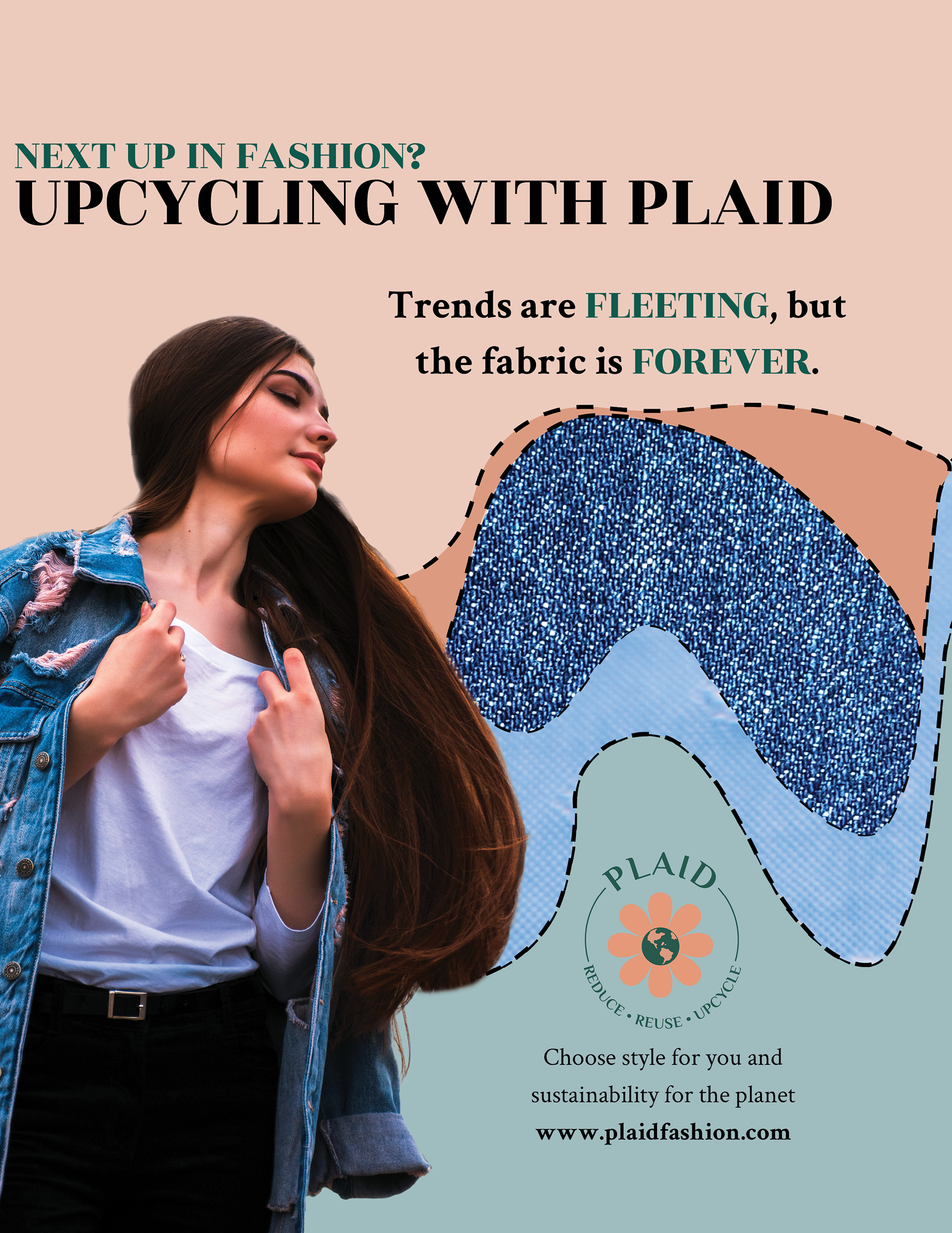
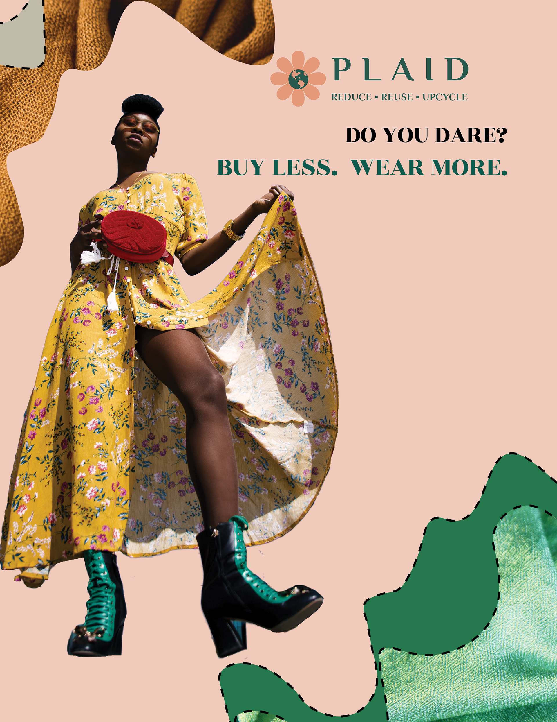
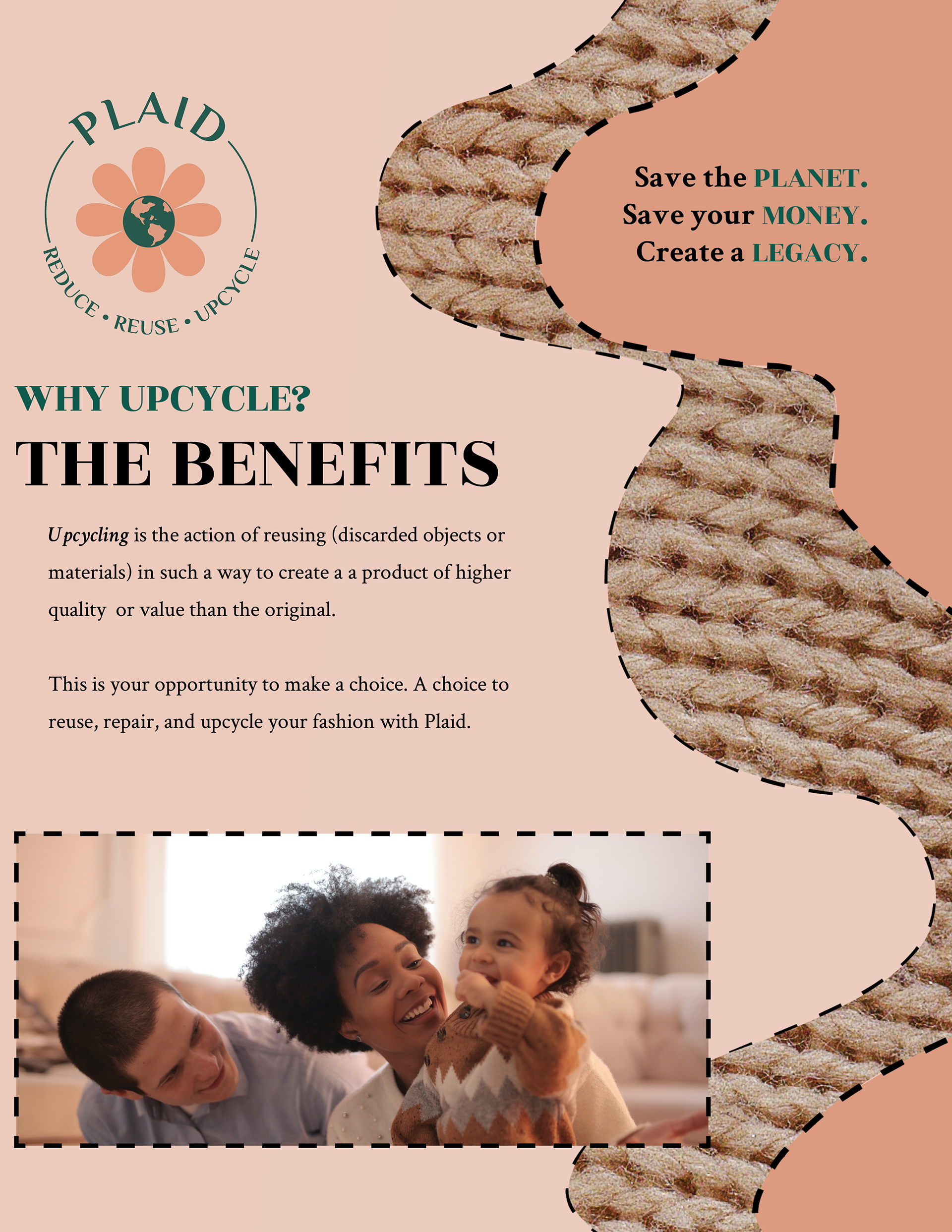
Working for Plaid on this series of magazine ads, the one thing I wanted to accomplish was showcasing what makes Plaid a unique clothing brand. They upcycle clothes with high-quality materials and then sell these clothes to clients at more affordable prices than current established fast fashion brands. To best communicate this, my ads worked around a central theme of choosing a style for you and more sustainability for the planet.
The brand’s target audience is a diverse range of 25-35 year-olds with an interest in fashion. While both men and women are interested in fashion, I focused more on catering toward females in my advertising because data from my research showed that women were more likely to spend money on clothing shopping online than men. So, with that in mind, I chose earth-tone colors for my color scheme, complemented by a lighter and darker peach color.
For the fonts, I chose Philosopher for my logo, my heading font was Rozha One, and my body copy was font-family Crimson Text. Rohza One was a great choice as a display typeface because the extreme difference between its letters’ thick and thin strokes make it an excellent choice for large headlines. The Philosopher font is universal: It can be used in logos, headlines, and text, but the uniqueness and clarity of the characters made it perfect for the logo. Finally, Crimson Text has long been one of my favorite go-to serif fonts for body copy. The design was inspired by classic serifs like Garamond, Minion, and Baskerville, however, it’s a typeface that not many people can recognize on sight. Most of the more popular fonts have a level of familiarity to them, even for non-designers, which is why I went with Crimson Text because I wanted these ads to feel refined and new in a way that suited the brand.
Lastly, I chose to incorporate organic shapes and fabric textures in my design to evoke the sense that these are high-quality, handmade products. They don’t fit the mold of what we’re used to as consumers of fast fashion, so I thought that showcasing different qualities of fabrics and textures in different ways would draw the attention of viewers and make them more likely to purchase clothing from Plaid. Thank you for reading, and please contact me if you have any questions.