For this assignment, we were tasked with creating a logo and business card design for a brand of our very own.
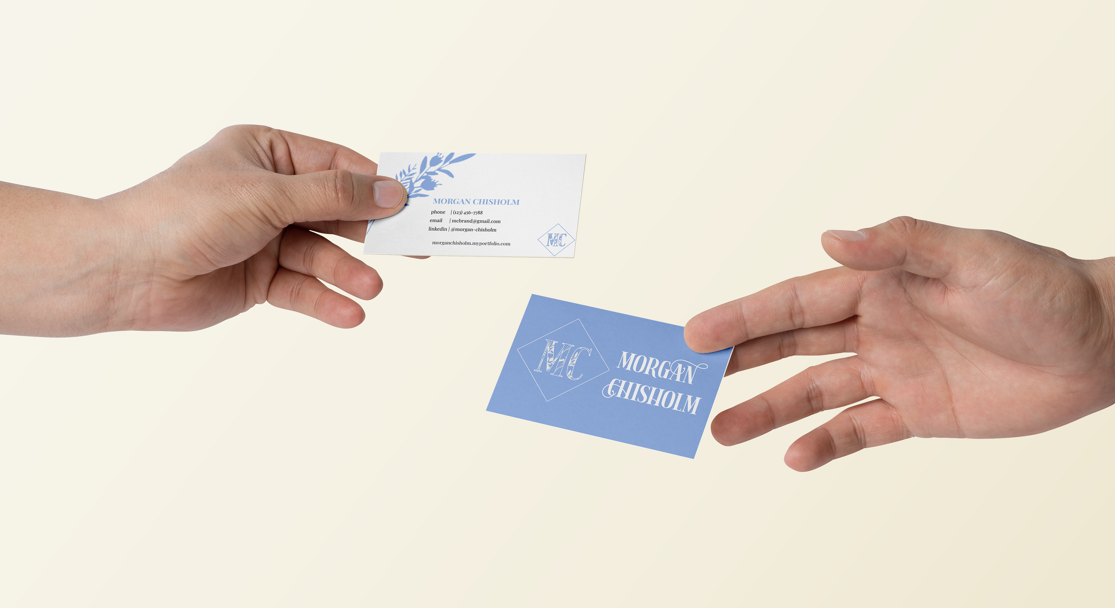
Business Card Mock Up
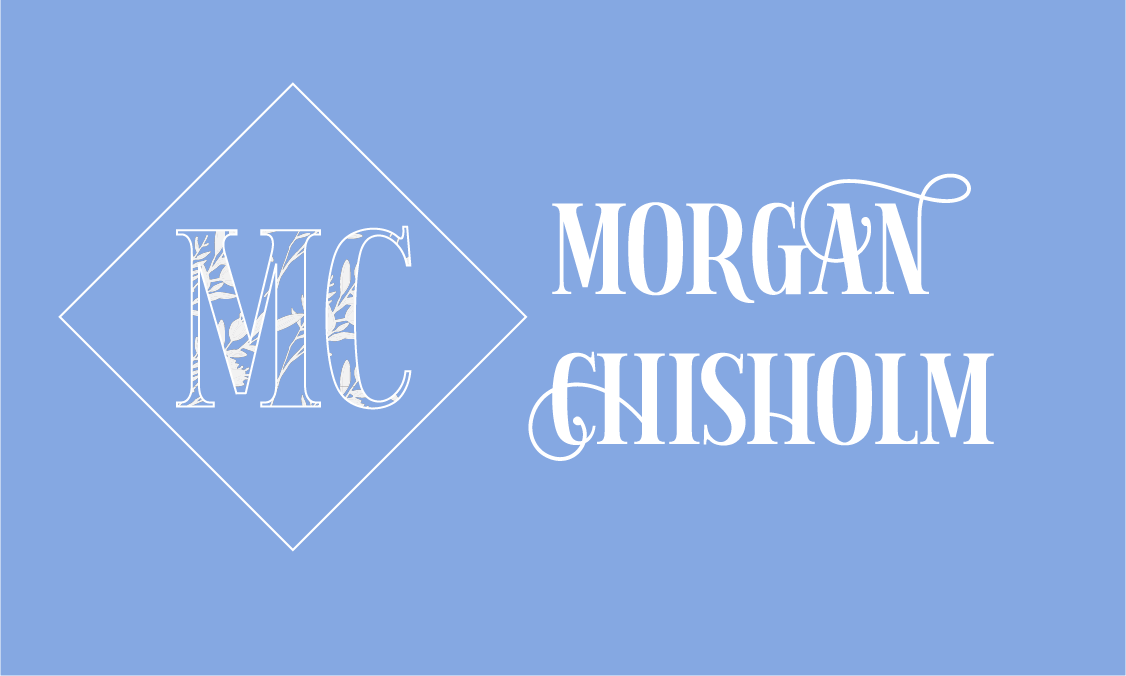
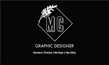
Front
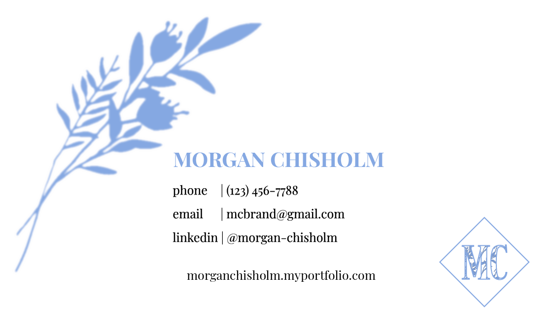
Back
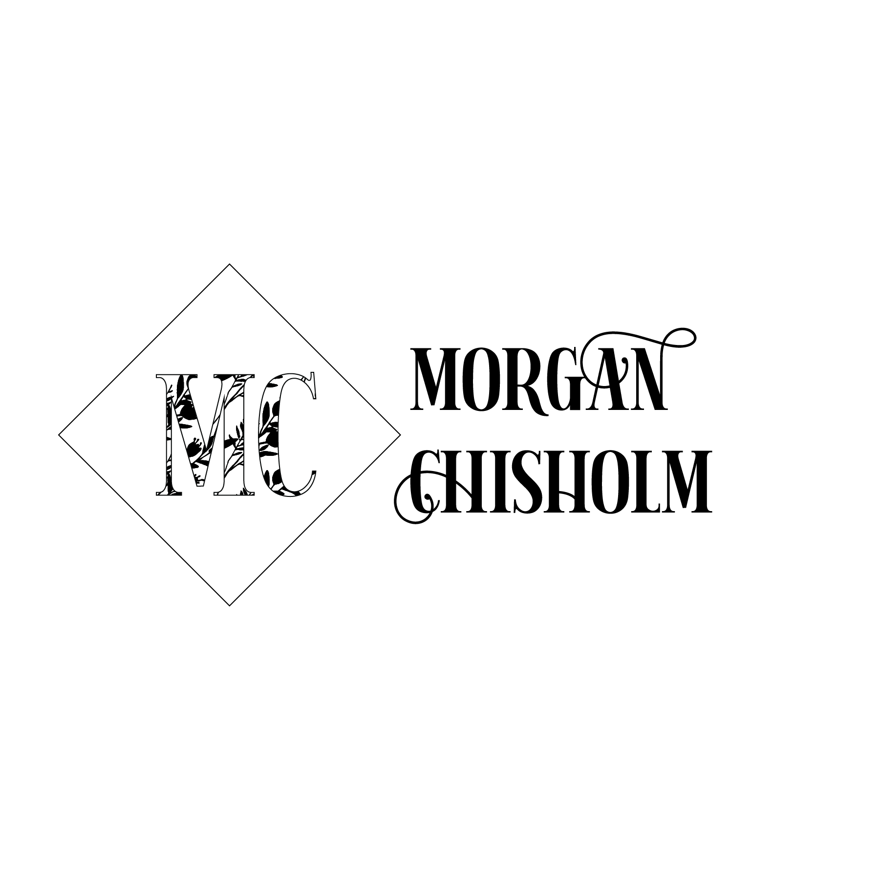
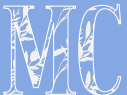
Logo Black on White
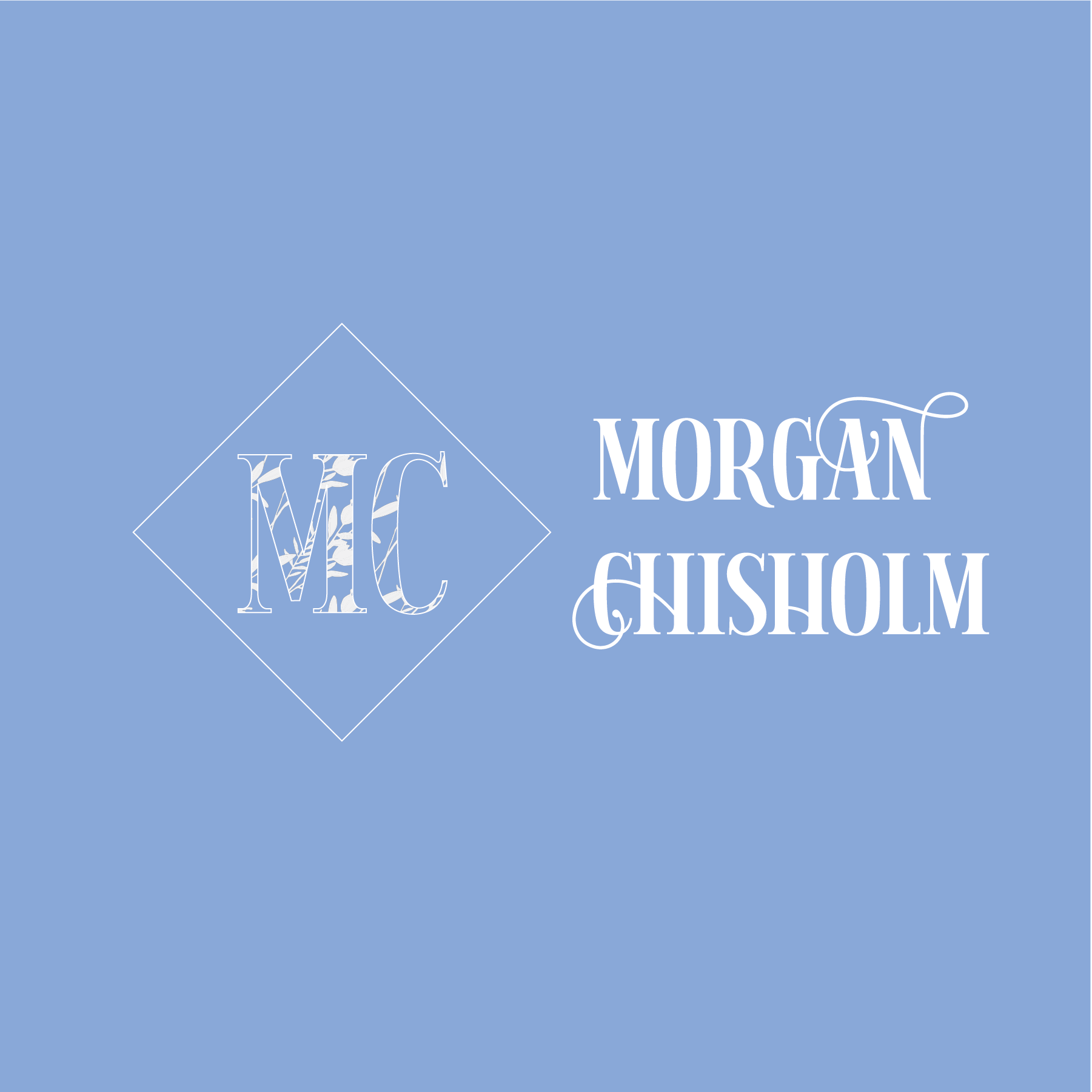
Logo Color
Logo White on Black
Scroll for Creative Process
Initial Inspiration
Creating a logo for other people is much preferable to creating a logo for yourself, in my experience. This project was definitely going to be an undertaking, I knew that much from the start, but as the old adage goes, "we are our own worst enemy," or critic in this case. I know that I get overly attached to my work and I also simultaneously rip it to shreds as I go along, so those were the pitfalls I knew to watch out for during this process.
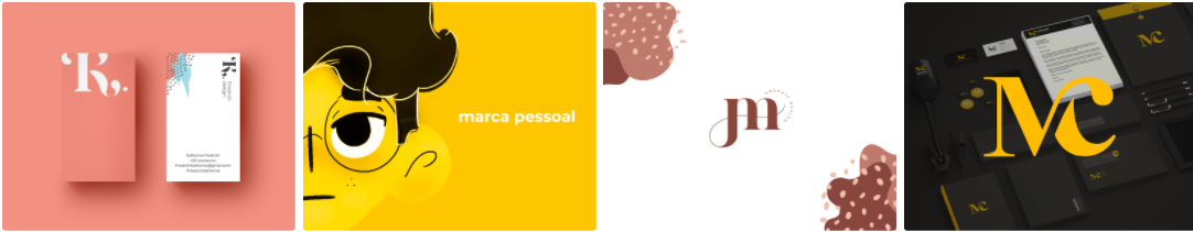
To start, I made a word association map about myself. Alone, the words don't define who I am, but in combination, you could get pretty close to me in a nutshell. This gave my idea generation a jumpstart so that I could narrow down what I wanted in a logo. I also looked on behance and selected four logo designs that inspired me in some way.
Looking back on these, I think I aspire to be simple and then am shocked that it never ends up happening. I start with simple shapes and idea and then complexify from there, but I'm getting ahead of myself...

Inspiration Behance
Typographic Logo Ideas
There are several different types of logo designs: lettermarks, wordmarks, pictorial, abstract marks with separate type titles, or a combination logos (symbols integrated into the type). I'm sure there are more, but these are the three we had to focus on. From my research and brainstorming, I had a pretty clear idea of what I wanted to focus on.
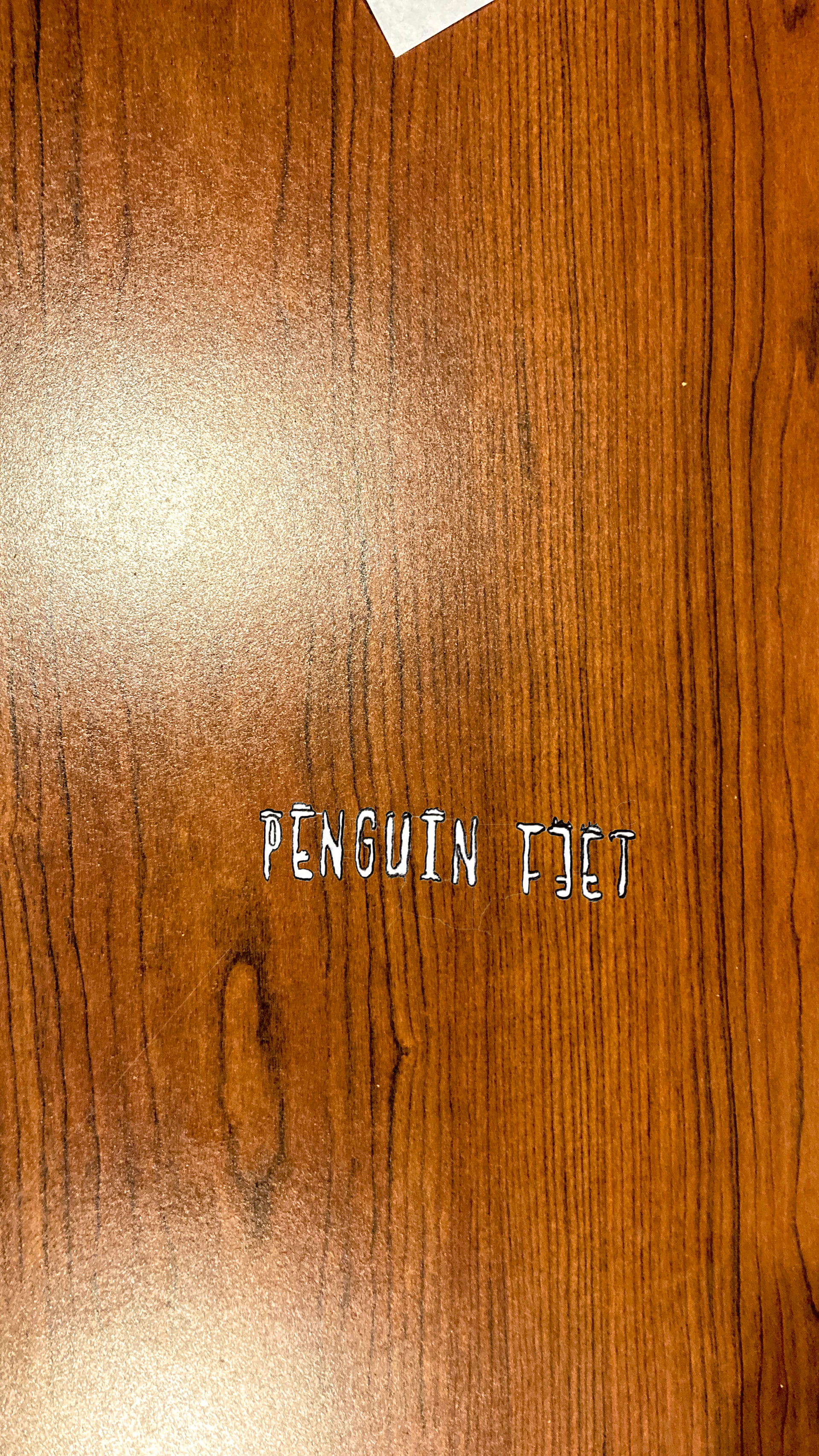
My typography logo Penguin Feet or Penguin Feet Designs pays homage to a family joke about how I do the best penguin impersonation ever when I walk. While I liked the designs that I came up with and the potential they had, I realized that I didn't want to have to explain that personal story to potential client or connection. I also didn't want to promote the idea that it was okay to be casual about someone's identity surrounding disabilities. I do look like a penguin walking around with the way my feet move and the way that bounce side to side, but that doesn't mean it's okay to be called penguin feet. So, for the sake a maintaining a professional appearance, I decided to nix any personal jokes that might be misconstrued from an outside perspective.

Penguin Feet Design Sketches
Pictorial Logo Ideas
For my pictorial logo, I was immediately inspired by the marca pessoal business card (pictured above). While the face itself is very expressive and intriguing, what caught my eye was the simplicity in the design of the hair. I have long hair by most people's standards and I absolute cannot work well until my hair is put up in a ponytail or bun (mostly because they are the only hairstyles I can accomplish).
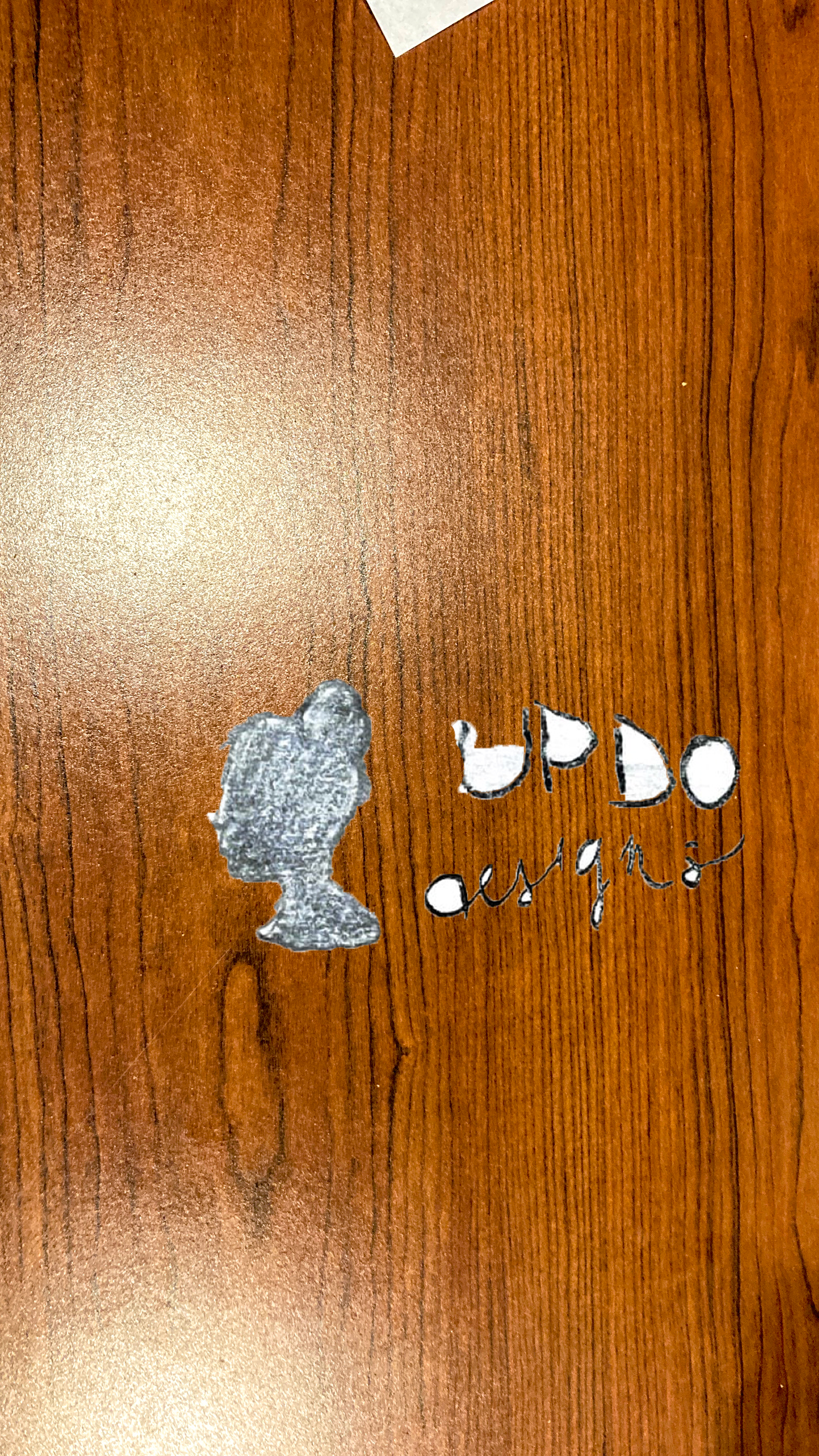
In my rough sketches, I explored the complexities and the simplicity in making hair designs. To be honest, I don't know how I forgot so quickly that hair is hard to do well without getting detailed. In my Tangled Movie Poster project, I didn't know how to get the hair to look realistic, maintain a simple vector shape, and have it look visutI struggled with the same issues coming up with sketches for the logo design process as well. For this reason, I decided to scrap Updo Designs and the hair logo ideas because I had already confronted similar design elements.

UPDO Designs Rough Sketches
Combination Logo Ideas
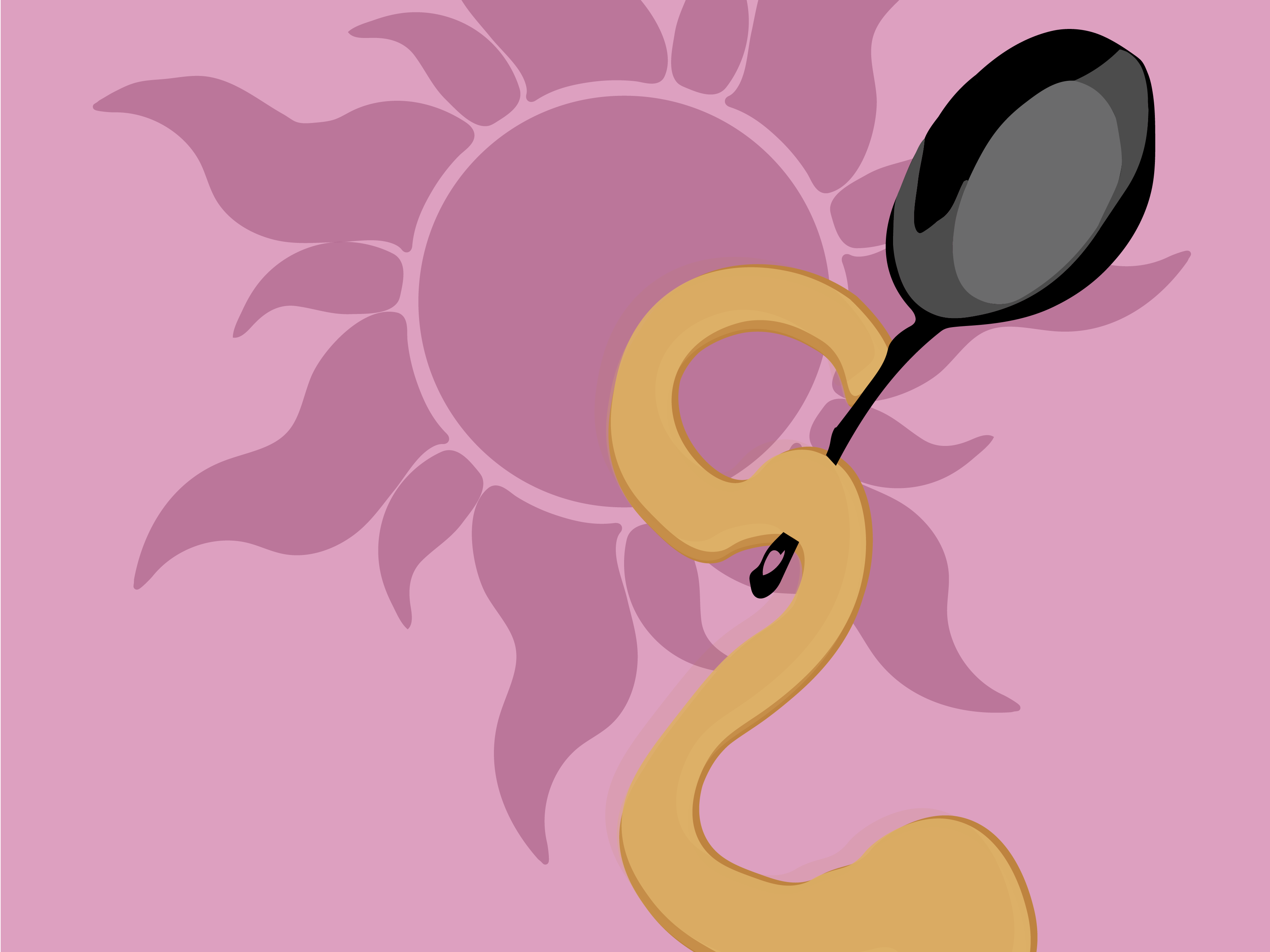
For the combination elements I wanted to highlight something that has had a place in my life since I was two-years-old. Horseback riding is one of my favorite pastimes, and one of the few ways I can truly experience rugged terrain due to my physical disability. Riding horses gave me freedom to do what I wanted at the speed I wanted, but also taught me control and was very regimented. So, balancing freedom, control, and nature into one logo proved to be difficult, but with the help of my peers and professor, I think I managed to do it.
Beyond horseback riding itself, trail riding is what inspired this design. Trail riding happens when there are no fences, tasks to perform, or anything else to hold you back. Going on trail rides were few and far between because at the barn where I rode, we could only trail ride on perfectly sunny days. My favorite place to ride was a small pond/creek area where these beautiful flowers would grow out of the water, and the fact that my relationship with my horse, Pilot was strong enough to go into the water was an amazing feeling when it happened.
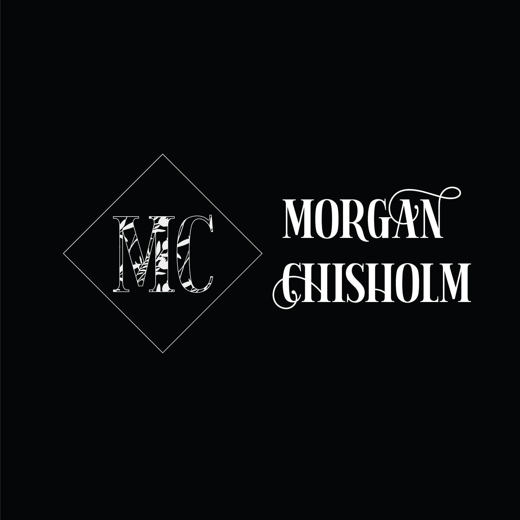
This logo represents years of practice and dedication towards working in tandem with my horse. The reeds and water lilies represent freedom the MC represents me, and the diamond/rhombus shape represents Pilot because horses have very distinctive markings. In the picture below, Pilot's white marking is called a star, and I wanted to the diamond to reflect that.

Rough Sketches Combination Logo

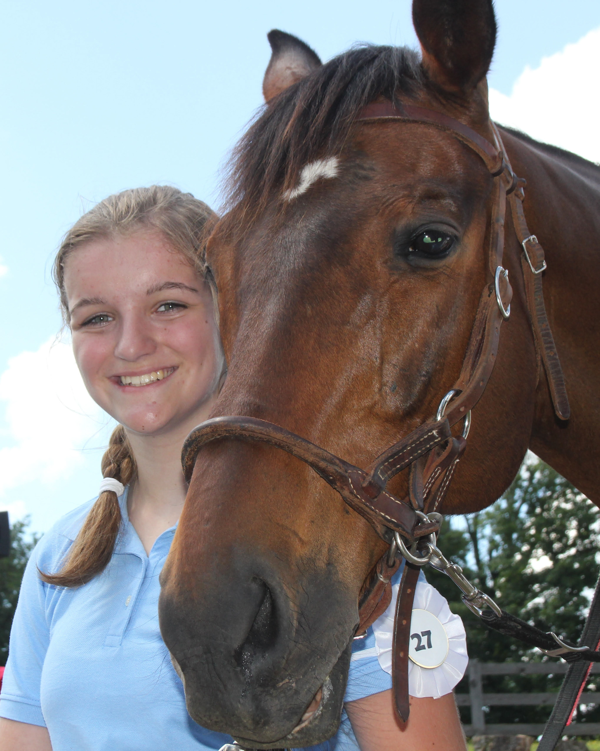
Pilot
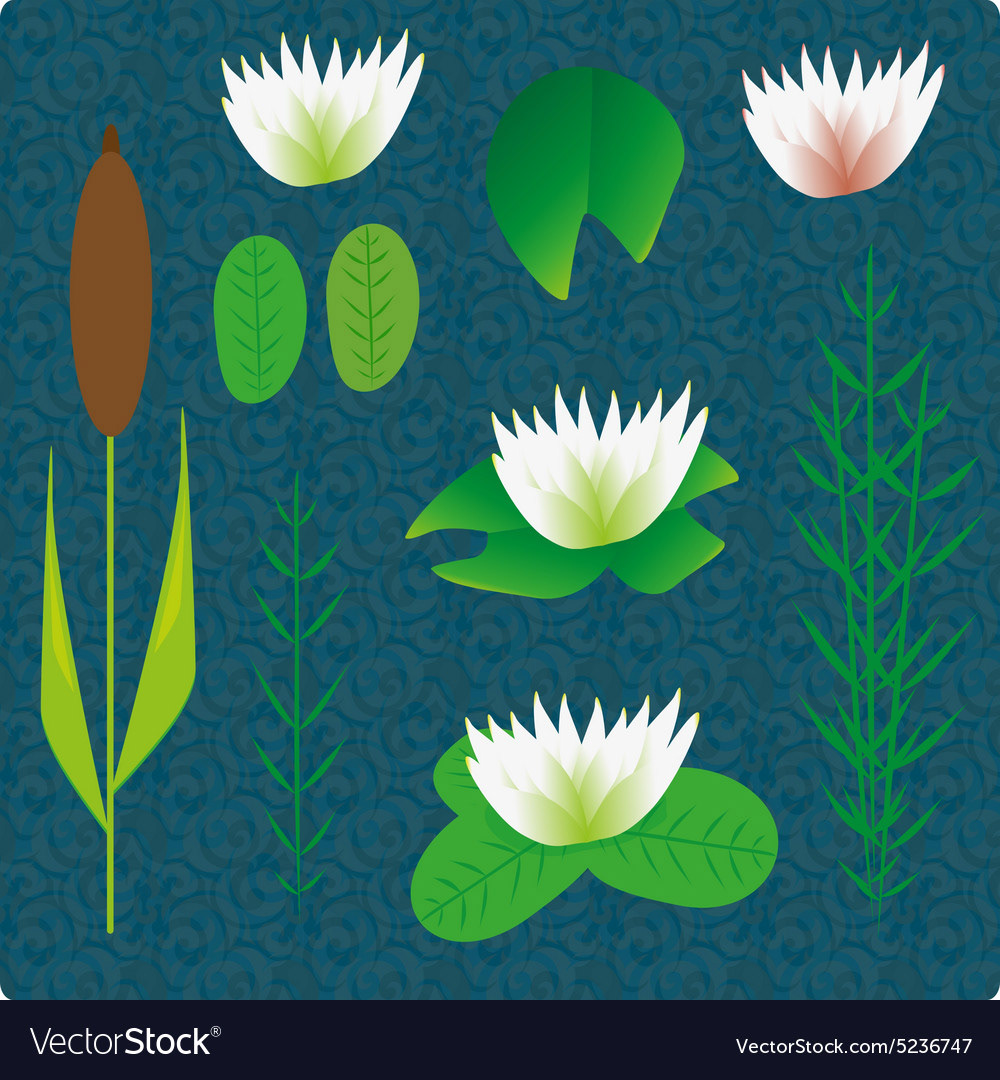
River Plant Ideas
leaf shape inspiration
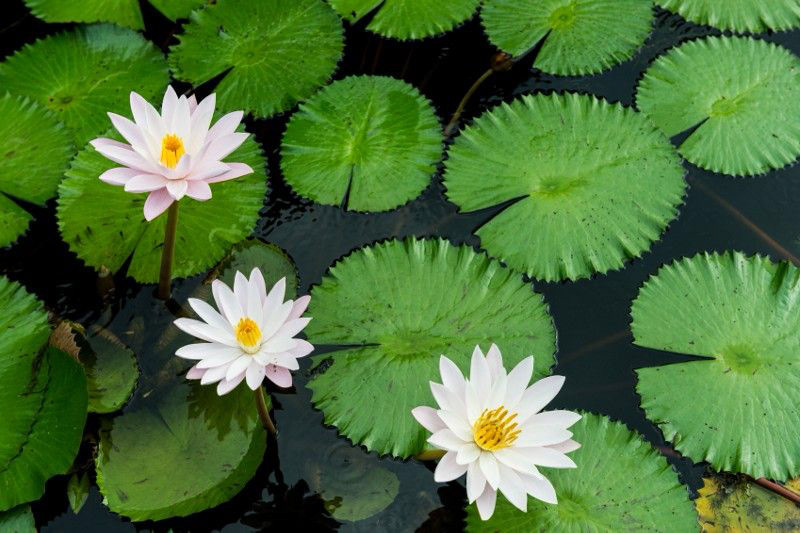
water lilies
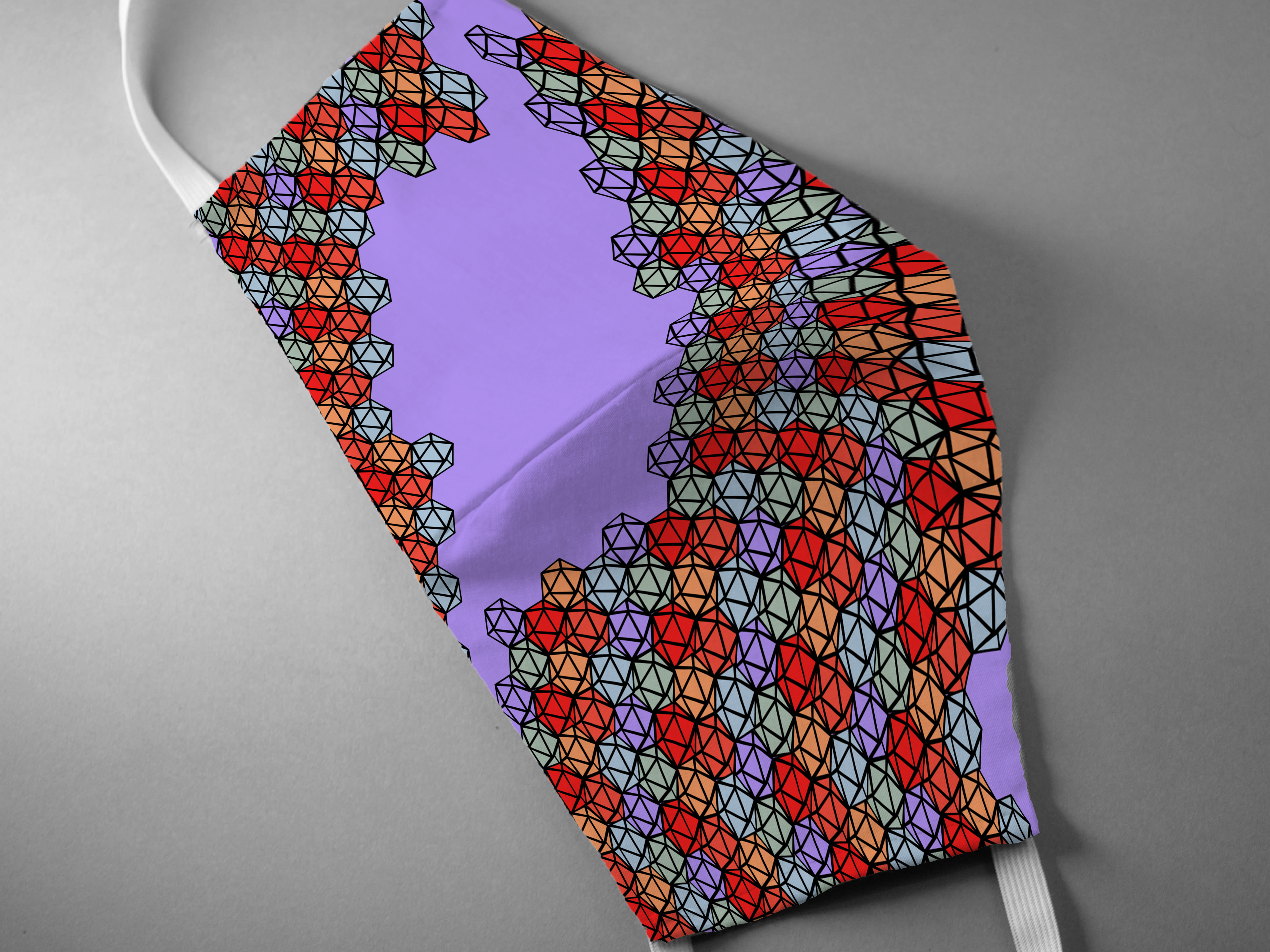
Drafting the Combination Logo on a Business Card
Creating the business card once my logo was rough drafted was pretty simple in my opinion. However, once I started tweaking the layout, I couldn't stop. Getting everything positioned perfectly was a challenge, and I couldn't decide how I wanted to align everything.
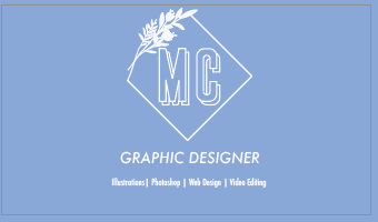
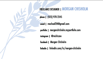
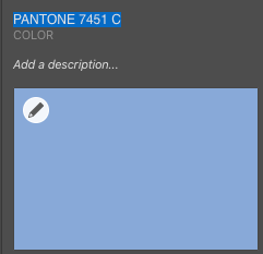
For once in my life, the color scheme was very simple to deduce. I decided that since trail riding only happens under a Tennessee blue sky, I should strive to match it. I used solid coated Pantone 7451 C in case I should ever want to print real-world business cards from a company like Moo. Pantone colors are much easier to replicate in print rather than through the use of RGB hex codes which you cannot access outside of your computer.
I received very constructive feedback from both my classmates and my professor which prompted me to dig further into my design concepts, figure out what's really necessary, and improve my final designs for the better.
Draft 1 Black
Draft 1 Black Back
Draft 1 Color
Draft 1 Color Back
Revision based on Critiques
Alright, I promise this is the last section, so if you are still reading, then congratulations! The final step in my design process was to revise my work based on the feedback I received, and this can be hard especially when you've put so much effort into a single design by this point, but ultimately, it will help your work achieve its potential.
After meeting with my professor, I understood that while I had justifications for making the design choices I did, that doesn't necessarily mean that every element works together cohesively. I ended up changing my font from Stockport Double Outline to Herina GT which is a serif font that conveys elegance while still visually looking solid. It's my #1 go-to font for most personal display type needs. I also changed the text font from Futura Condensed medium to Playfair Display regular, which pairs well with Herina.
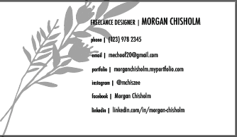
I cut down on my business information to include only relevant information rather than all the information, I tightened up the layout of the elements on the back of the card, and I added a mini version of the logo in the lower right to add cohesion between the two sides. However perhaps my biggest change was moving the water lily sketch from the front diamond and turning into a fill pattern for the MC instead. This choice lends to a more elegant, less busy design in my opinion, and since the water lilies are still featured prominently on the back, I think the front and the back tie together very well. I am actually proud for all the hard work that went into achieving this final design, and am planning on having versions printed soon!

Final Color Design
Thank you for reading!