For this project, I was tasked with the creation of a branding campaign that included at least three unique deliverables.. . The true test of this project, was to create products that told a story of who your consumers were. So, I chose to create a mock business called Stay Pressed, a premium, customizable press-on-nail company.

Postcard Front & Back
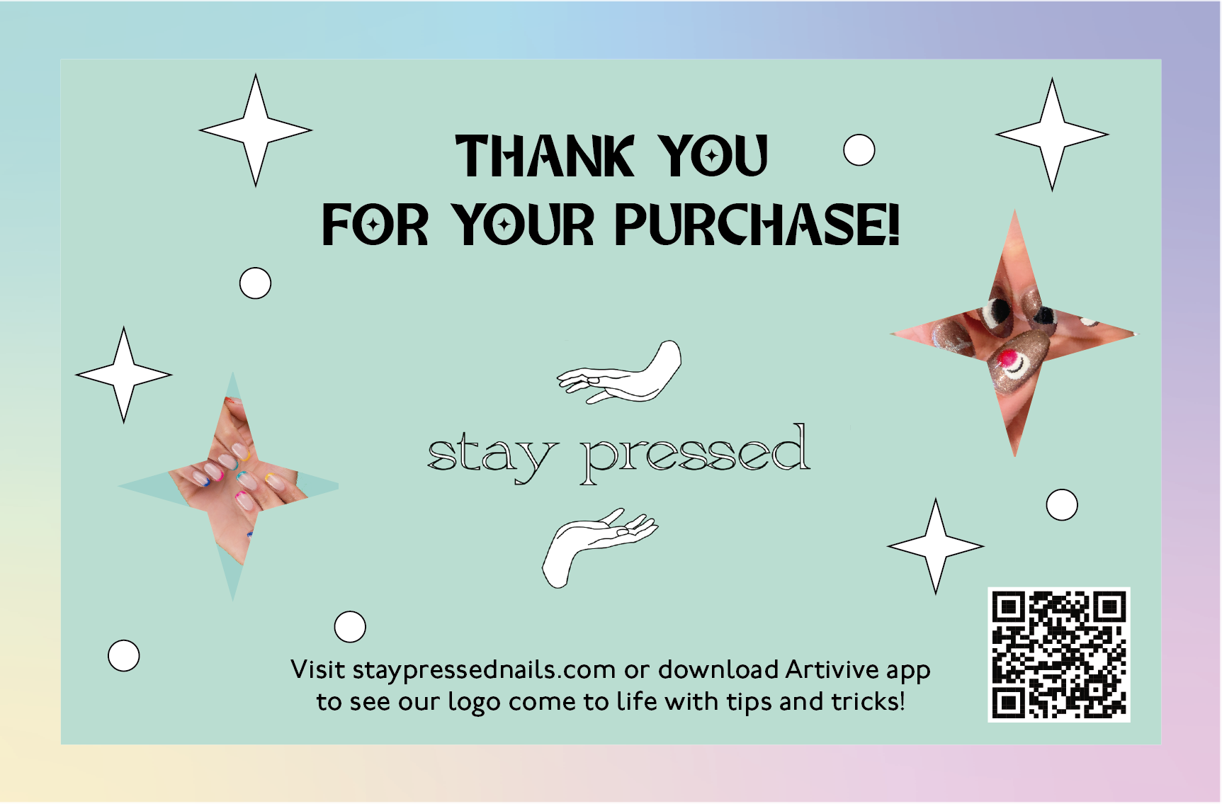
Postcard Front
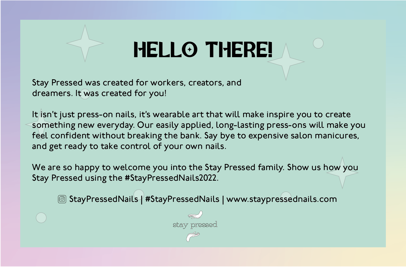
Postcard Back
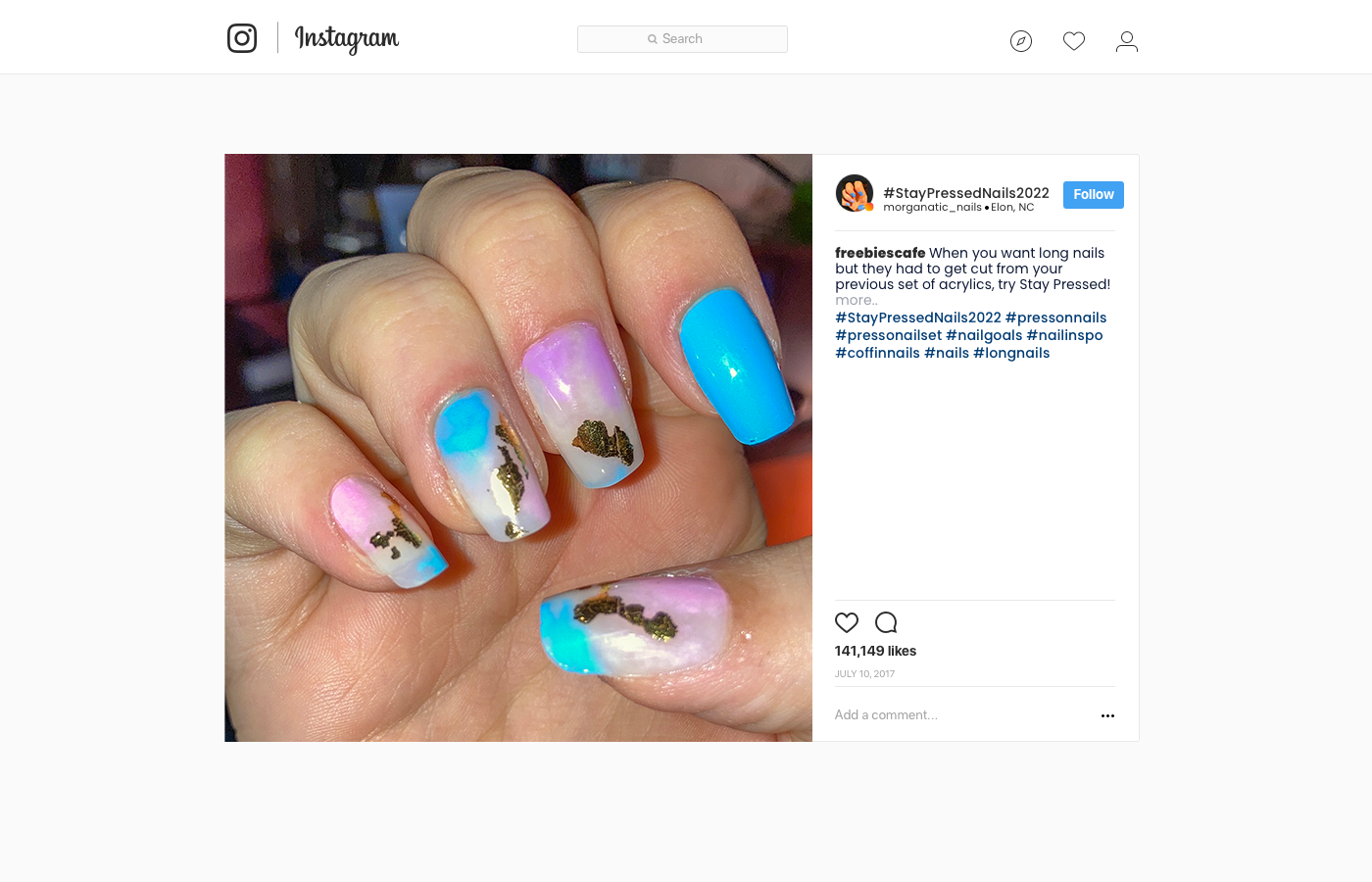
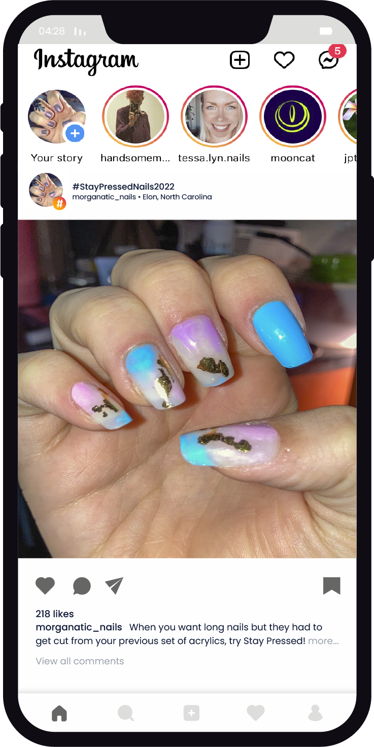
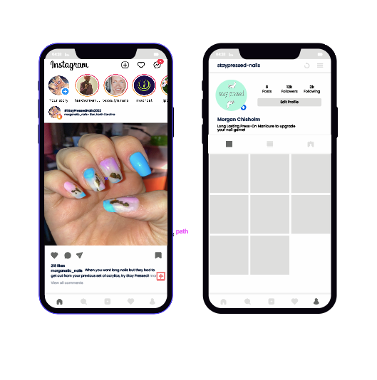
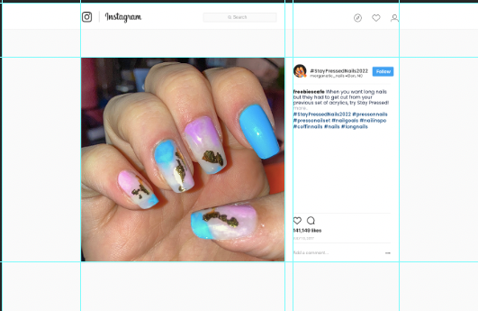
Instagram Caption example

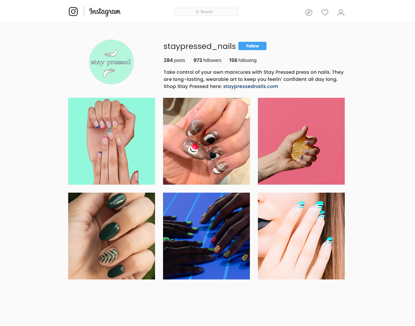
Instagram Profile
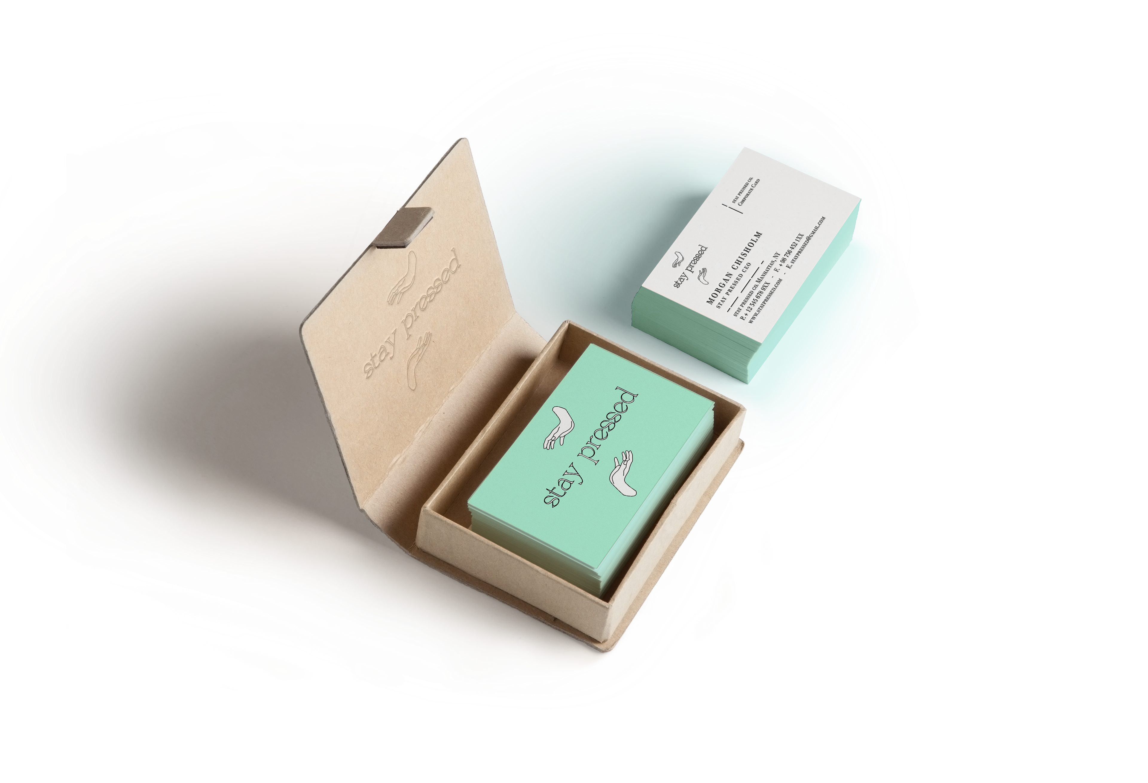
Business Card
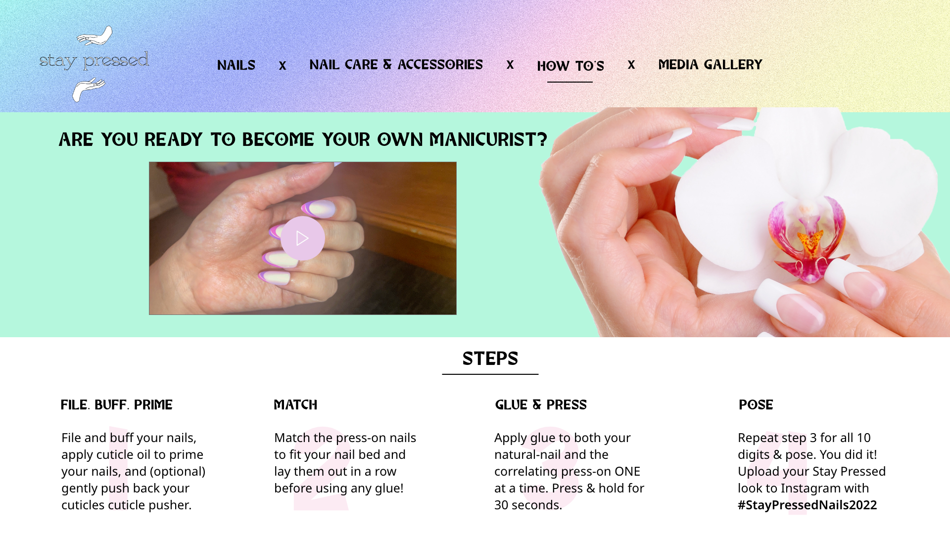
Website Design
Scroll for Creative Process
To start, I had to put myself in the shoes of my target audience, the majority of women between the ages of 25-50 who either paint, get gels, or put acrylics on their nails. This audience is based on my personal experience as well as the statistics breaking down the demographics for people in the nail artist career path. There was no consistent data on nail artist clientele, so I had to draw insights from nail artists themselves. 85% are women between the ages of 20-40+, and I inferred that the client base is very comparable. Therefore, my target audience is women who fall within these ranges because these are people that could be buying press-on nails instead of acrylic. As a broke college student, there is nothing simpler than a quality set of press-on nails to make you feel more confident about yourself without breaking your budget. This is the consumer experience I wanted to emulate for this project.
The world of nail care or nail art holds a variety of ways to turn natural nails into works of art. As a person who bit their nails for 21 years, I was always enamored by the idea of longer nails that looked nice, but I bit through everything out of stress or boredom, and nail care is expensive. Over the course of the past year, I have stopped biting my nails by constantly painting them and learned about all the different varieties of nail options.
What do nail enthusiasts want amidst so many nail care options? They want a nail set that is quality, long-lasting nails above all else. They want no hassle and easy application. They also want sets that are unique and photo-ready. If all of this can be delivered at a fraction of the price of a full-set salon price, then these are some savvy nail enthusiasts indeed. However, the trick with this project is how do I show this, and what mediums do I use?
Research Methods
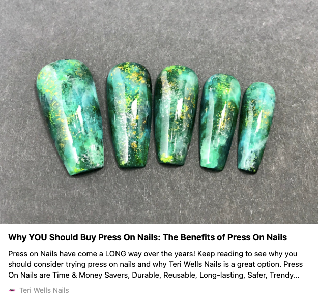
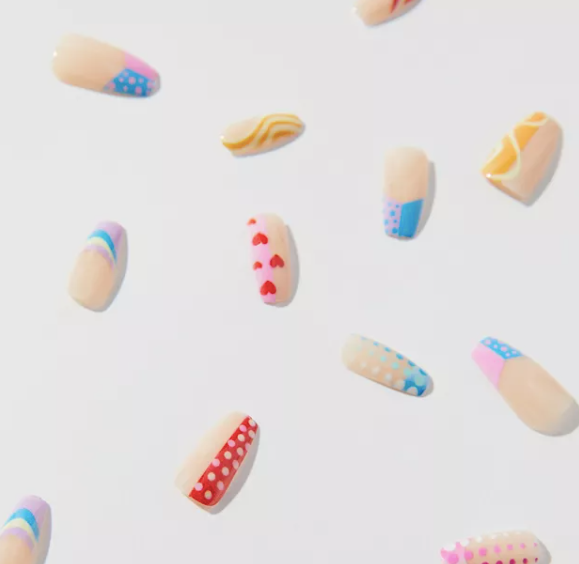
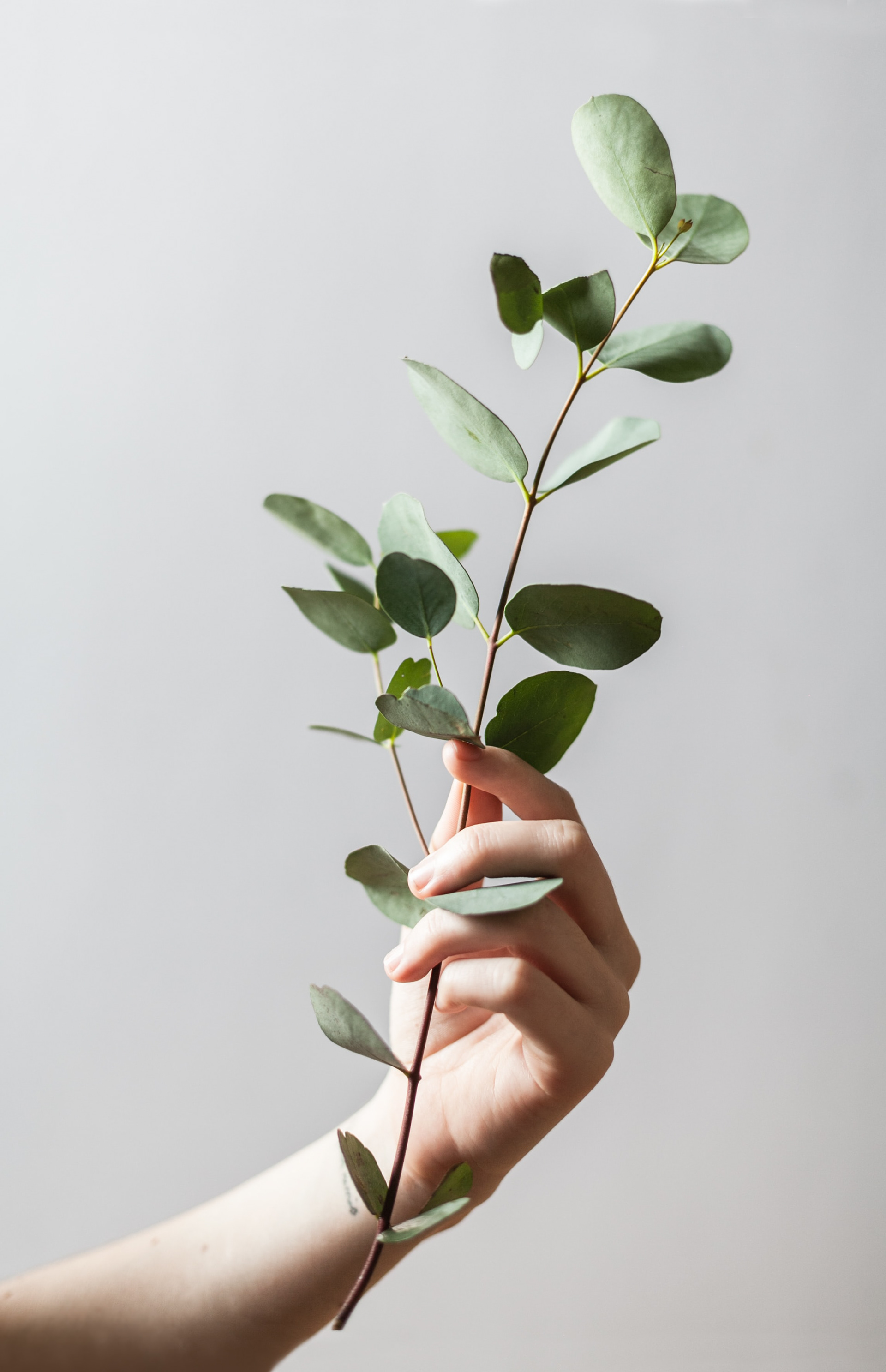
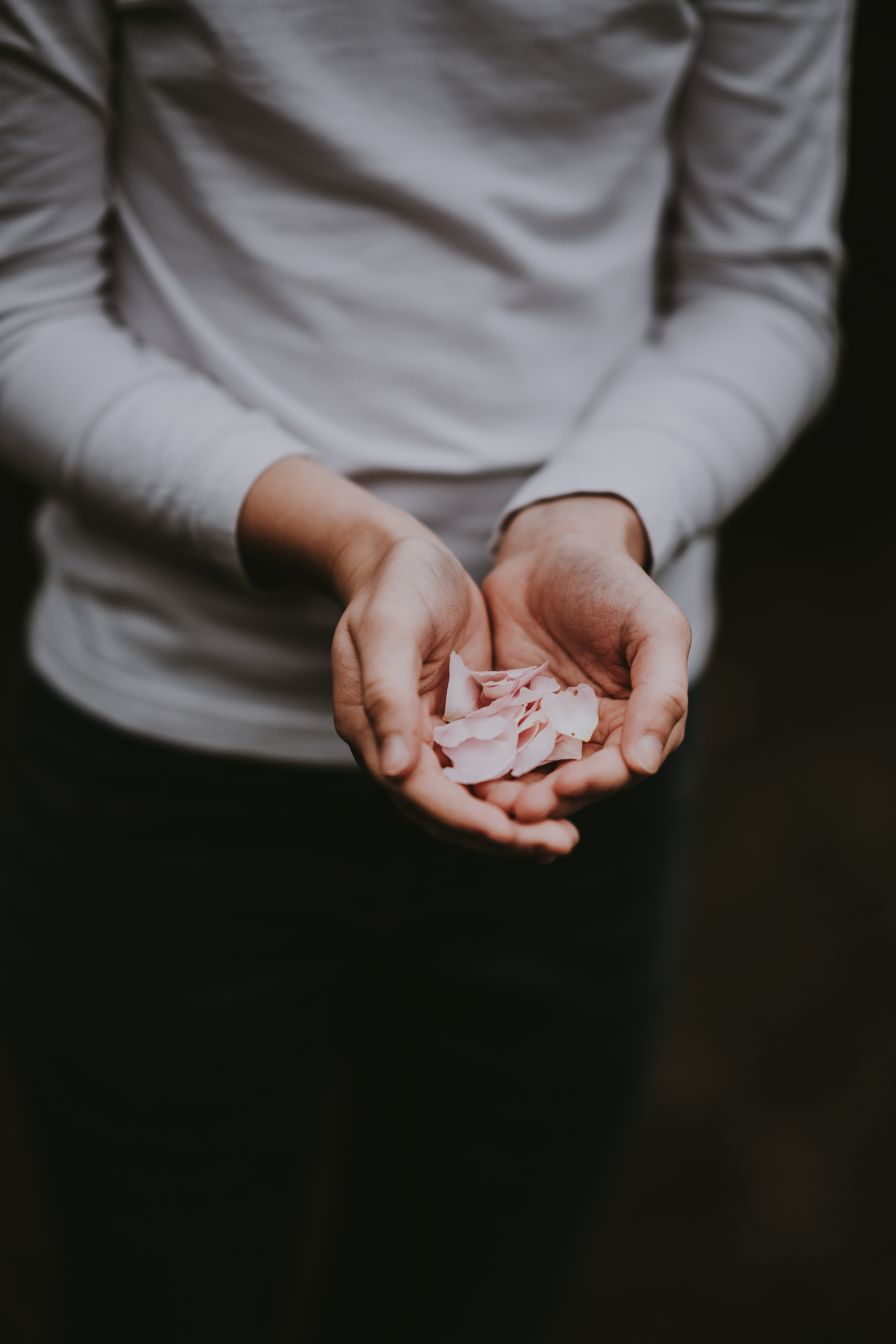
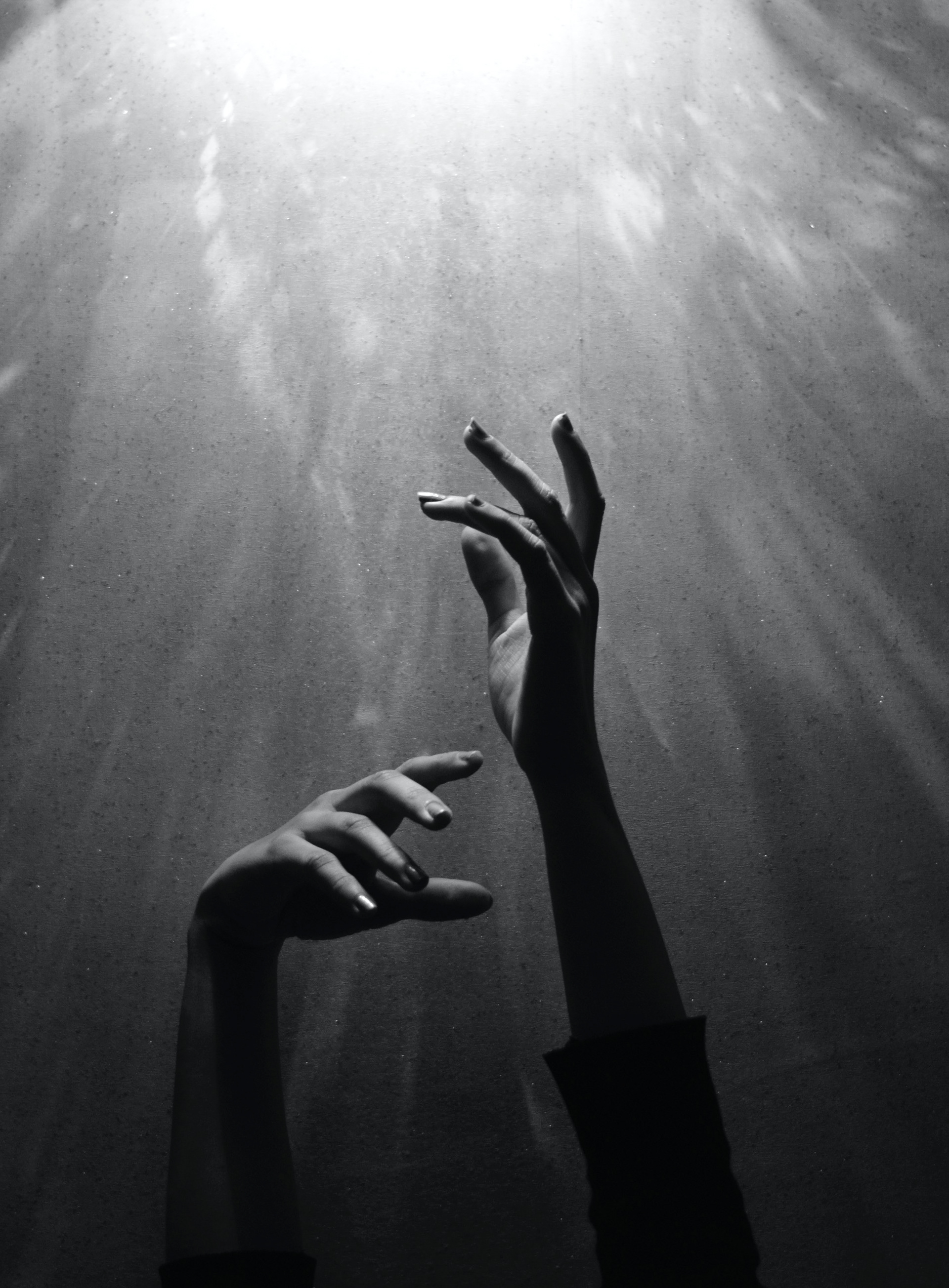
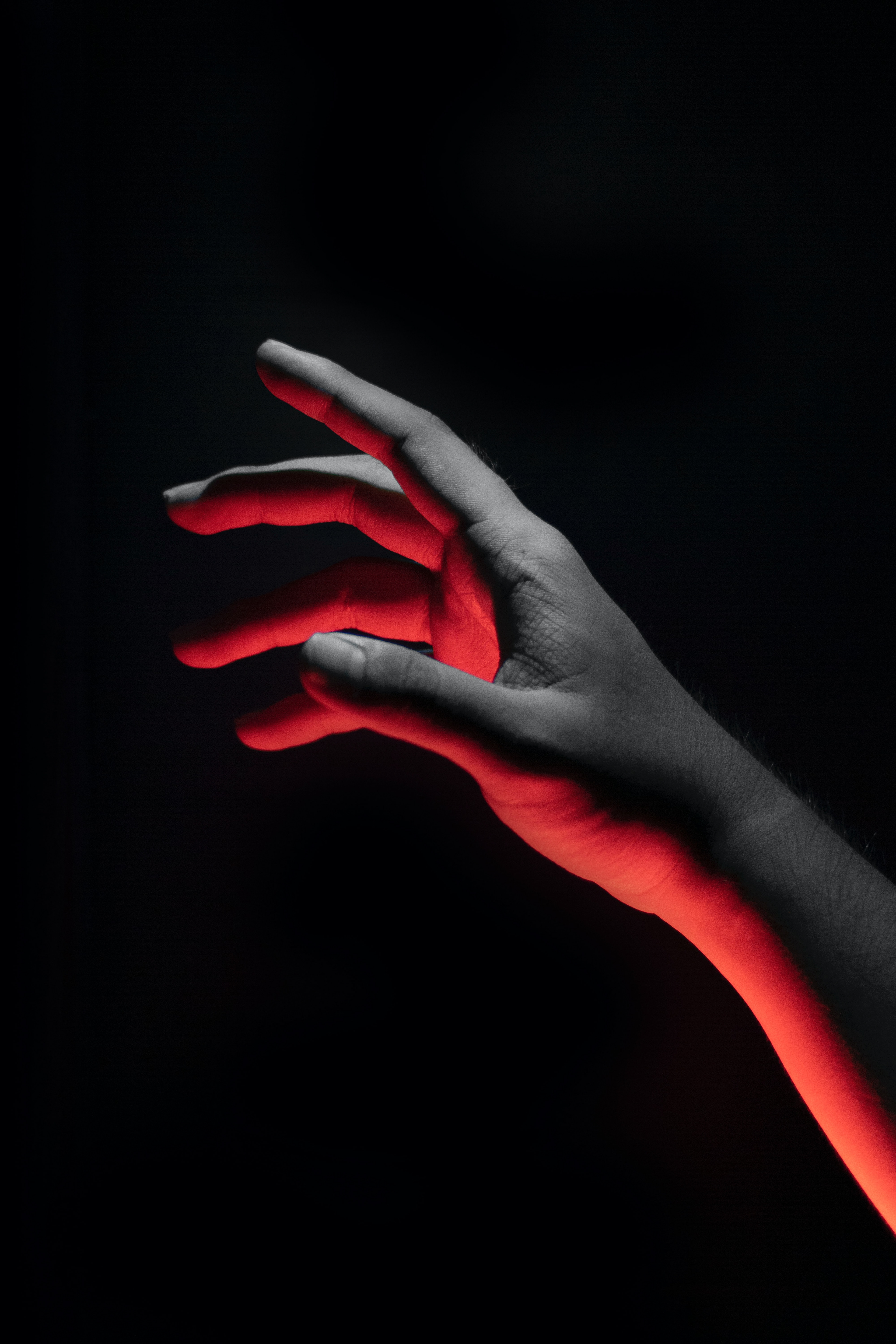
I began with the logo design because, in my process, that is the easiest way to get a feel for the brand. I did some research into press on nails to add to my knowledge of them. There are a lot of pros to using press-on nails, but the biggest con is that there is a bit of a learning curve to using them, and if you don't apply them correctly then they won't last as long as a customer's salon nails. So, my branding would need to emphasize the simplicity of press-on nails and their application process.
Design Decisions - Logo
For the logo itself, I wanted to use a real hand shape, particularly an open hand, to convey welcome to people. Press-on nails could be for anyone, so I utilized open shapes in the Greca Typeface and negative space in the hands and the letters to create emphasis. This gives the logo a minimal, modern look that is further supported by the thin, line-art illustrated hands. Taking inspiration from the photos shown above, I wanted to create a relaxed hand shape that would bracket the typography like parenthesis, but ultimately, I decided it looked better above and below the words 'Stay Pressed'.
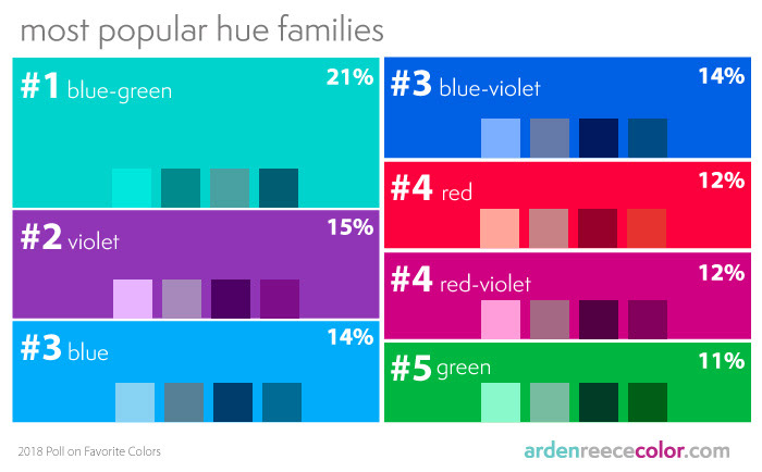
Another element I carefully considered while making this logo was the color theory behind the blue-green background color. This carries across all of my branded elements from the website to the Instagram page. I chose this color in particular because it's that time of year when people launch spring collections which very commonly include pastels, and my research into color theory showed me that blue-green is the most commonly purchased nail color after black, white, and beige. "It is a calm, friendly, and happy color, radiating the tranquility of blue, the growth of green, and the energy of yellow." Which I thought was exactly what the brand needed.
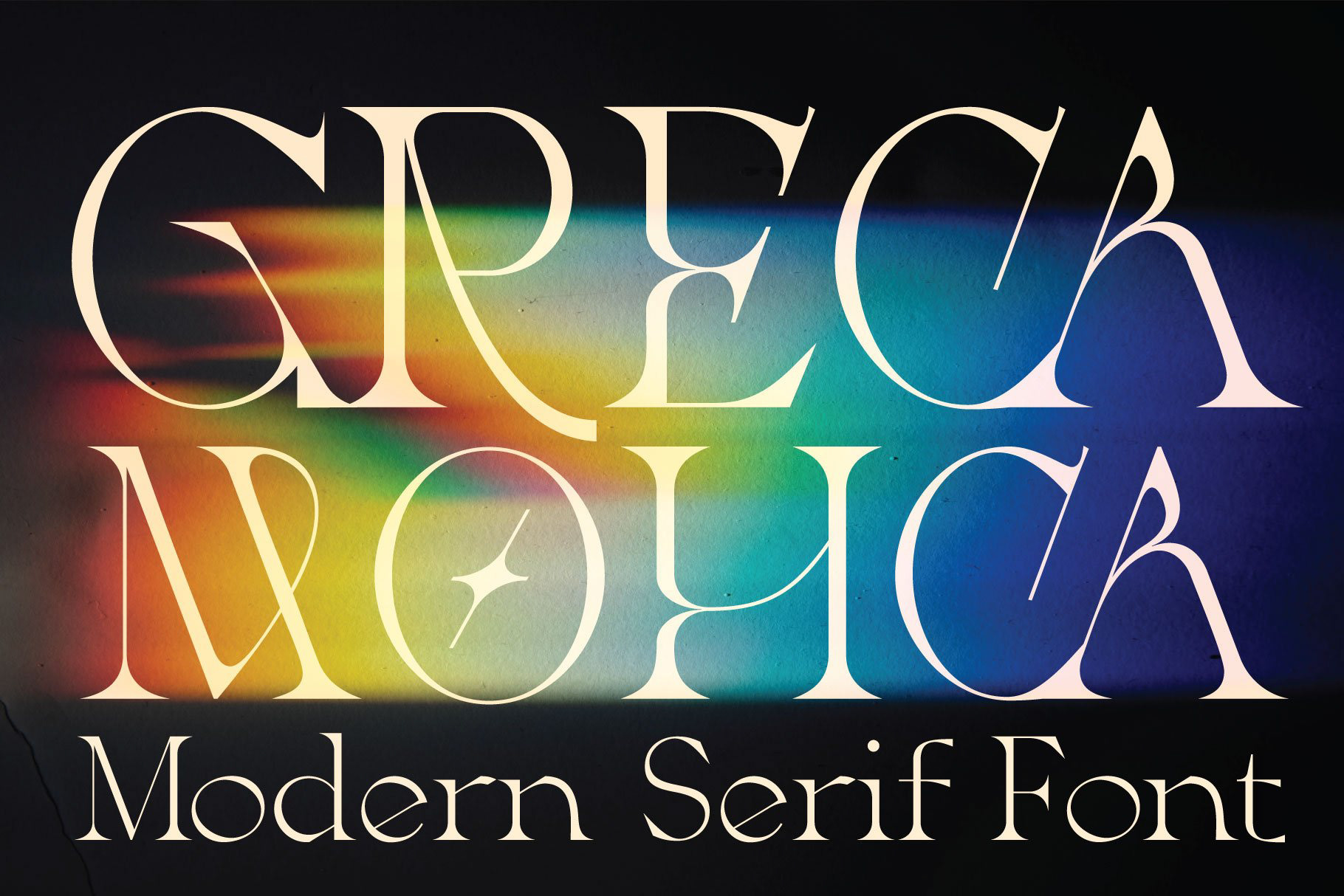
Greca
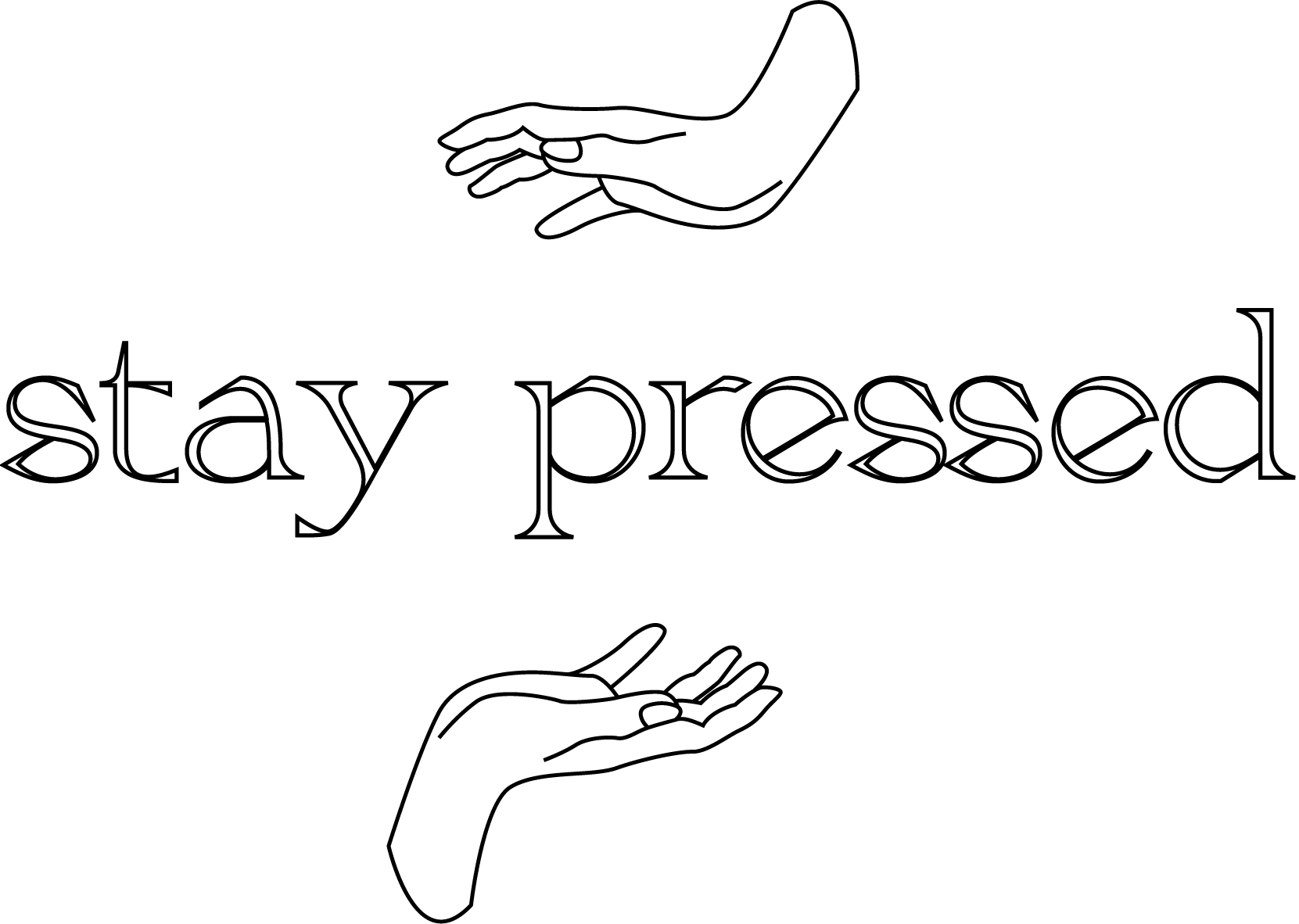
logo b/w
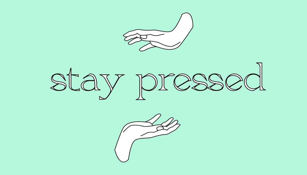
logo-color

Next, I designed my website layout (shown above). This is the How-To page, which includes the standard rainbow navigation bar with a logo across the top, a header with a video & hero image, followed by a transcription of the steps displayed in the video. The coloration follows the business card and I pulled complimentary pastel colors from the gradient to continue the pastel theme. One way I could have improved upon this design is by including a footer which was recommended in my critique feedback, however, I wanted the website design to fit a 1920x1080 pixel screen without being cramped, and therefore chose not to sacrifice breathing room for excess additions.
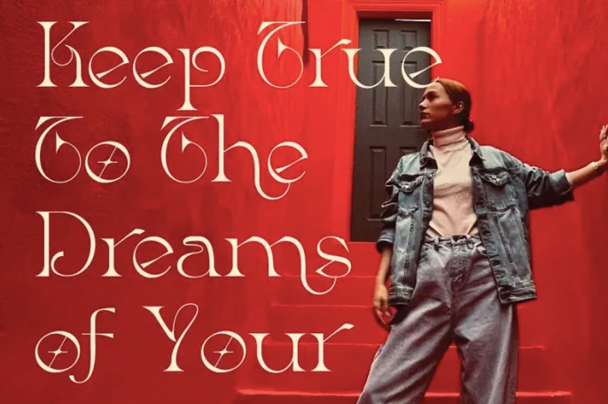
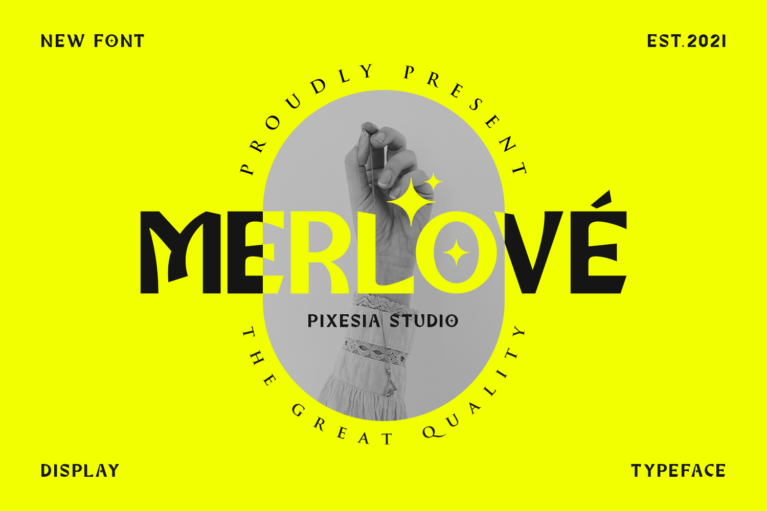
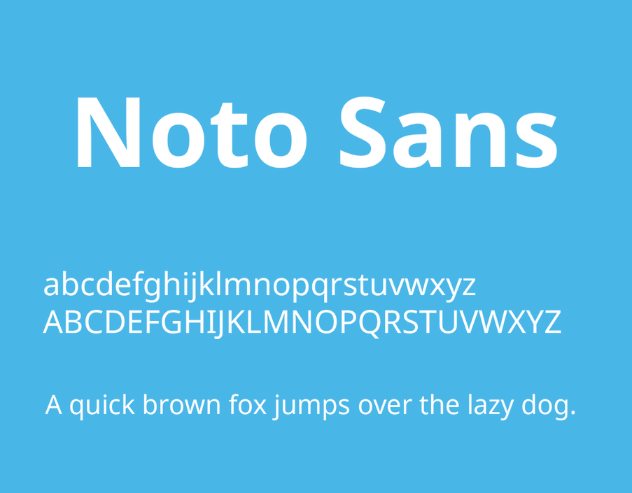
For the typography, I used Merlove typeface as my header and Noto Sans for my body copy. I think Merlove was an excellent choice as a display font because its letterforms are unique and intriguing. They evoke a sense of levity and joy without being overbearing. By contrast, Noto Sans is a clean, no-nonsense typeface with easy readability on digital screens.
The entire feel for what I wanted the site to be was clean & dynamic. I want viewers to be excited to scroll through the website without being overwhelmed with content, which I believe I achieved through this design. The end of the website prompts viewers to post to the Instagram #StayPressedNails2022 furthering engagement with the brand and encouraging customers to share their opinions.

mockup 1
mockup 2
mockup3
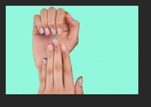
free images

personal images

personal images

personal images
This portion was the hardest for me to work on because it was difficult to find mockups that I needed to fit the overall mockup that I selected. This required 2 iterations before I finally found the tablet format specifications I was looking for. Though it was difficult to find and manipulate to get right, I'm glad that I followed this critique and didn't leave my original layout for the final submission. It adds to the overall aesthetic of the brand and is much more readable in laptop and tablet format. It shows the versatility of what Stay Pressed has to offer, and Instagram would most likely be the best way to market the brand based on my target audience.
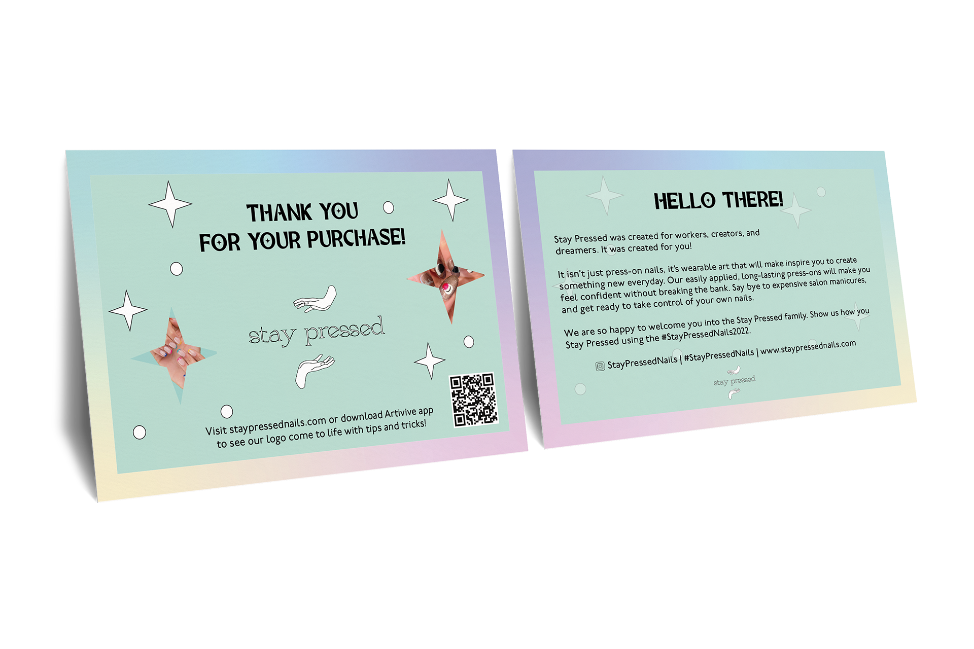
Finally, there is the postcard that ties everything together. It thanks them for their purchase, lets clients know about the website, tells them about the quality of their purchase, encourages them to share their nails and comments on Instagram, and, through the power of Artivive, even walks them through the video of how to apply their new nails without going to the website.
I'm most proud of this card because it ties everything together for this branded series and really caters to that customer experience. It perfectly fits the design of Stay Pressed between what was accomplished on the website and what was accomplished on the business card. The customer should easily be able to navigate from their purchased package to the Stay Pressed website. From there, they should easily learn how to apply the nails, which gives them control of their own expression. Lastly, they should be able to share their photos and comments with the Stay Pressed Team over Instagram.
I worked hard to make sure that the card held just enough information to make them feel excited about their purchase without feeling overwhelmed by the process. Due to readability, I took the signature blue-green color for Stay Pressed and tinted it slightly darker so that it wouldn't be hard to read. I carried over the Merlove Typeface for consistency's sake and changed the body copy to P22 Underground for print purposes. P22 Underground is a typeface that includes modern letterforms that make anything fun to read without sacrificing readability and legibility. The letterforms are distinctive, and I believe it melds really well with Greca in the logo and Merlove in the headings. It further pushes the brand into the realm of professional whimsy that is so perfect for nail enthusiasts.
Nails are meant to make people feel more confident about themselves and express themselves in a form of wearable art. It's a fun, treat yourself moment that feels way better than going to the salon and shelling out one hundred dollars for the nail techs to grumble about your lack of nail care and only do one solid color after an hour of work. Stay Pressed nails are the pop of color clients have been missing in their lives for the same quality at a fraction of the cost.
Thank you for reading this far.
